|
What is hierarchy in typography, and how does it work? In this article, we’ll explain type hierarchy and look at some examples. How Does Visual Hierarchy Relate to Typography?Visual hierarchy is a system of arrangement that guides the viewer’s eye through your composition. It’s often a system of importance, with some content serving as a focal point and others acting as a supplement. This is essential—think of it like a band. Some instruments play the melody, while others play supplemental parts, like adding harmony and rhythm.   
This principle applies to so many different facets of design. Your hierarchy in typography is just one piece. The hierarchy in the design itself will also use said typography. It’s like many pieces of a puzzle coming together. Try to think of it in terms of importance. What should grab your viewer’s attention first? What is supplemental to your focal point? What Is Hierarchy in Typography?How does visual hierarchy relate to typography, then? One of the most important techniques for effectively communicating (or “honoring”) content is the use of typographic hierarchy. Typographic hierarchy is a system of organizing type that establishes an order of importance within the data, allowing the reader to easily find what they are looking for and navigate the content. It helps guide the reader’s eye to where a section begins and ends, whilst enabling the user to isolate certain information based on the consistent use of style throughout a body of text.
Without typeface hierarchy, content can get difficult to navigate in a number of ways. While the specifics can vary according to the project or media, type hierarchy still remains essential. A Simple ExampleLet’s look at an example of content with and without consideration for typography hierarchy. The image below is a list of concerts playing at an outdoor venue. For the sake of this example, let’s say I’ve got the weekend of August 15–17 free, and I want to see if there’s a concert I’d like to attend around that time. In the scenario below, this is a task that’s much more difficult than it should be. Without any type of hierarchy, one has to sift through much of the data to find the dates of the concerts. Just imagine trying to look through a list of 50 concerts.   
There’s not much type hierarchy at work here. It’s just three columns without much differentiation between the content’s pieces. As you can see in the next example, the title, date, and descriptions are all styled uniquely, consistently, and isolated by using paragraph spacing. This allows us to easily isolate the dates (or band names for that matter) based on the styling, so that we can get at the information we need. Looks like we’re going to the Avett Brothers show!   
Hierarchy and the WebSo what is hierarchy in typography when you’re designing for the web? It should be pointed out that when designing for the web, there’s another layer to take into account. A webpage itself has a hierarchy that not only is read, but also contains interaction. The page as a whole must be designed in a way that clearly communicates to the user what actions are available and how to easily access the information they seek, how to purchase an item, etc.   
For the purpose of this article, however, we’re talking strictly about hierarchy as it applies to type. Luckily for us, when it comes to the web, we have our own handy HTML tag that lets us semantically establish typographic hierarchy on the websites we build. Heading tags (H tags) allow us to specify an order of importance for our content: H1 through H6, H1 being most important and H6 being least. Search engines use this data to interpret the priority of content on a webpage. Hierarchy and Print DesignBut what about hierarchy and print design? We interact with print design pieces, but not quite in the same way we’d interact with a digital work, like a website. Instead of clicking, we turn pages. Instead of navigating a menu, we have a table of contents. So, while the nature can be quite different, a lot of the principles are the same. For example, think about a newspaper’s design. You expect to see the headlines large and bold. Why? It distinguishes them from the rest of the copy, as a title and a starting point.   
Print design encompasses a lot of different pieces, like brochures, posters, business cards, and more. All of them need to employ strong typographic hierarchy. We’ll look at some examples of that in a moment. Styling TechniquesFirst, let’s take a look at a few basic methods for establishing a visual typographic hierarchy:
Most commonly, these methods are used in combination with each other. In the concert list shown earlier, size, color, spacing, and type contrast were all used. The combinations are endless. Size or ScaleSize (also known as Scale) is one of the easiest and most common methods of establishing hierarchy. Take a look at this example. “Headline” is visible in the title of this excerpt. We know that because it’s larger—it stands out as a headline.   
WeightWeight can have a big impact on typographic hierarchy too. For example, this copy is all the same size, but notice how the bold copy stands out. Likewise, we’d expect the body copy to have a lower weight—it just visually feels more supplemental.   
ColorColor can play a big role in what our eye sees as primary and secondary, as well. In this example, our header is a different color. This contrasts with the body copy and distinguishes it as different from the rest. That’s how we know it’s a header or a title.   
PositionPositioning can also create that visual difference that distinguishes one part of your type from another. In this example, the copy is all the same font and same size. However, the title is positioned differently. Being off to the side, it differentiates it from the rest of the copy, so we can easily read it as a title.   
Contrasting TypefacesThat said, you can also use typefaces to establish hierarchy. The body copy is a clean sans serif font, but the headline is in a handwriting font called Kinda Thin. It’s far more decorative and stands out because it varies so much from the body copy.   
CombinationAs mentioned previously, these methods can be most effective when used in combination with one another. This is the fun part – deciding what combination is right for your content and layout! In this example, we largely have scale (the type is larger), color (the type is orange, versus the body set to gray), positioning (the type is on its own line, above the rest of the copy), and contrasting typefaces (using the script font Autography from Envato Elements).   
Spacing MattersOne of the most important concepts in type design is spacing. It’s one of the most difficult concepts to grasp for beginning designers, yet it is also one of the most visually obvious. Proper typographic spacing is critical in establishing hierarchy; it can make the difference between confusion and clarity. It is used in the majority of hierarchical systems, and it is present in all of the examples in this article.   
The rule of proximity in design generally states that related items should appear closer to each other than items that are not related. We know, for example, that the above lines of copy are a fluid paragraph because they are close to each other. We know the title is related because it is close to the body copy—it also shares the same left margin. However, proper spacing involves more than just a hard return between sections of type. Generally, a hard return creates too much space between content in the context of a paragraph. Paragraph spacing—either before or after—should be used. Let’s check out some examples of line spacing:   
In this example, the lines are so spaced apart that they start to feel disjointed—like they aren’t related anymore. That’s not what you want with something like body copy.   
But in this example, the lines are just so tight that it starts to look jumbled and difficult to read. Moderate spacing can keep the lines looking fluid without having a cramped reading experience. Other Considerations & Typographic Hierarchy ExamplesIt’s important to consider the meaning of a particular piece of content when thinking about hierarchy. What is the subject matter? What is it trying to communicate? If you don’t know, read it before making decisions on hierarchy and style. In some scenarios, you may have the freedom to employ any of the hierarchy methods listed above, but in other cases you may be limited to a certain vertical or horizontal space or be concerned with adequate contrast of type on a background. Evaluate which methods work for the situation, and employ the ones that make sense. The old “simpler is better” mantra usually applies here. Remember, the goal is to present the content in an organized way. To further examine these ideas, let’s take a look at some typographic hierarchy examples. Menu Design  
Can you spot the typeface hierarchy in action here? Notice how each menu subcategory stands out. There’s a black bar here, and the type is in white. This helps visually separate each section, so we can easily navigate the menu. Notice how the menu items themselves are also bigger than the descriptions. This example of type hierarchy helps us quickly and easily scan the menu for what we might want. Poster Design  
Poster design is often a case where the typography hierarchy can be creatively implemented—but it’s still essential in a similar way. In this case, our eyes go directly to the title: “Another Dance”. Notice how the date is smaller but still looks related due to its proximity. We also see the names of the featured artists, which are larger than a lot of the other content. There’s a lot of scale/size used effectively here. Business Card Design  
Here’s a simple, clean business card design, but it’s also a great example of typographic hierarchy. The person’s name is largest. Notice how the person’s title and website are highlighted in red—this helps them stand out. Then, the rest of the content is the most supplemental. There is a visual order of importance at work here. Magazine Layout Design  
Magazines are an essential place for typography hierarchy. There tends to be a lot of content, so we need to navigate it easily, and it also needs to be easy to read. Check out this example, and note which aspects are the largest. Things like titles and headlines need to be large to guide us through the content. Smaller, more supplemental content, like body copy, still needs to visually relate though—not only to the composition but to itself. Keep that line width moderate so the lines stay fluid. Event Flyer Design  
Event flyers often need to command attention quickly and effectively. Notice how typographic hierarchy helps achieve that here. The title is super bold and commands our attention. Next, the date and the entry fee. And then we see the supplemental information last in the system of hierarchy established here. ResourcesWant to learn more about hierarchy in typography? If you’re interested, I’ve provided a few interesting resources related to type, hierarchy, and the web: Learn More About Typography TodayNow you know about typeface hierarchy, but there’s plenty more to learn about typography here on Envato Tuts+. Editorial note: this post was originally published in 2013 by Jeremy Loyd and has been rewrote and updated with contributions from Daisy Ein. via Pixel Lyft https://ift.tt/oWpIfaE
0 Comments
Whatever business you’re designing for, chances are there’s an Adobe XD template to match! Above, you saw a selection of the best Adobe XD website templates for organizations (from yoga studios to kindergartens to charities). The best part? All of these premium Adobe XD website templates are available on Envato Elements! Even if you search the whole world wide web, you wouldn’t be able to find a Adobe XD template for free with those premium features! All you need now to do is subscribe to Envato Elements and download as many of the Adobe XD templates as want. If you’re after a different style from the ones shown here, check out the full list of Adobe XD templates on Envato Elements. Editorial Note: This article has been completely rewritten to make it more usable for the reader. via Pixel Lyft https://ift.tt/OJ1aZN0 Having a dedicated ebook website not only gives you a platform to showcase your work, but it also establishes your brand and credibility online. And a well-designed site can serve as a one-stop shop for your readers, offering them easy access to your ebooks, related content, and even exclusive offers. As you can imagine, this can make all the difference in your ebook sales. That’s why we curated this list of the 14 best ebook HTML website templates to help you create a stunning online presence. These templates offer a range of features from responsive designs to drag-and-drop builders, ensuring you’ll find the perfect fit for your ebook project. via Pixel Lyft https://ift.tt/azYqLEd This article was created in partnership with SVGator. Thank you for supporting the partners who make SitePoint possible. Creating dynamic user experiences with interactive SVG animations is no longer an ability reserved for designers that have a solid coding background skillset. With the help of tools that make keyframe animation possible, and that facilitate the process of animating graphics in a WYSIWYG interface, interactive SVG animations are now a craft that anyone can master in a matter of hours. As an integral part of modern web design standards, interactive animated vector graphics are a fantastic user experience elevating tool for both designers and developers. These types of dynamic visuals can captivate users’ attention more efficiently than static content, and have the clear advantage of lower production costs, compared to traditional video production costs. What are Interactive SVG Animations?Interactive SVG animations are dynamic scalable vector graphics that allow users to interact with a web page or mobile app’s UI. SVG animations can respond to user interactions like mouse clicks/hovers, scrolling, touch events on mobile, and other similar event triggers. The future-proof and performance-friendly advantages of using scalable vector graphics (such as infinite scalability, responsive design, lightweight file size, fast-loading times, and so on) carry over into the realm of interactive SVG animations. Design teams, and even solopreneurs, use them to create dynamic, immersive and engaging user experiences on the web or inside mobile apps. What Are the Main Types of Interactive SVG Animations?The main types of interactive SVG animations are:
Each of these types of interactive animated graphics can contribute immensely to the immersive user experience we all want to create for our customers. From subtle microinteractions to complex user-triggered sequences, interactive SVG animations will allow you to cast a wide net on your design goals and help you meet a diverse range of user needs and expectations (including those concerning usability/accessibility). Interactive on-click / touch event SVG animationsAn SVG animation that is triggered on-click or by a touch event can be set to play, pause, restart, reverse, and so on, with a mouse click or a tap on a mobile UI. You can also control how the animation responds on a second click. This type of interactivity is particularly effective at crafting an intuitive and easy-to-navigate interface. On-click SVG animations are best used to deliver immediate system feedback to user input/tactile interaction. You can leverage them to guide users through the UI, to create memorable and responsive storytelling, and to upgrade the overall user experience at the same time. Interactive on-hover SVG animationsSVG animations triggered on-hover (also referred to as hover effects) can be set to play on mouse-over, and pause, reset, reverse, or continue on mouse-out. This type of interactive asset introduces an extra layer of interest and engagement to any web page, allowing the user to be in control of turning static objects into dynamic ones. Hover effects are best used to convey information based on the user’s particular interests, to increase the amount of time a viewer stays on-page (and consequently increasing the chances of said viewer becoming a customer), and to deliver the immersive and intuitive browsing experience that we’ve all come to expect from our favorite brands. Interactive on scroll SVG animationsAn SVG animation triggered on-scroll will play as the user scrolls through a web page/app. You can control how much of the animation should be visible in the viewport before the animation plays. As a user progresses down a page’s layout, your dynamic graphics will start playing and help you build a sophisticated visual narrative with little to no effort. The design style associated with this type of interactive animation is referred to as “scrollytelling”. It’s exceptionally helpful in presenting users with information at an easier-to-digest pace, while also persuading viewers to explore more of your content. Interactive SVG animations with custom trigger eventsSVG animations support a lot of interactive trigger events. Animating interactive SVG programmatically will require a certain level of coding knowledge, but it can also be done with the help of tools such as SVGator’s Player JS API. This API enables external, code-based, and event-driven control of all animated SVG projects exported from the animation tool. Customizing trigger events allows you to go beyond the conventional SVG interactivity settings (on-click, on-hover, on-scroll). You can create unique and highly tailored interactive experiences that align perfectly with the rest of your content, and with your brand’s identity. <br> The Most Popular Use Cases for Interactive SVG AnimationsInteractive SVG animations are a perfect match for a diverse variety of web/app design contexts thanks to their inherent ability to enhance user engagement. The most popular use cases for dynamic interactive graphics include:
How to Use SVGator to Create Interactive SVG AnimationsYou can use SVGator to create interactive animated SVG easily using the tool’s full-featured vector creator and editor, keyframe animation capabilities, and its interactive animation presets. Most of the other options available for creating interactive SVG animations from scratch require a certain level of background coding knowledge, and even using JavaScript libraries involves a good amount of code writing. That’s why a no-code animation tool like SVGator is definitely worth exploring. Here are some of this animation tool’s other notable features:
When it comes to creating dynamic web experiences, SVGator has two options available:
Interactive animation presetsA dropdown menu in SVGator’s Export panel interface offers easy access to a range of interactivity options. With these interactivity presets you can decide how your SVG animation should behave in response to user input, in literally just a few clicks. Setting your animation to start on hover, or on click, and even choosing what happens on mouse-out or on a second click, drastically cuts down the time and effort needed to achieve impressive interactive animation effects. The editor’s real-time preview allows you to see exactly how the animation responds to interactions, making it easy to nail even the most finicky animation effects. Programmatic control with SVGator’s Player JS APISVGator’s Player JS API offers complete programmatic control over your SVG animations when it comes to interactivity settings. To make the most out of this feature, users do need to know their way around code writing. The results, however, are outstanding. You can even set different trigger events between two or more animated SVG animations, which means the number of creative possibilities increases exponentially, when compared to the results you can achieve with the interactivity presets alone. ConclusionBuilding interactive user experiences with SVG animations feels like a cheat code, simply because of how effective and quick of a solution it is to implement. Interactive animated graphics can extend the visual appeal, usability, and accessibility of your website or app. They can also also improve the ability to captivate visitors, and ultimately convert them into paying customers. Feature-packed animation tools like SVGator have helped level the playing field, making the process of animating interactive SVG much more accessible to creative professionals from all business fields. FAQs
How can an animation be interactive?
SVG animations can be interactive when they respond to user input like clicks, scrolling, mouse hovers or other trigger events. Tools like SVGator make it easy for anyone to create interactive SVG animations with its user-friendly interface, among other features, without the need for extensive coding, or any coding at all if you use the tool’s interactive animation presets.
Will interactive animations work on any device/browser?
Yes, interactive SVG animations will work on most devices or browsers. Scalable vector graphics are supported by all major browsers. In fact, the animations will actually play exactly the same way they play in SVGator’s editor. That’s one of the best things about WYSIWYG design interfaces. Testing across browsers and devices is however a standard best practice we all need to follow to ensure a consistent user experience across the board.
Can interactive SVG have clickable links?
Yes, interactive SVG animations can have clickable links. The SVG format supports the via Pixel Lyft https://ift.tt/cvpGghb In a recent tutorial, we covered a method to convert WordPress child pages into navigation tabs. Today, we’ll move a step further and learn how to navigate between these pages with the next and previous links. Before starting, I recommend you go through the previous tutorial first and then come back here, as this tutorial is its continuation. As usual with my WordPress tutorials, here’s an introductory video that showcases the expected behavior:
Just a quick reminder from the previous tutorial:
  
   Tοday’s goal is to facilitate the navigation to sibling child pages through the next and previous links. In my case, all pages contain some dummy content that even fits inside a laptop screen, so extra navigation seems unnecessary. However, in a real scenario, pages can be too lengthy, so users have to scroll up to the tabs to navigate to the other pages—something certainly not user-friendly. We’ll provide two navigation variations:
  
   ImplementationFor the implementation part, as usual, I’ll work with my custom Playground theme and use, as a starting point, the files from the previous tutorial. Here’s the updated theme structure—I’ll describe all the code additions:    For your convenience, all the theme files of this exercise will be available in the A few notes:
Let’s breakdown the logic for the navigation:
  
Here’s the PHP code added in the
And the associated styles—notice the
ConclusionDuring this tutorial, we learned a technique that facilitates the WordPress child page navigation through the next and previous links. Hopefully, you found some value in it and plan to use it shortly! As always, thanks for reading! via Pixel Lyft https://ift.tt/F7noI1d The Pomodoro technique is a widely used tool for increasing productivity. It does this by breaking work intervals into 25 minutes of focused work followed by short breaks. In this tutorial, we will create a Pomodoro tool that allows users to set a work interval timer. After the work session, a user can choose a 5 or 10 minute break. Getting StartedLet’s start by creating the HTML structure for the Pomodoro timer. The timer will feature three buttons, namely:
We will also have a display for each timer duration and control buttons for starting and stopping the timer. HTML and CSSThe structure and styling of the timer are relatively straight-forward; suitable colors and layout, container elements with classes and IDs for targeting them properly. I’ll explain what they all are when we dive into the JavaScript, because that’s where the real learning happens in this tutorial! JavaScript FunctionalityAs I mentioned, the most important aspect of this timer is the JavaScript functionality. Start by getting the IDs of all the timer button elements and assigning them to variables. By defining these variables at the top of the file, we are essentially creating them as global variables. JavaScript global variables can be accessed inside functions, and this avoids having to redeclare them when we need them.
By default, when a user opens the Pomodoro timer application, we want to show them the 25 minute timer display; so let’s create a function called
Here, we are using the CSS display property to change the visibility of the timer displays. The short and long display elements will be hidden, while the Pomodoro display will be visible. Finally, we call the Event ListenersNext, well create event listeners for listening to click events in each timer button. Begin by declaring a variable
Next, create event listeners that will be triggered when a user clicks on the buttons.
The event listeners will be fired when a user clicks the button timers. For example, when a user clicks the short break button, the user will see the 5:00 displayed, and the rest of the displays will be hidden. It will also set the value of Hide the TimersThe
Start Timer FunctionalityJavaScript provides the
For example, in our case, we want to decrement a timer by 1 second. Let’s create a
Let’s break down what is happening here:
Create the TimerNext, we will create our timer using the Update the
Inside the If the timeRemaining is greater than 0, we do the following.
When the Start ButtonFor the timer to display a countdown , it needs to be executed inside the start click event listener. Add a click listener to the start button and execute the
The event listener above will be triggered when the start button is clicked, and it will call the Fixing FlawsOur timer is working, but it still has a flaw; when you start a new timer before the previous one has ended, the previous one will still be running. To solve this flaw, we first need to check for an existing timer before starting a new one. Inside the
To stop the timer when the sop button is clicked, , we call the
Our Finished Pomodoro Timer!We’re done! See the Pomodoro Timer in action. ConclusionThis tutorial has covered how to create a basic Pomodoro timer. You should now be able to create your own Pomodoro Timer with more added functionality. Why not take it a step further and enhance the UI? Share your results with us!
via Pixel Lyft https://ift.tt/PCJMKw6
There are times when mistakes happen, and useful and important files are deleted by error or lost from your file system irrevocably (or seemingly, at least). Version control systems make it difficult to permanently lose files, provided they have been either added to staging or committed to a remote repository, because Git allows you to undo or revert changes and access previous versions of the saved files. It is also possible to erroneously erase files from both the working directory and the Git repository. I’ve certainly done that! I imagine you have, too, if you’re reading this, and if that’s the case, then you will need a way to recover those files. I have a few methods and strategies you can use to recover your deleted files. Some are more obvious than others, and some are designed for very specific situations. And while it is indeed possible to irrevocably lose a file, even then, you may have a path to at least recover a copy of it with third-party software if it comes to that. How Git Works With FilesBefore we dive into all of that, let’s explore how your files journey from your local computer to your remote repository. Your files are initially only located on your computer’s storage, known as your working tree or working directory, and Git has no idea they exist yet. At this point, they are at their most vulnerable state since they are untracked. Adding files to the staging area — also known as the index — so that Git is aware of them is what the 
Once the files are staged, Git is at least aware of them, and we can include them in commits. When including a file in a commit, Git creates a new tree object to represent the state of the repository at the time the commit happens. The tree object contains the following information:
It’s at this point that the files are 
How Files Can Get Deleted From A Working TreeSo, the key pieces we’re talking about are your project’s working tree, staging area and commit. It is possible for files to be deleted at any one of these points, but it’s the working tree where it is most irreversible, or at least tough, to restore a lost file. There are some very specific Git commands or actions that tend to be the biggest culprits when a file is deleted from the working tree.
|

| Software | Operating Systems supported | Starting price | File types and formats supported |
|---|---|---|---|
| Wondershare Recoverit | Windows, Mac, Linux(Premium) | $69.99/year | 1000+ file types and formats |
| EaseUS | Windows, Mac | $99.95/year (Windows), $119.95/year (Mac) | 1000+ file types and formats |
| DMDE | Windows, Mac, Linux, DOS | $20/year | Supports basic file formats. Does not support raw photo files. |
As I said, there are many, many more options out there. If you’re reading this and have a favorite app that you use to recover lost files, then please share it in the comments. The more, the merrier!
Last Resort: git fsck
First off, the git fsck command can be dangerous if used incorrectly. It is essential to make sure that you understand how to use the command before using it to recover files from the working tree. If you are unsure how to proceed after reading this section, then it is a good idea to consult the Git documentation for additional details on how it is used and when it is best to use it.
That said, git fsck can indeed recover files lost from the working tree in Git and maybe your absolute last resort. It works by scanning the Git repository for “dangling” objects, which are objects that are not referenced by any commit. The Git docs define it like this:
dangling object:“An unreachable object that is not reachable even from other unreachable objects; a dangling object has no references to it from any reference or object in the repository.”
This can happen if a file is deleted from the working tree but not committed or if a branch is deleted, but the files on the branch are not deleted.
To recover files lost from the working tree using the git fsck command, follow these steps:
- Run
git fsck –lost-found, which is a special mode of thegit fsckcommand.
It creates a directory called.git/lost-foundand moves all of the lost objects to that directory. The lost objects are organized into two subdirectories: commits and objects. The/commitssubdirectory contains lost commits, and the/objectssubdirectory contains lost blobs, trees, and tags. This command prints the dangling objects (blobs, commits, trees, and tags) if they exist.

- Run the
git show <dangling_object_hash>command for each dangling object that is printed.
This will print the content of the object and enable you to see the original content of the hashed object so you can identify the dangling objects in the case of files dangling blobs that correspond to the files that you want to recover. - To recover a dangling object, you can manually copy the content of the printed in the console when you run the
git show <dangling_object_hash>command or rungit show <dangling_object_hash> > <filename>command to save the content of the hashed object to the file you specified in the command. You can also use thegit checkout <dangling_object_hash>command to restore the file to the working tree.
Once you have recovered the files that you want to recover, you can commit the changes to the Git repository as if nothing ever happened. Phew! But again, I only advise this approach if you’ve tried everything else and are absolutely at your last resort.
Conclusion
Now that you know how to recover files lost from your working tree, your mind should be relatively at ease whenever or if ever you find yourself in this unfortunate situation. Remember, there’s a good chance to recover a file that may have been accidentally deleted from a project.
That said, a better plan is to prevent being in this situation in the first place. Here are some tips that will help you prevent ending up almost irrevocably losing files from your working tree:
- Commit your files to your Git repository and remote servers as quickly and as often as you create or make changes to them.
There is no such thing as a “too small” commit. - Routinely create backups of your project files.
This will help you recover your files if you accidentally delete them or your computer crashes.
Further Reading On SmashingMag
(gg, yk)
via Pixel Lyft https://ift.tt/uJ4FEhG
Click to set custom HTML
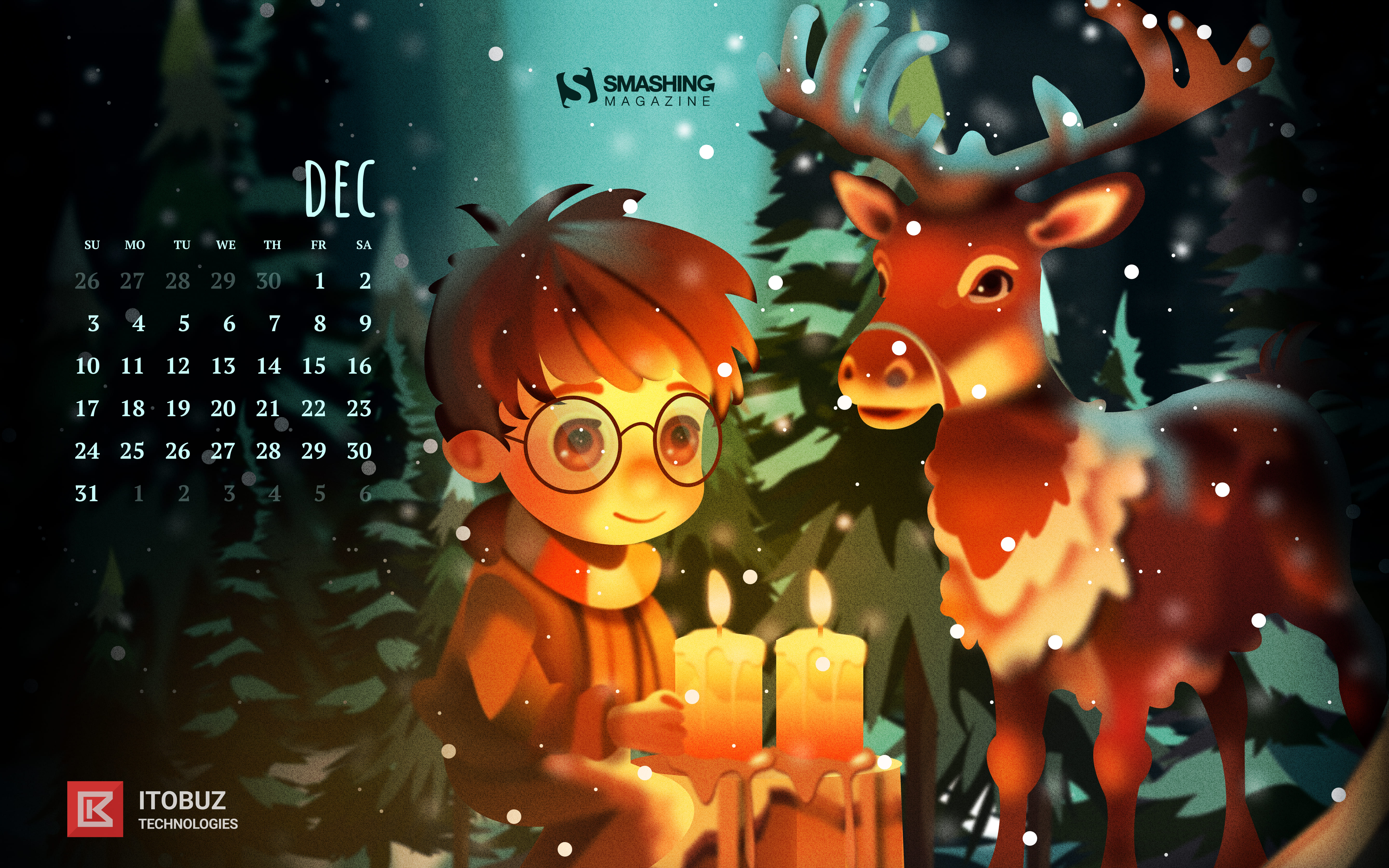
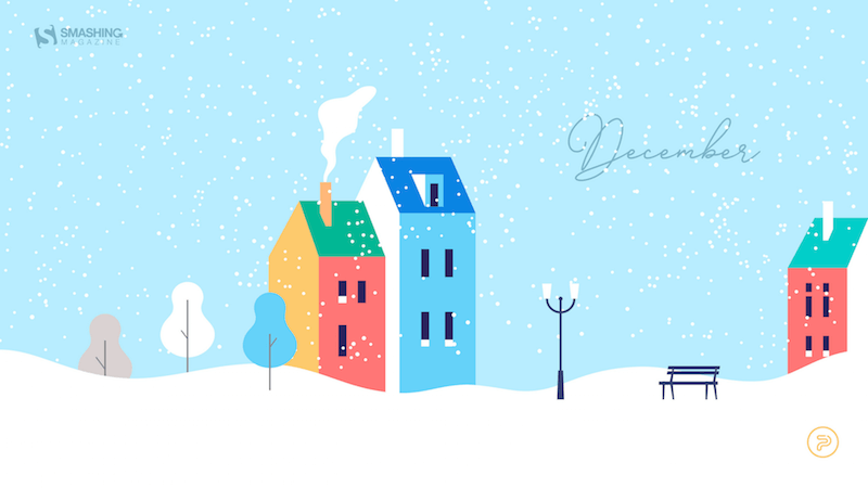
As the year is coming to a close, many of us feel rushed, meeting deadlines, finishing off projects, or preparing for the upcoming holiday season. So how about some beautiful, wintery desktop wallpapers to cater for some fresh inspiration and get you in the mood for December (and the holidays, if you’re celebrating)?
As every month since more than twelve years already, artists and designers from across the globe once again got their ideas bubbling and created wallpaper designs to sweeten up your December. They come in versions with and without a calendar and can be downloaded for free. As a little bonus goodie, we also added a selection of December favorites from our wallpapers archives to the collection that are just waiting to be rediscovered, so maybe you’ll spot one of your almost-forgotten favorites in here, too.
A huge thank you to everyone who took on the challenge and shared their designs with us — this post wouldn’t exist without you! Happy December!
- You can click on every image to see a larger preview,
- We respect and carefully consider the ideas and motivation behind each and every artist’s work. This is why we give all artists the full freedom to explore their creativity and express emotions and experience through their works. This is also why the themes of the wallpapers weren’t anyhow influenced by us but rather designed from scratch by the artists themselves.
- Submit a wallpaper!
Did you know that you could get featured in our next wallpapers post, too? We are always looking for creative talent.
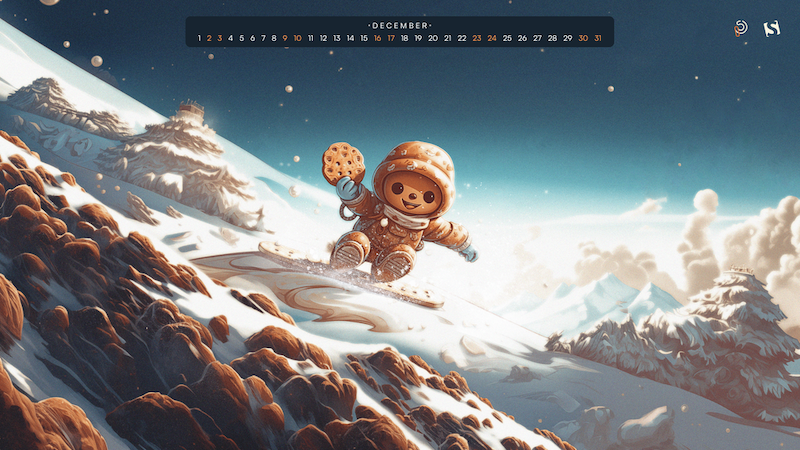
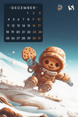
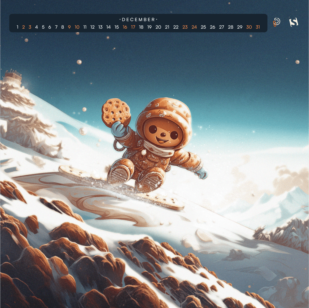
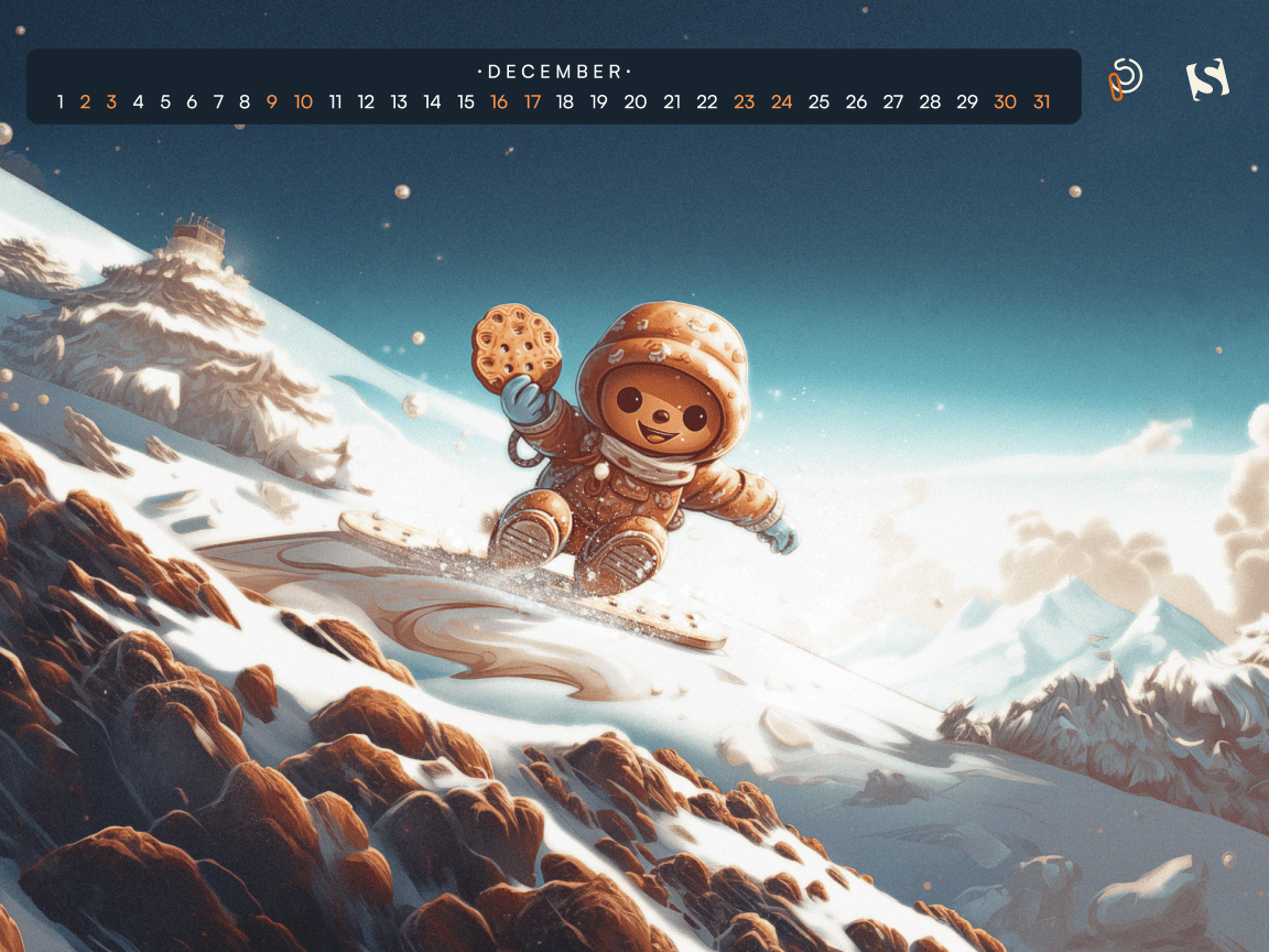
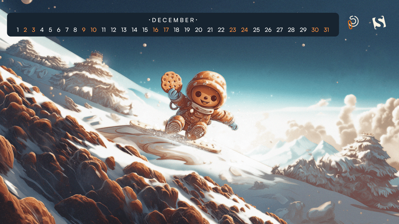
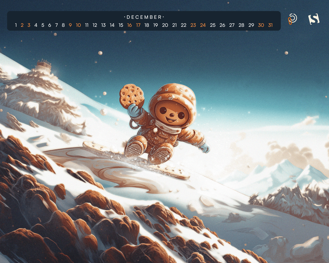
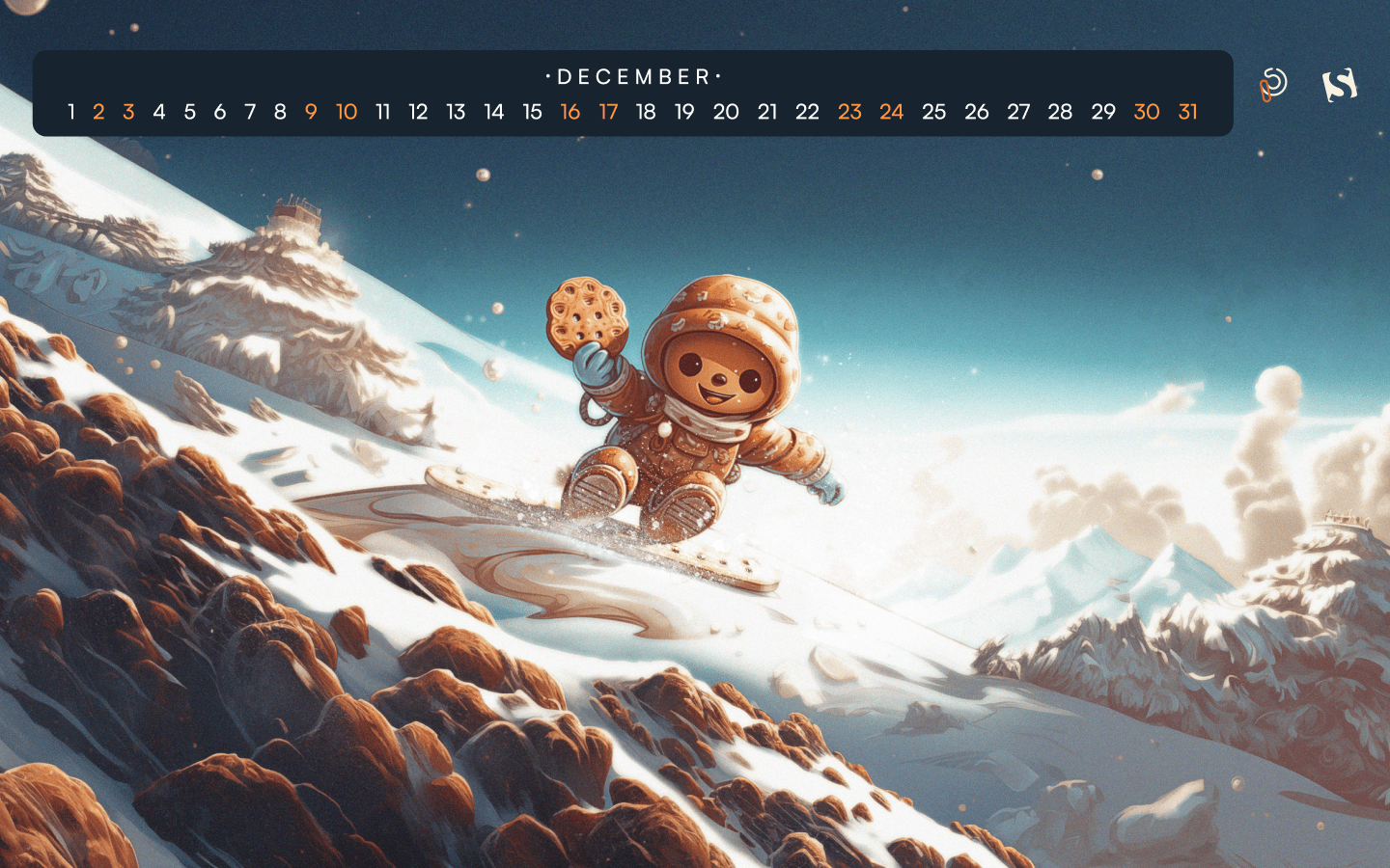
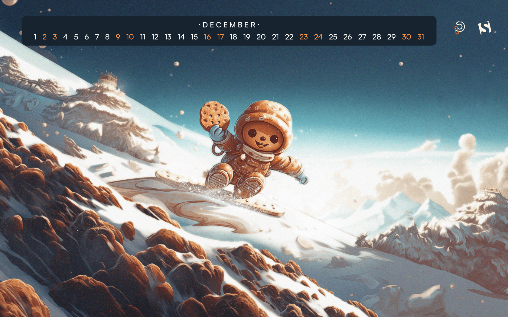
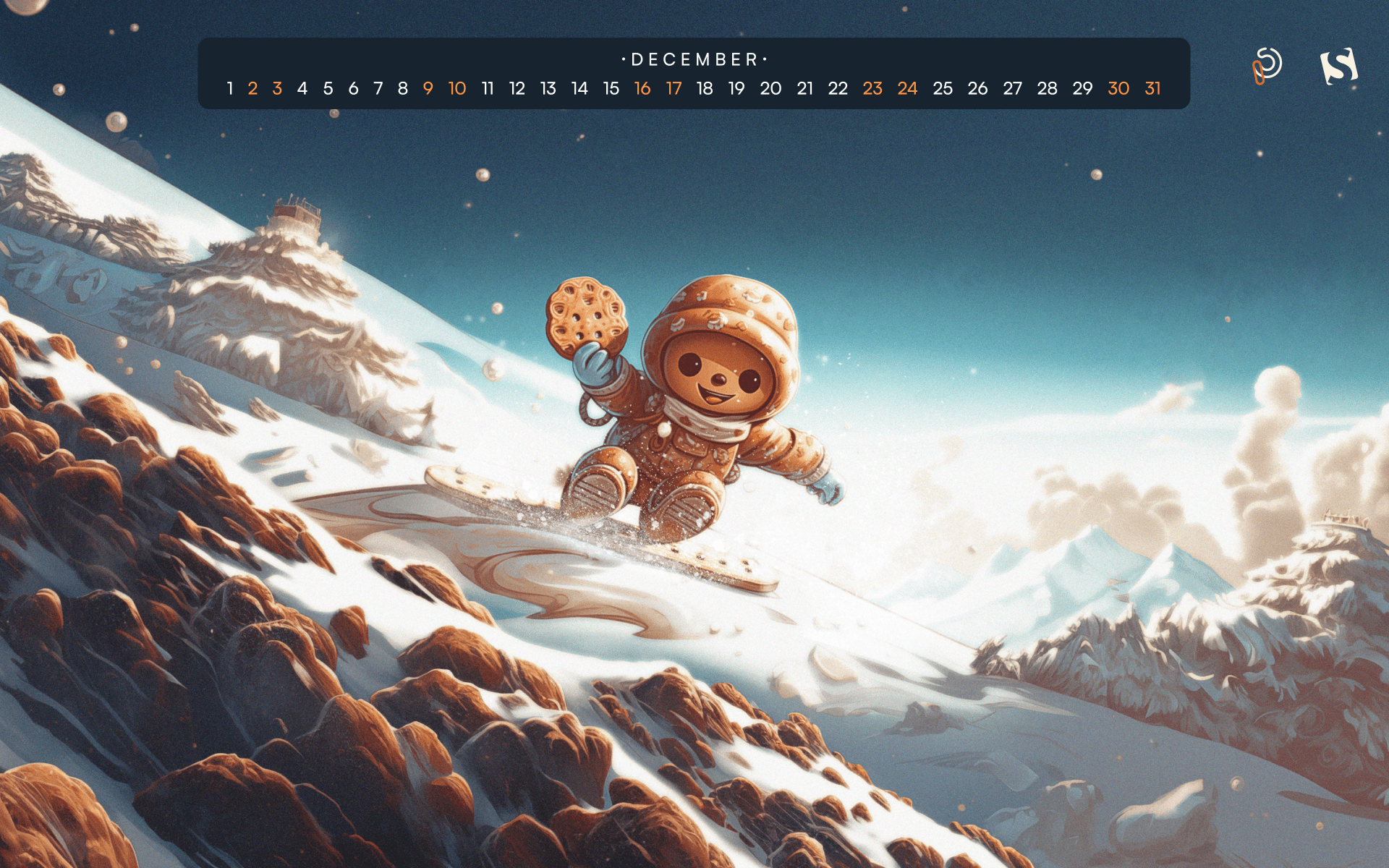
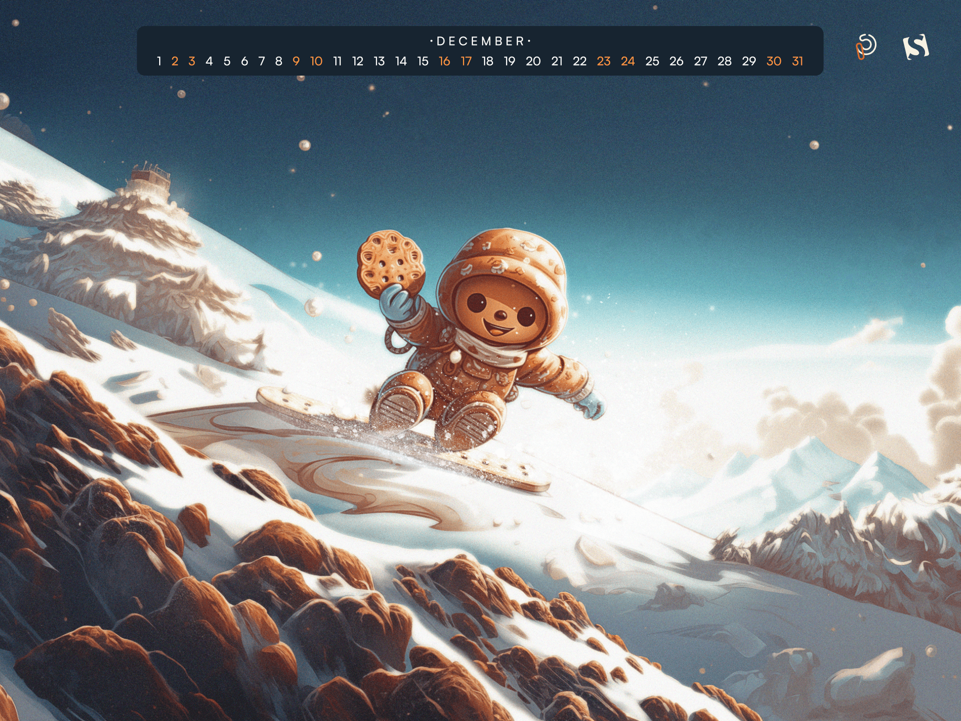
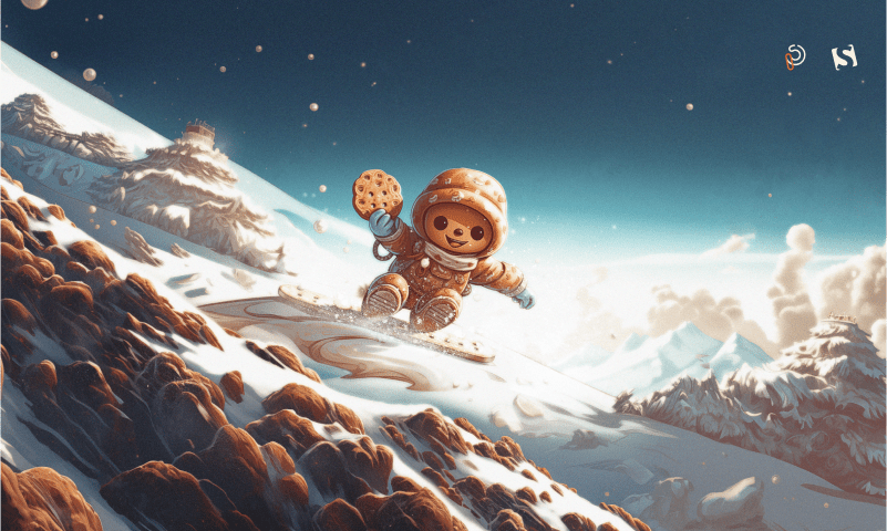
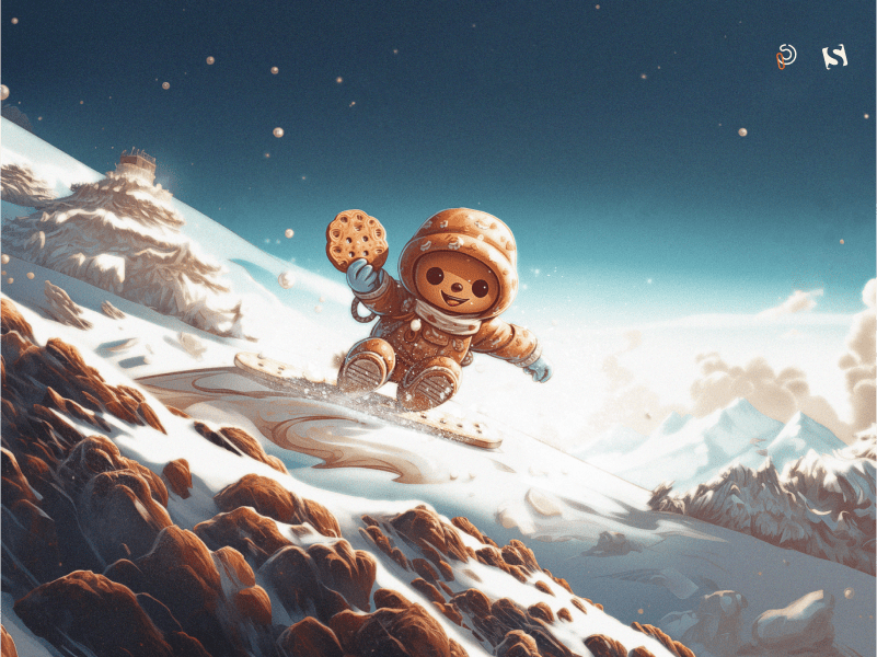
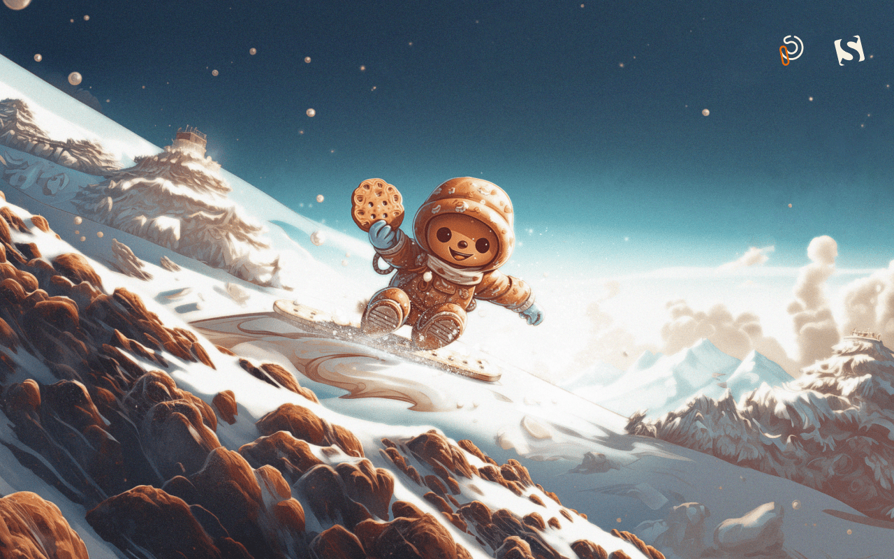
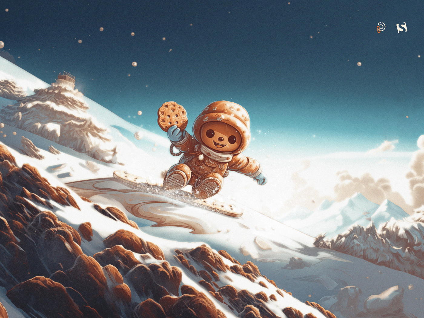
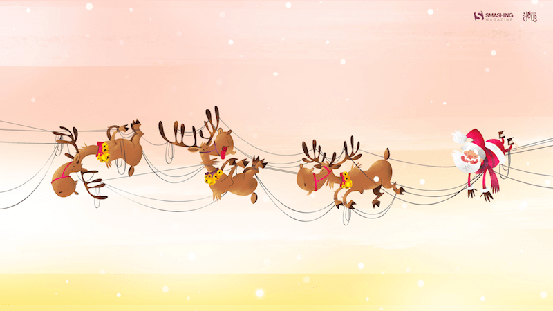
Sweet Ride Into The Holidays
December is here, and that means it’s time to celebrate National Cookie Day and embrace the festive spirit with our snowboarding cookie man! This delightful illustration captures the essence of the holidays — a time for indulging in our favorite treats, spreading joy, and creating unforgettable memories with loved ones. So, grab your favorite cookie, put on your coziest pajamas, and let the holiday cheer commence! — Designed by PopArt Studio from Serbia.

- preview
- with calendar: 320×480, 640×480, 800×480, 800×600, 1024×768, 1024×1024, 1152×864, 1280×720, 1280×800, 1280×960, 1280×1024, 1400×1050, 1440×900, 1600×1200, 1680×1050, 1680×1200, 1920×1080, 1920×1200, 1920×1440, 2560×1440
- without calendar: 320×480, 640×480, 800×480, 800×600, 1024×768, 1024×1024, 1152×864, 1280×720, 1280×800, 1280×960, 1280×1024, 1400×1050, 1440×900, 1600×1200, 1680×1050, 1680×1200, 1920×1080, 1920×1200, 1920×1440, 2560×1440
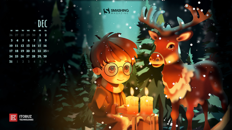
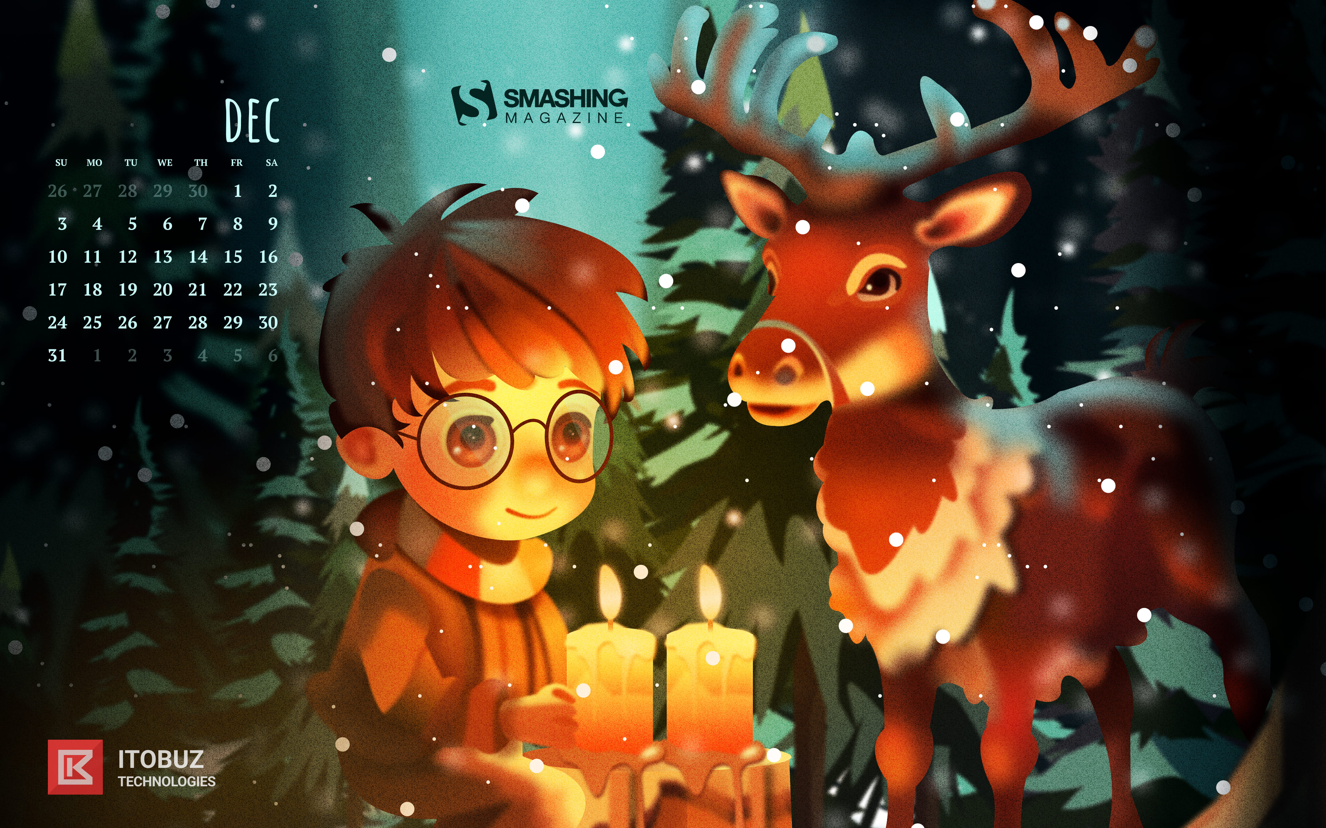
Spread The Soul Of Christmas
Designed by Bhabna Basak from India.

- preview
- with calendar: 1440×900, 1600×1200, 1680×1050, 1680×1200, 1920×1080, 1920×1200, 1920×1440, 2560×1440
- without calendar: 1440×900, 1600×1200, 1680×1050, 1680×1200, 1920×1080, 1920×1200, 1920×1440, 2560×1440
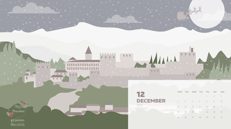
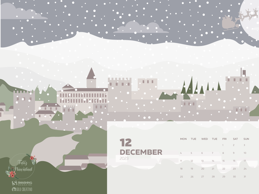
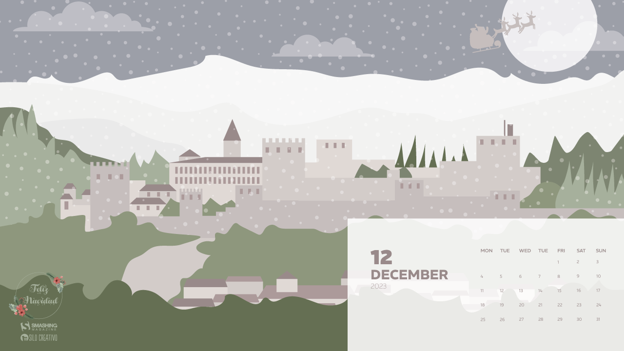
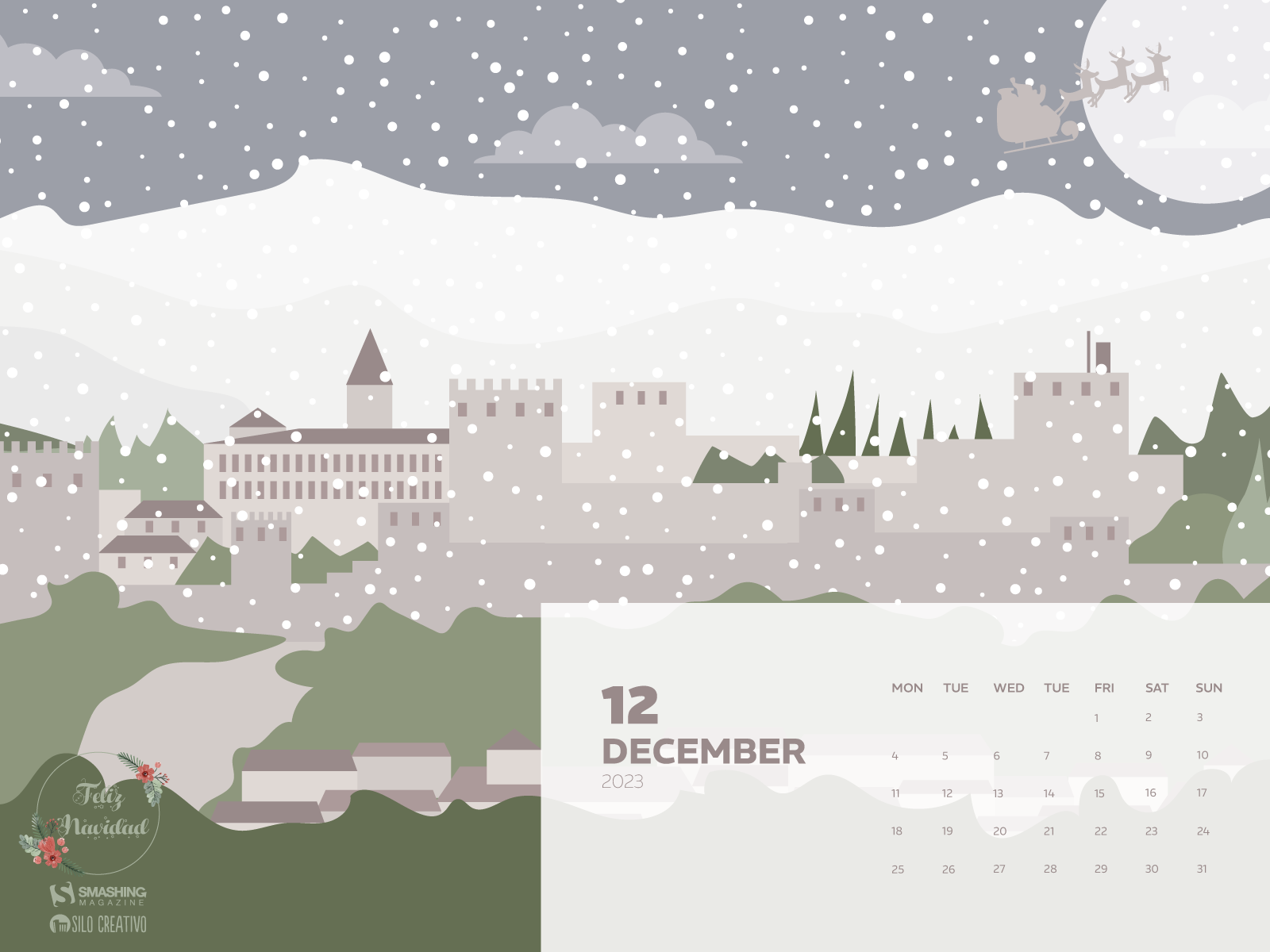
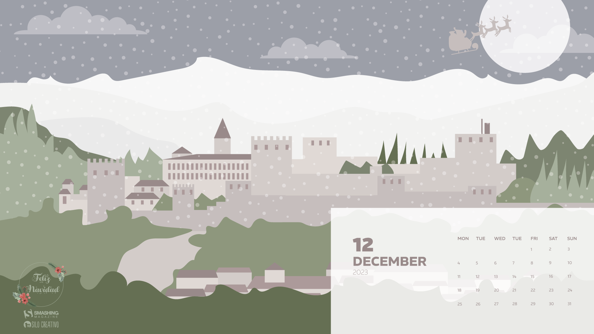
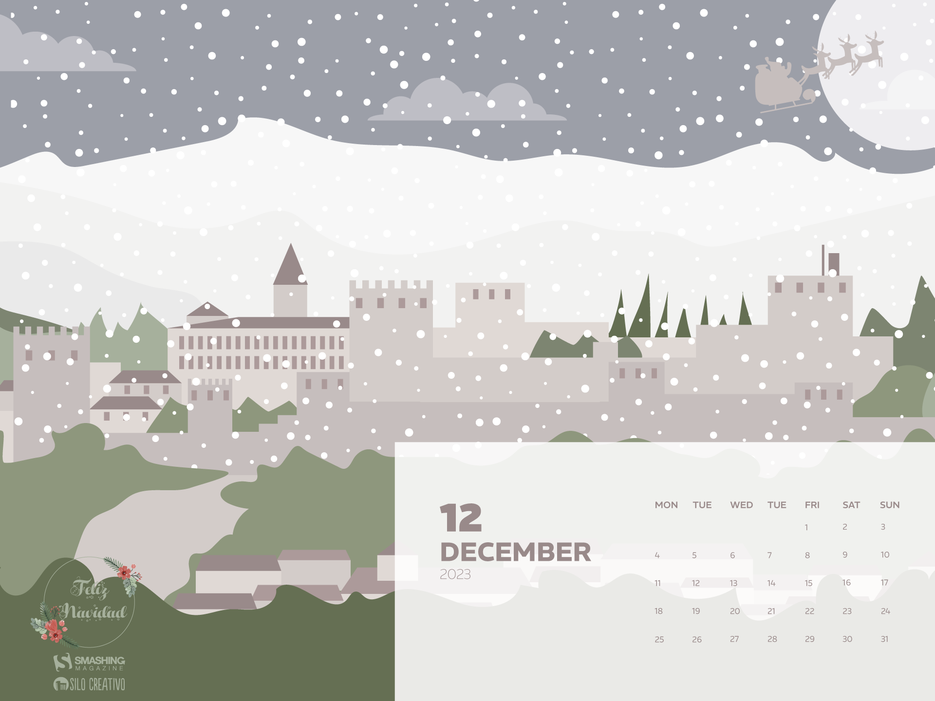
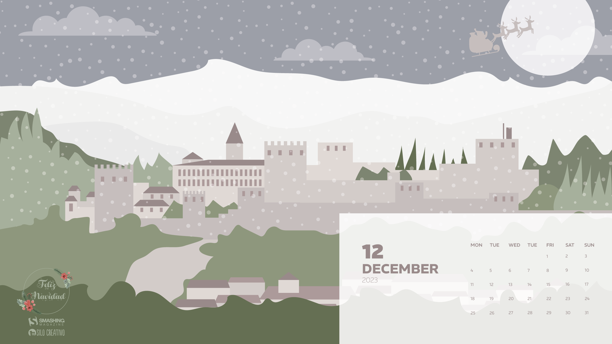
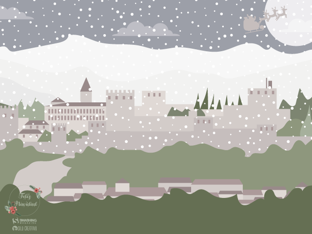
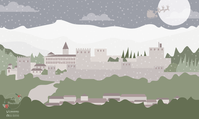
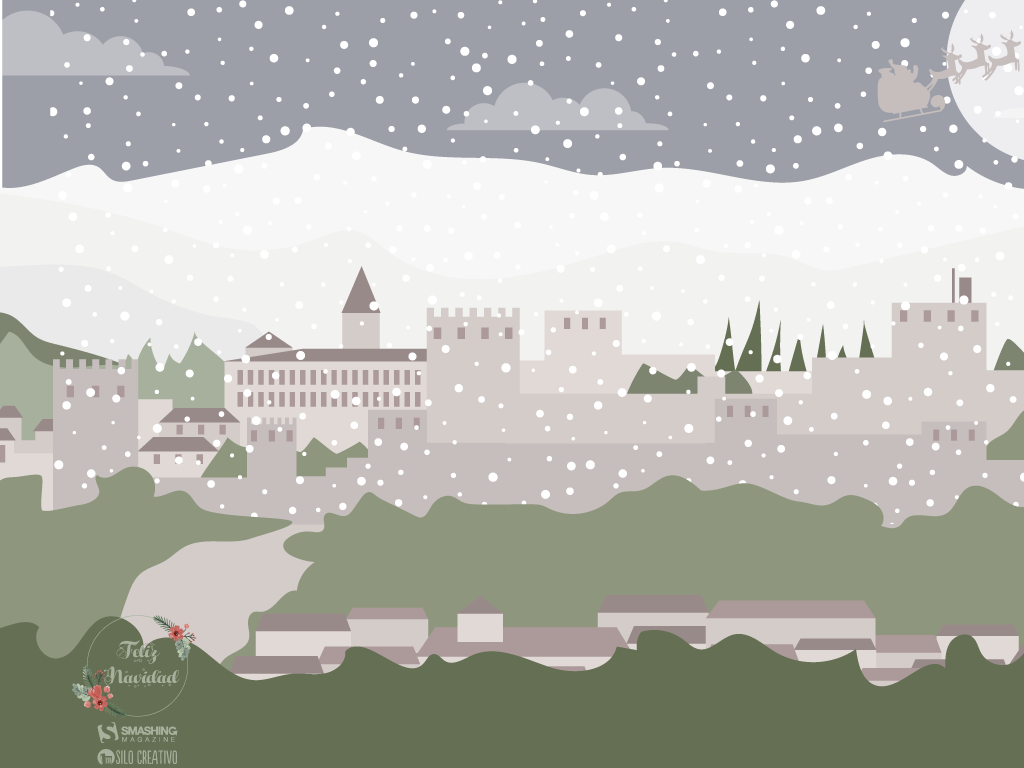
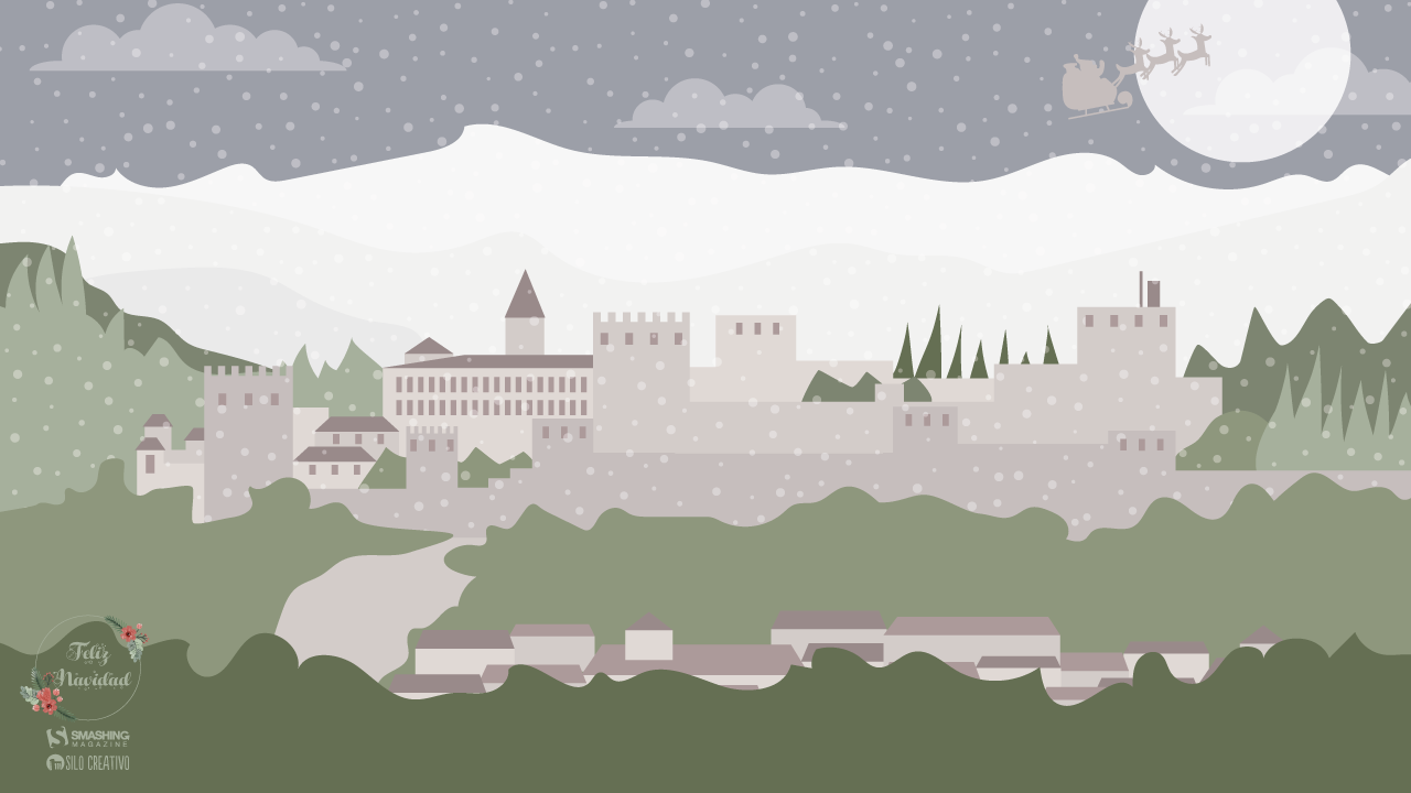
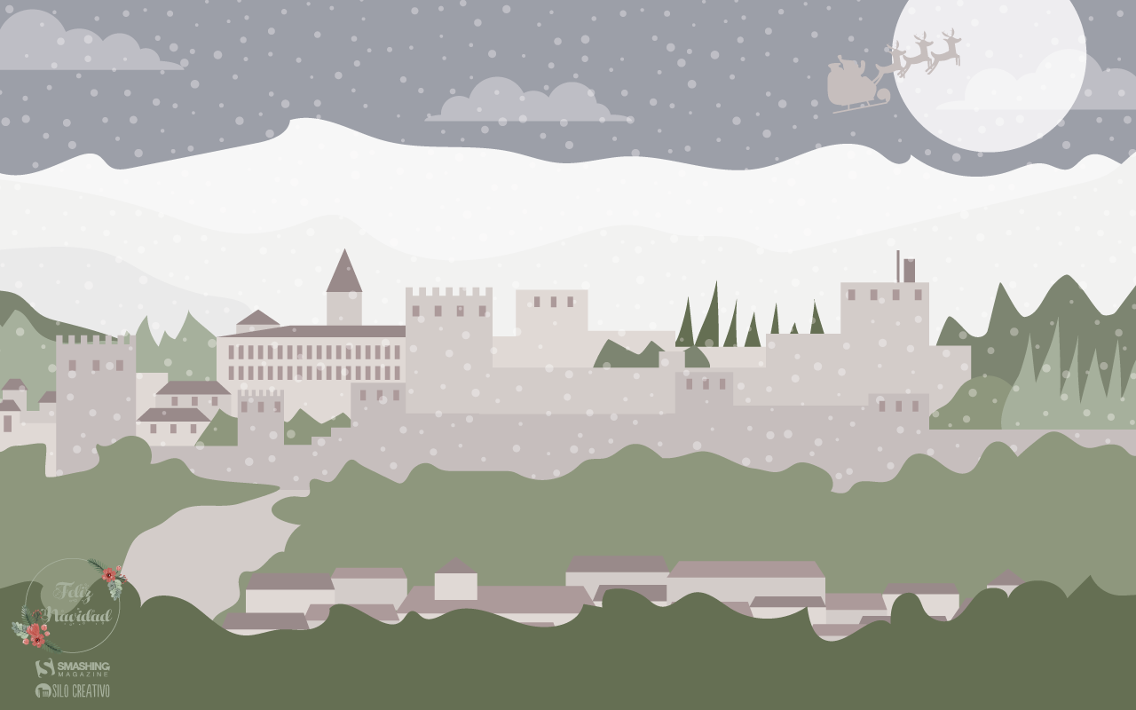
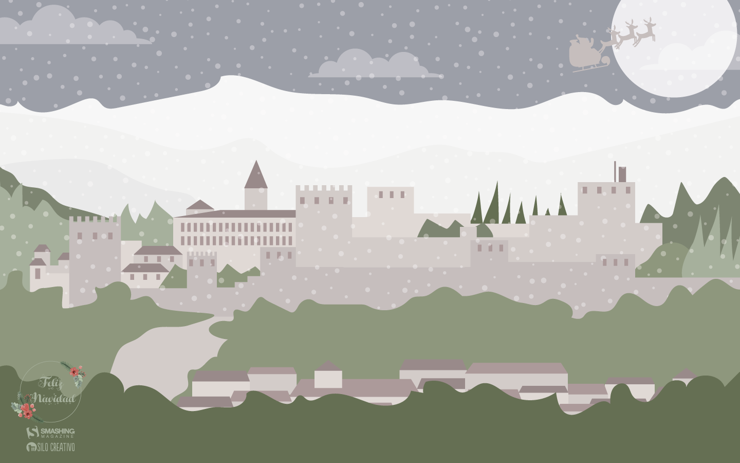
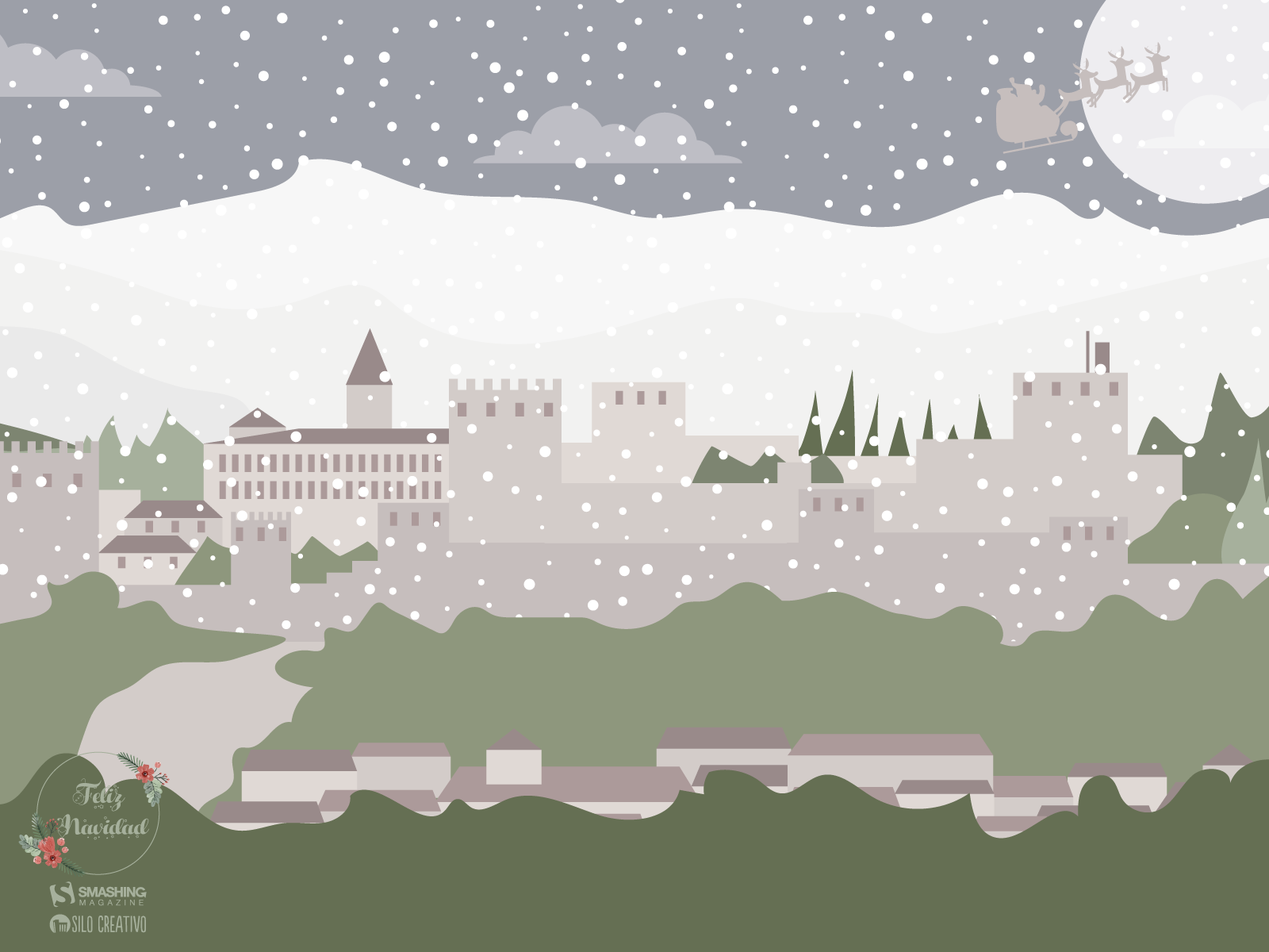
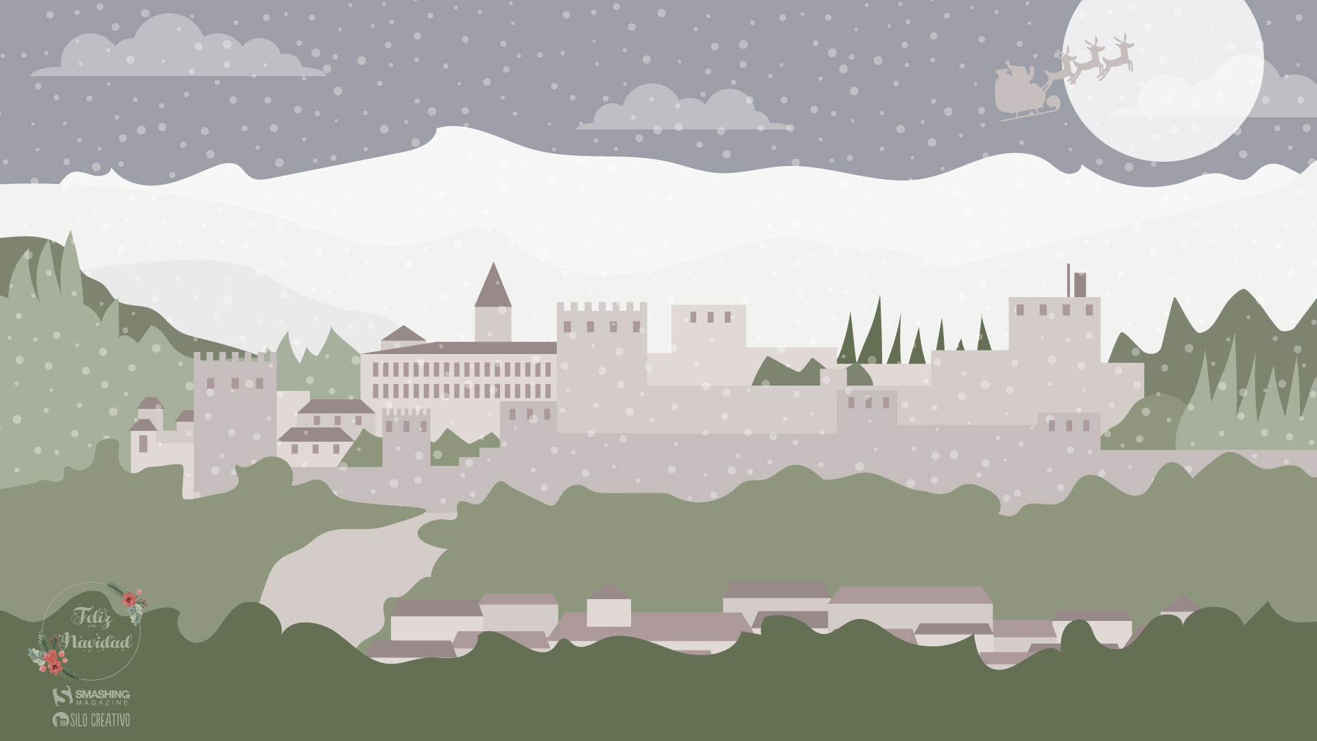
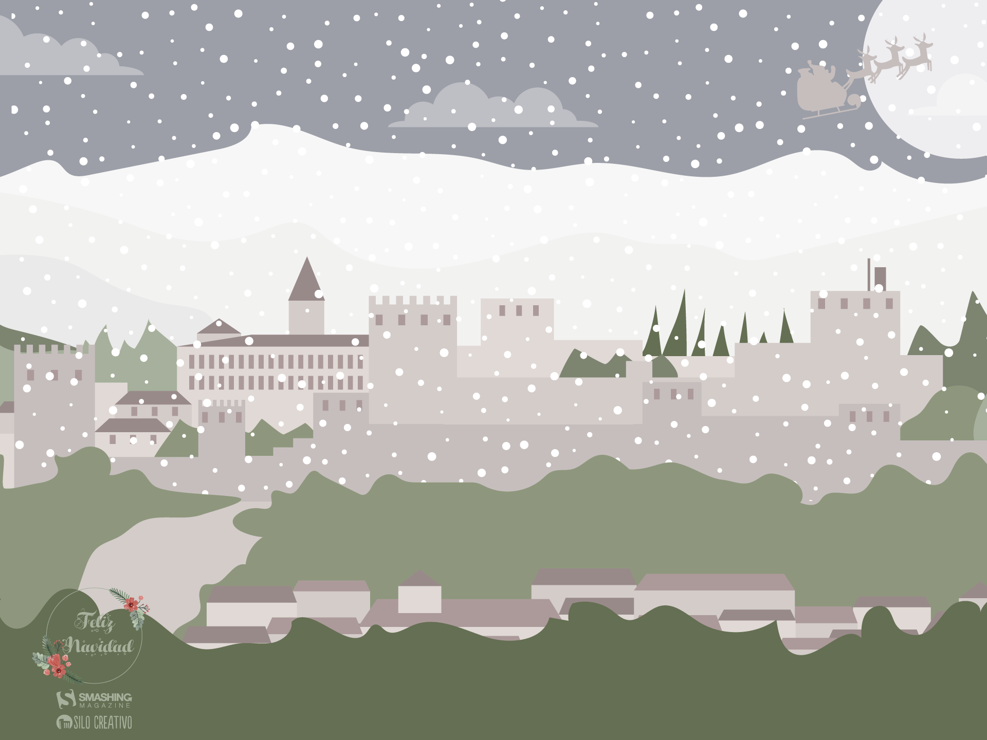
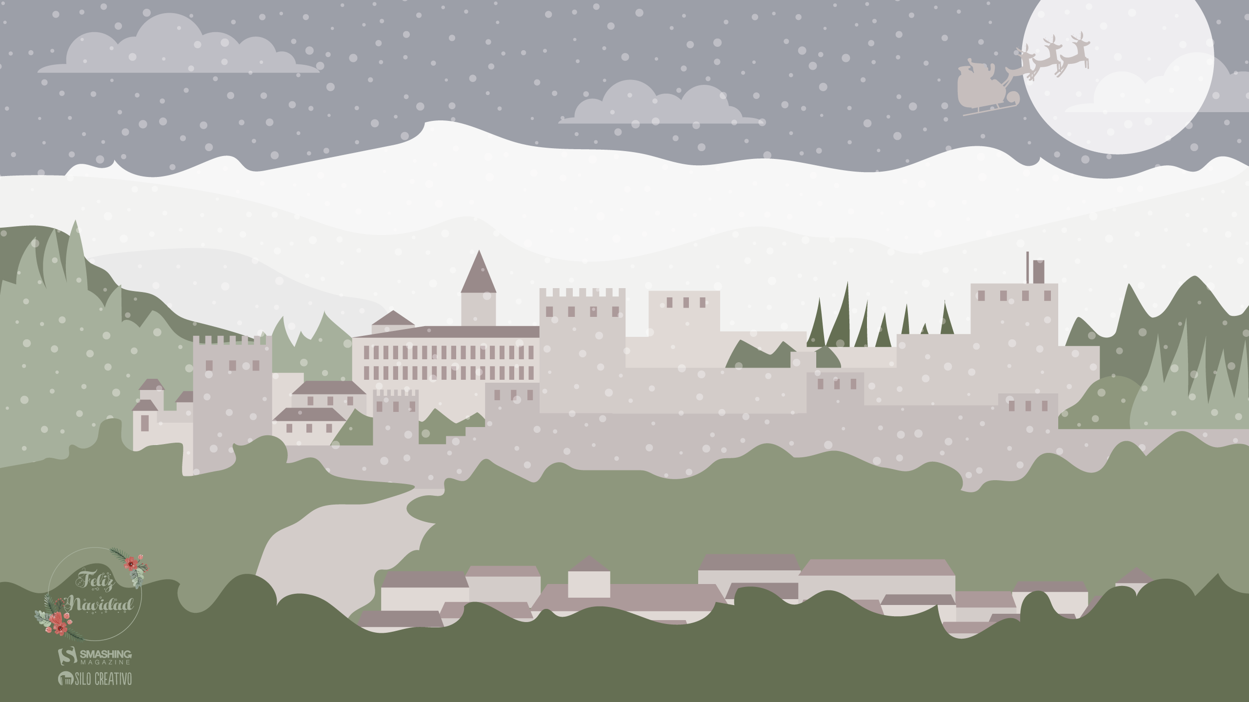
Views Of The Alhambra
This last month of the year, we wanted to put the focus on one of the most visited buildings in the world whose beauty is unmatched: the Alhambra in Granada. Together, from the Albaicín we will see this beauty and tour its gardens and rooms. We wish you a very merry Christmas and all the best for the coming year! — Designed by Veronica Valenzuela Jimenez from Spain.

- preview
- with calendar: 640×480, 800×480, 1024×768, 1280×720, 1280×800, 1440×900, 1600×1200, 1920×1080, 1920×1440, 2560×1440
- without calendar: 640×480, 800×480, 1024×768, 1280×720, 1280×800, 1440×900, 1600×1200, 1920×1080, 1920×1440, 2560×1440
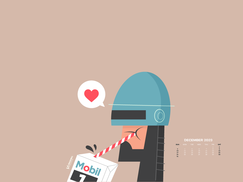
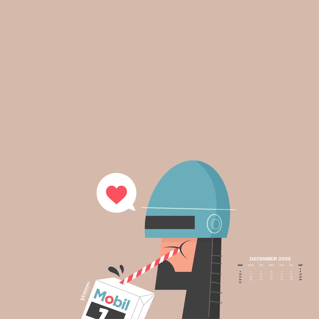
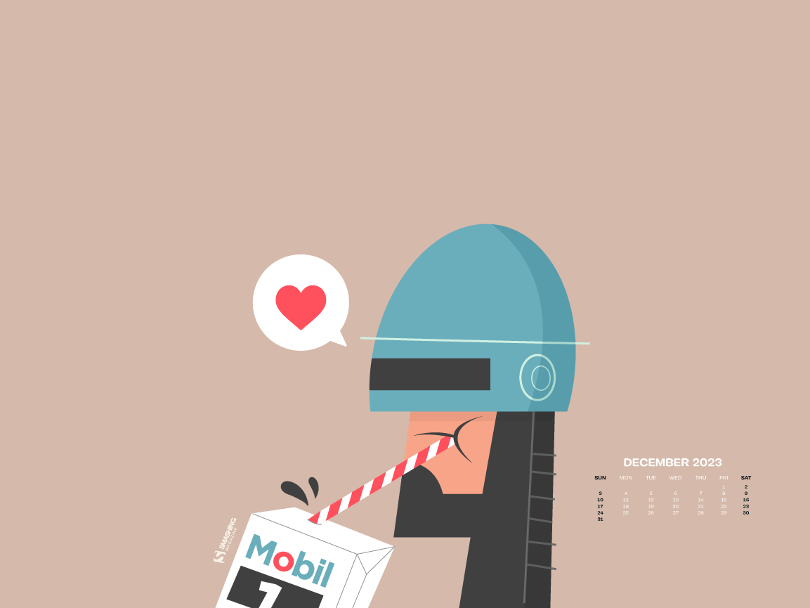
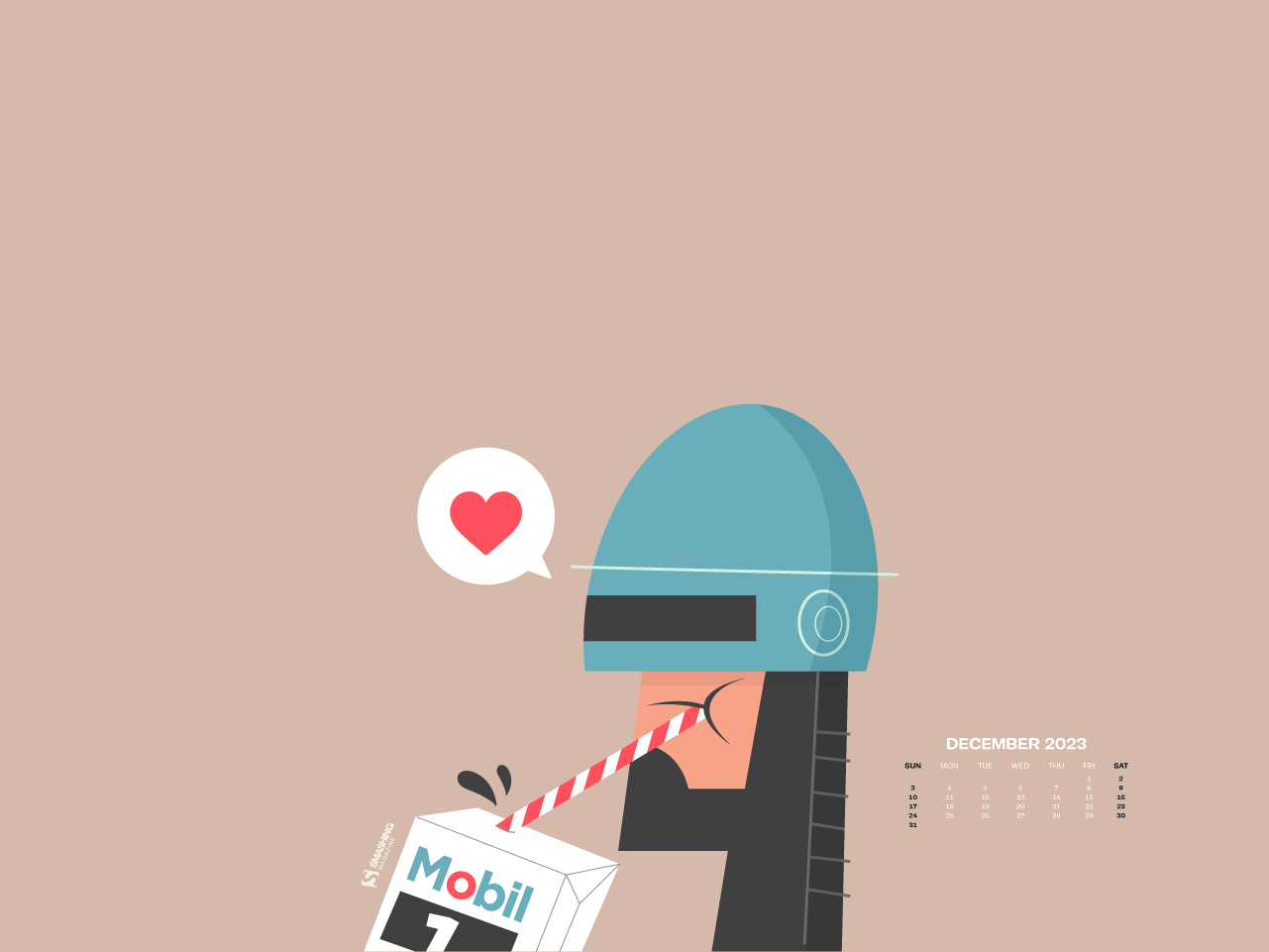
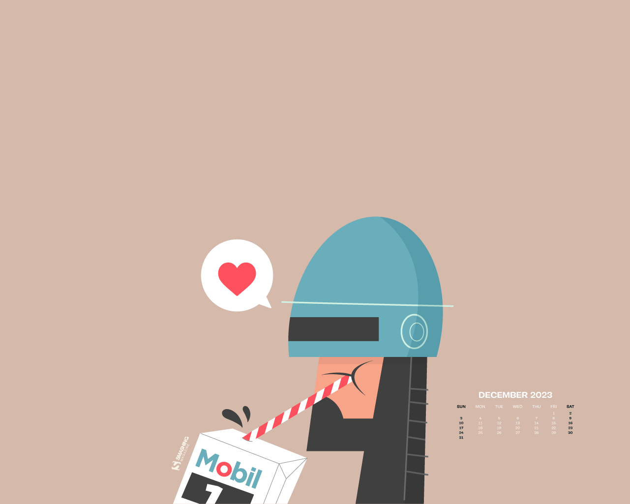
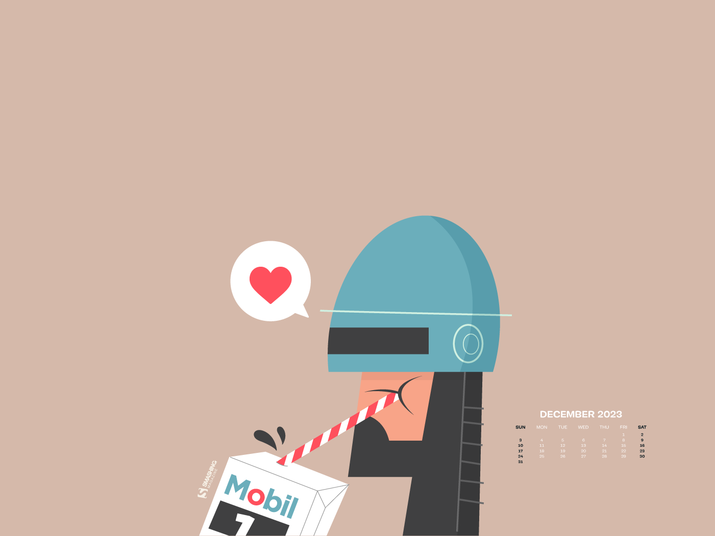
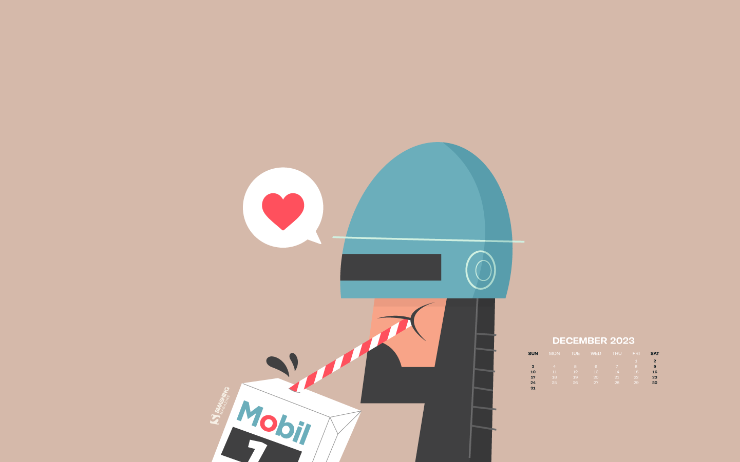
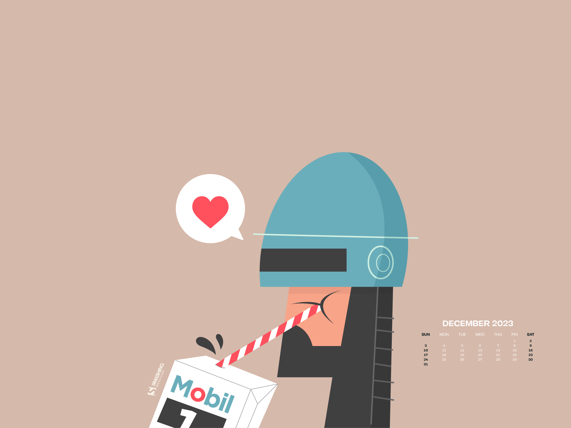
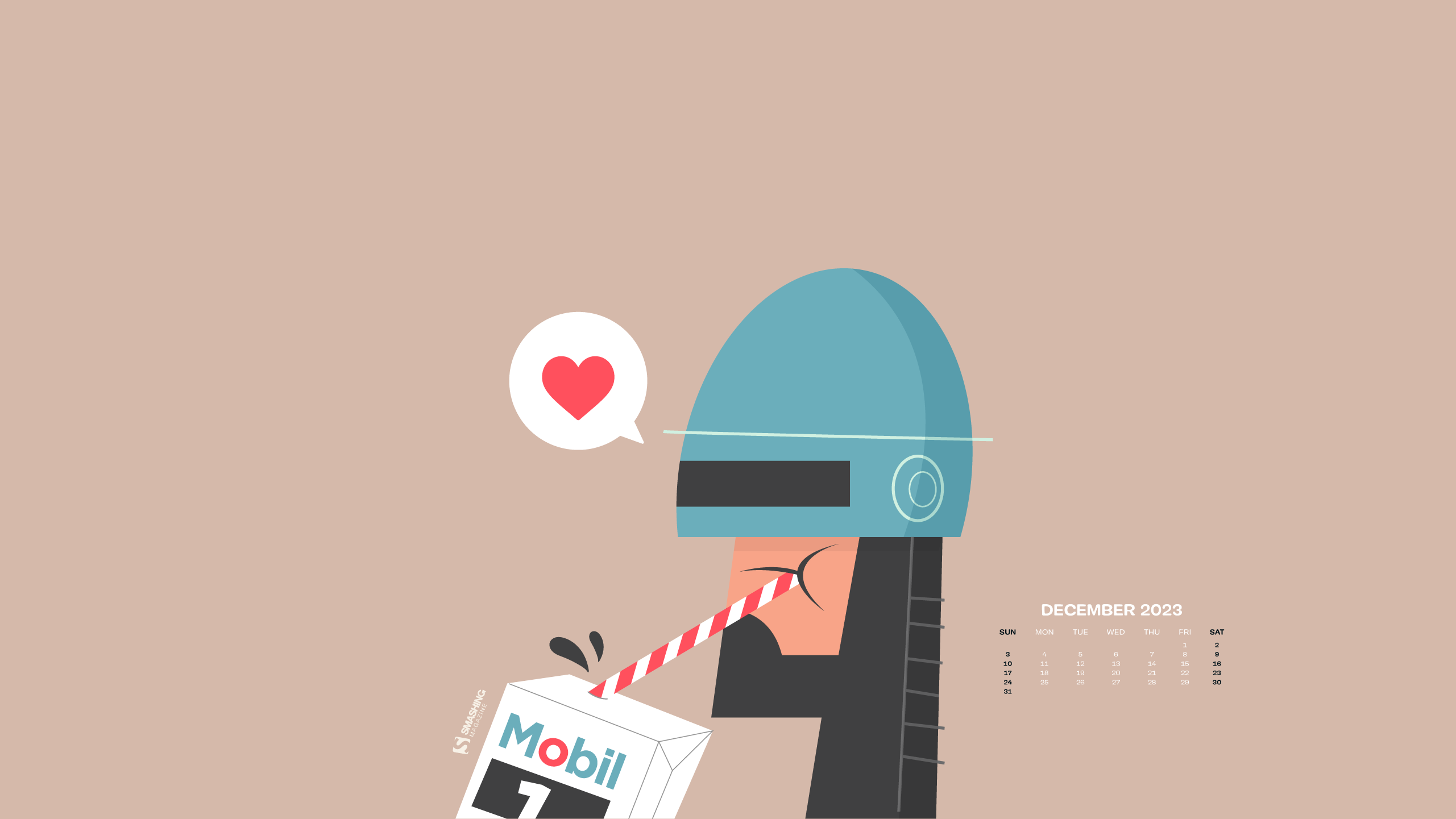
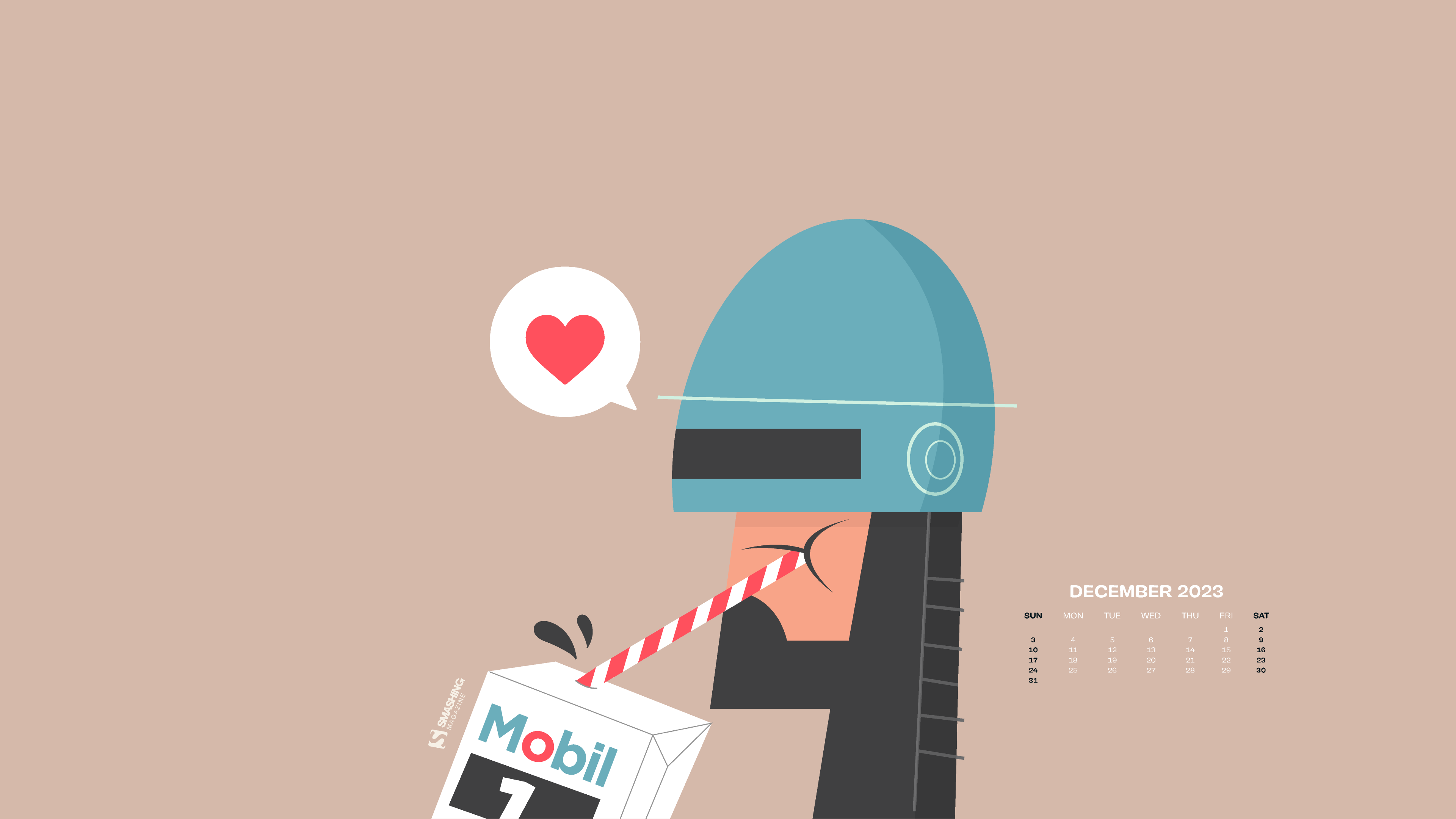
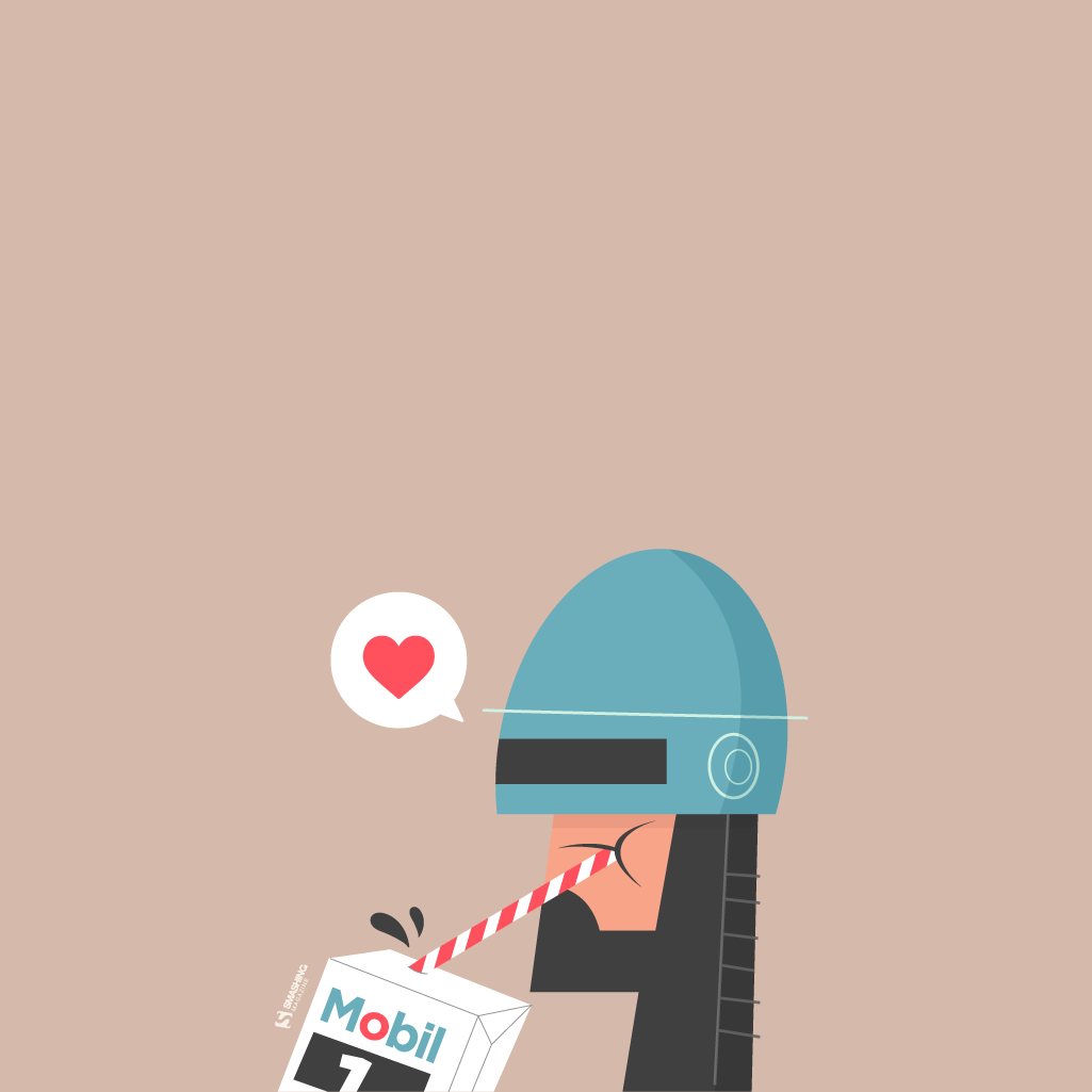
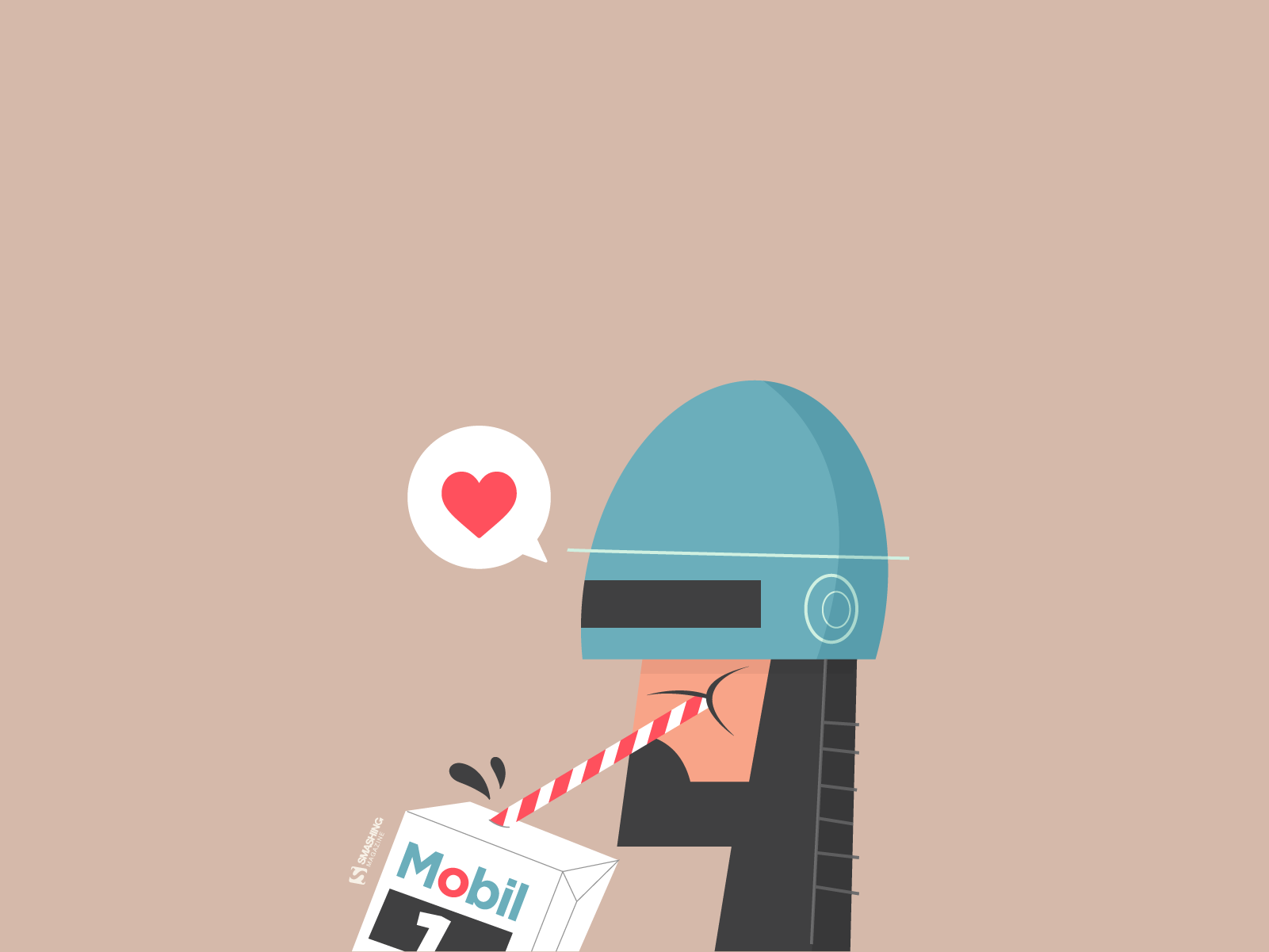
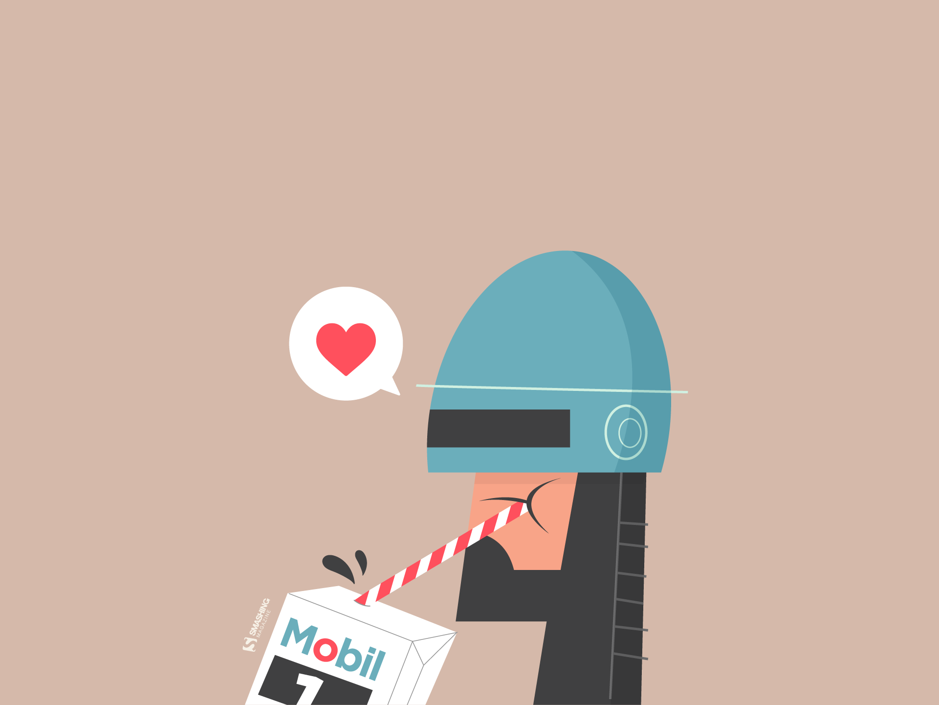
Energy Drink
Designed by Ricardo Gimenes from Sweden.

- preview
- with calendar: 640×480, 800×480, 800×600, 1024×768, 1024×1024, 1152×864, 1280×720, 1280×800, 1280×960, 1280×1024, 1366×768, 1400×1050, 1440×900, 1600×1200, 1680×1050, 1680×1200, 1920×1080, 1920×1200, 1920×1440, 2560×1440, 3840×2160
- without calendar: 640×480, 800×480, 800×600, 1024×768, 1024×1024, 1152×864, 1280×720, 1280×800, 1280×960, 1280×1024, 1366×768, 1400×1050, 1440×900, 1600×1200, 1680×1050, 1680×1200, 1920×1080, 1920×1200, 1920×1440, 2560×1440, 3840×2160
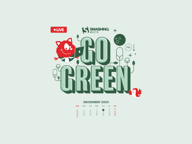
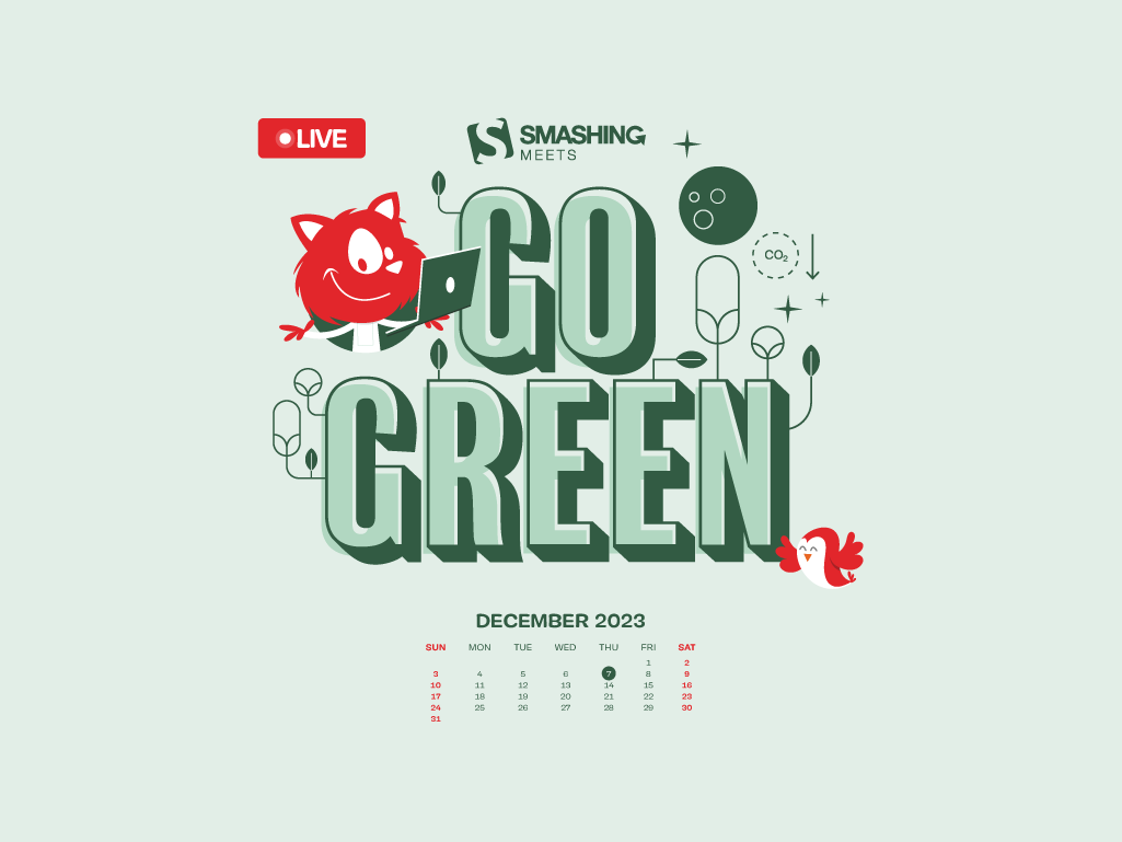
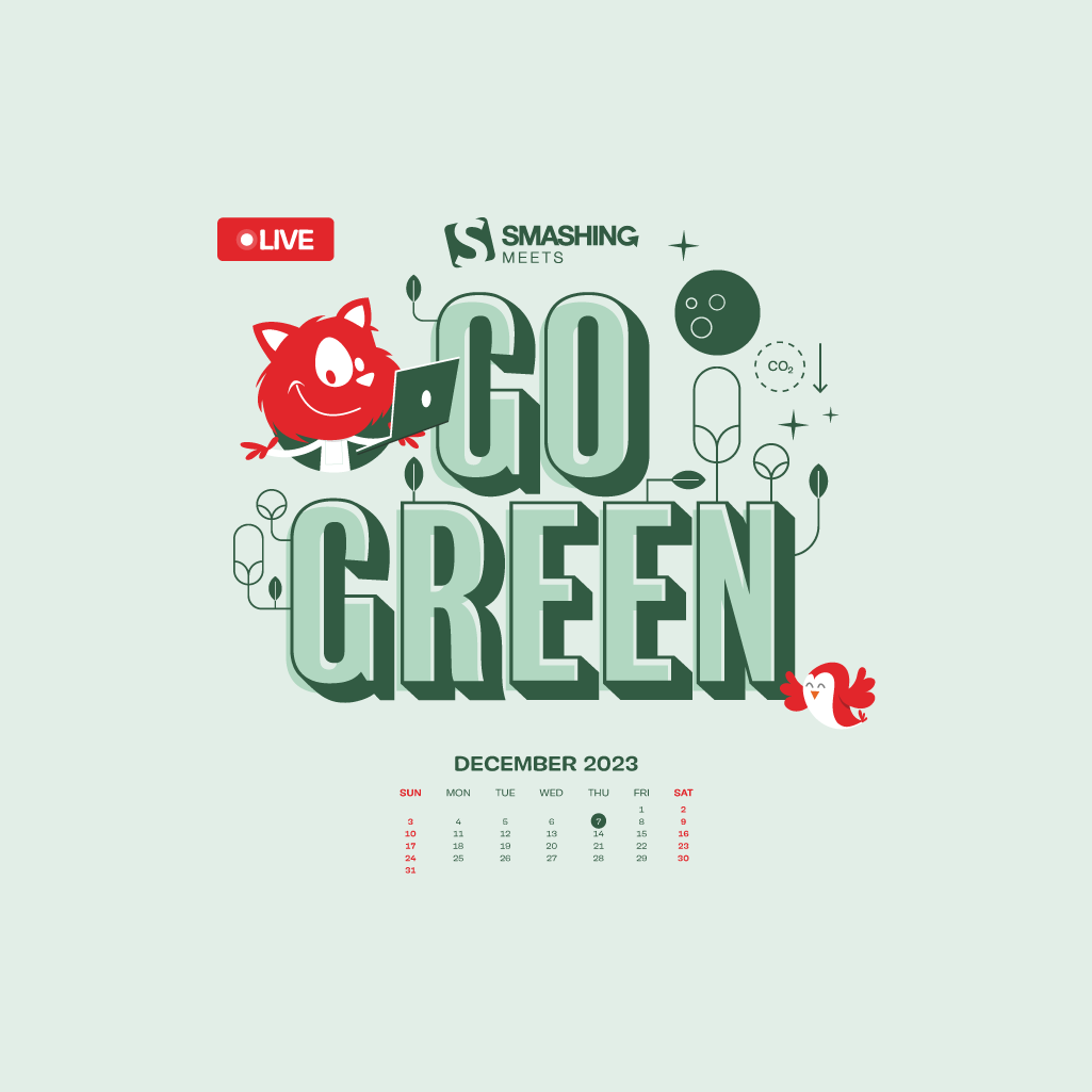
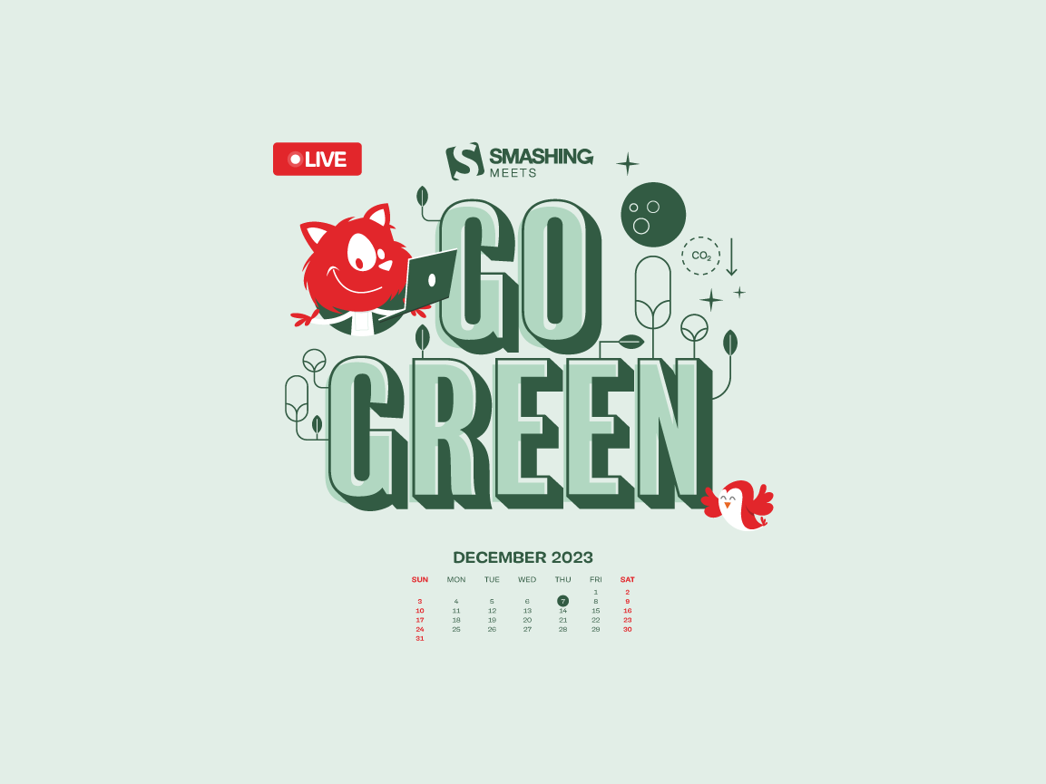
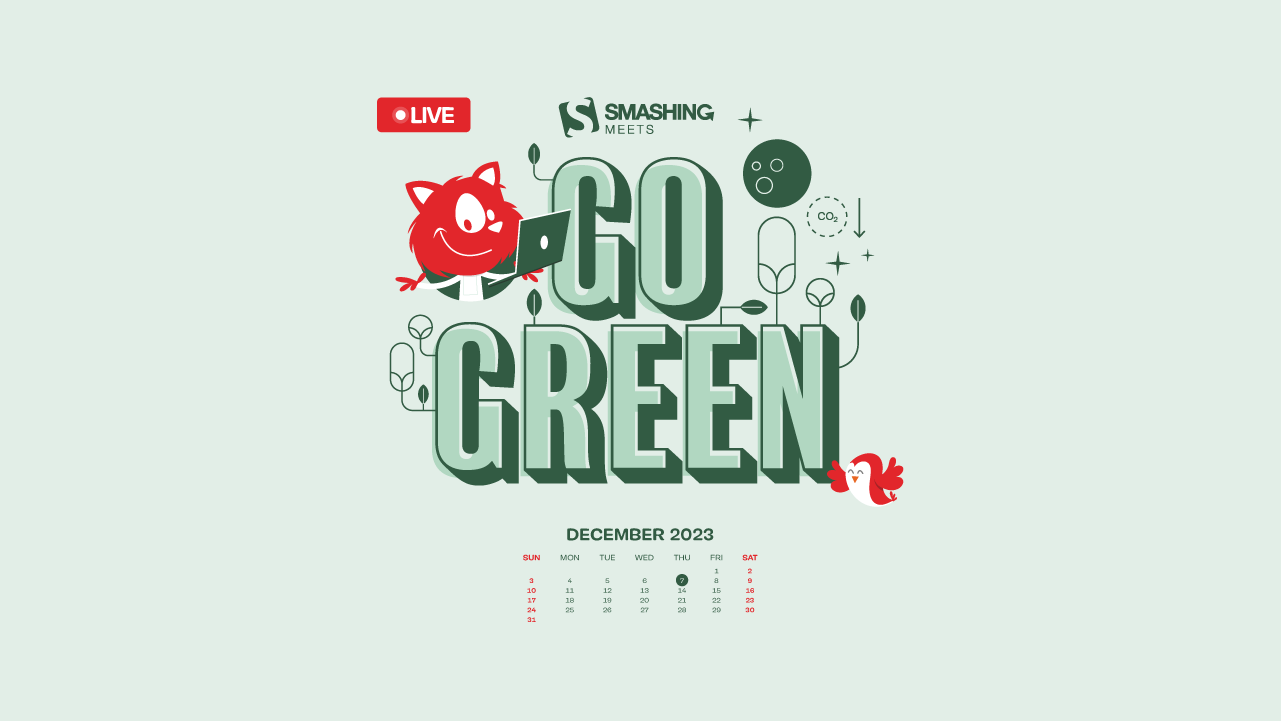
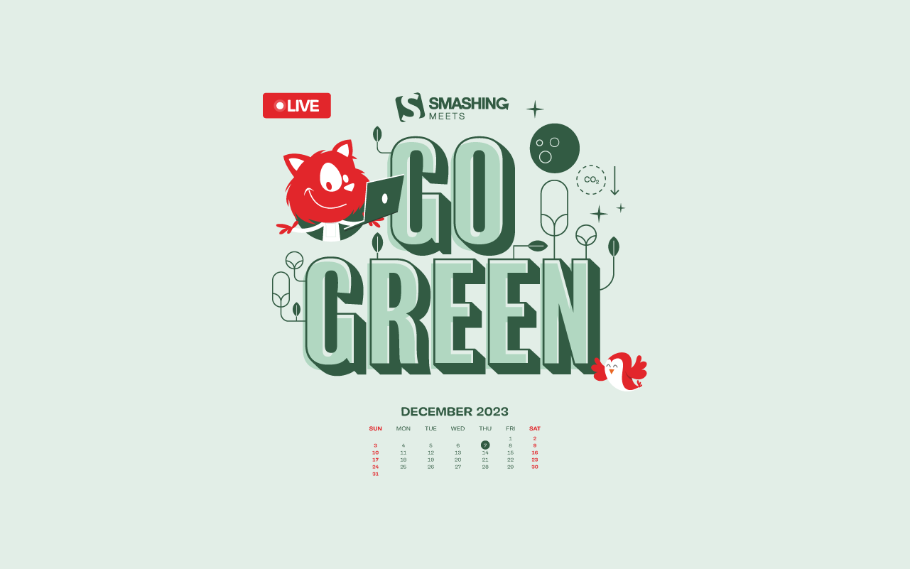
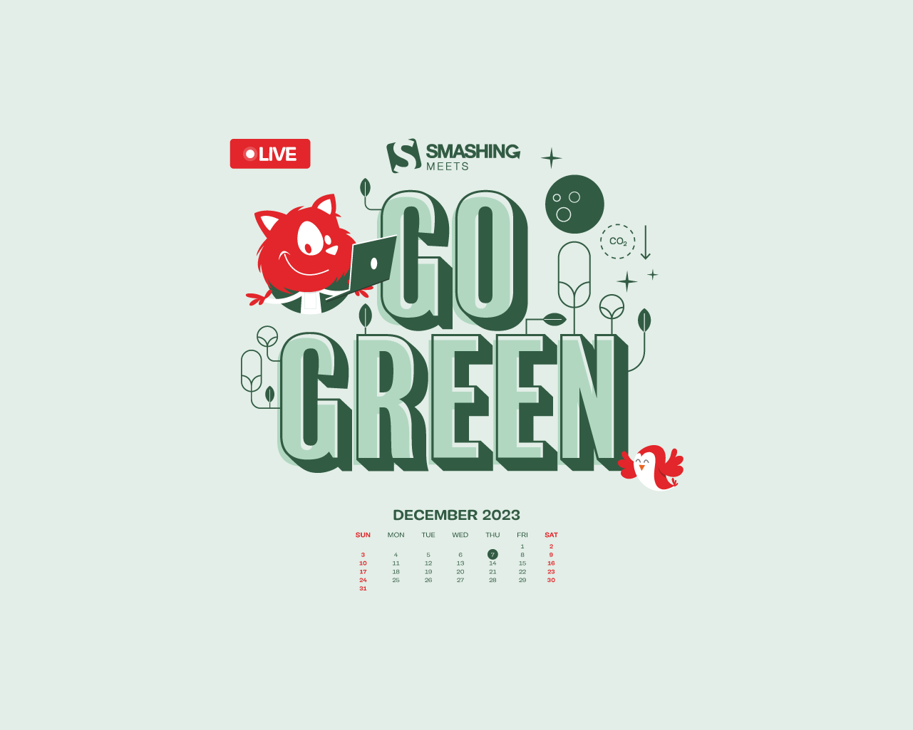
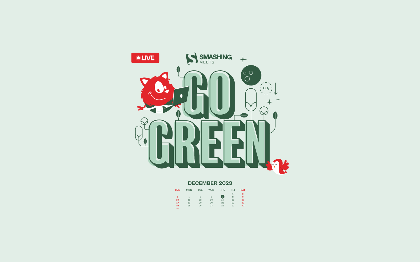
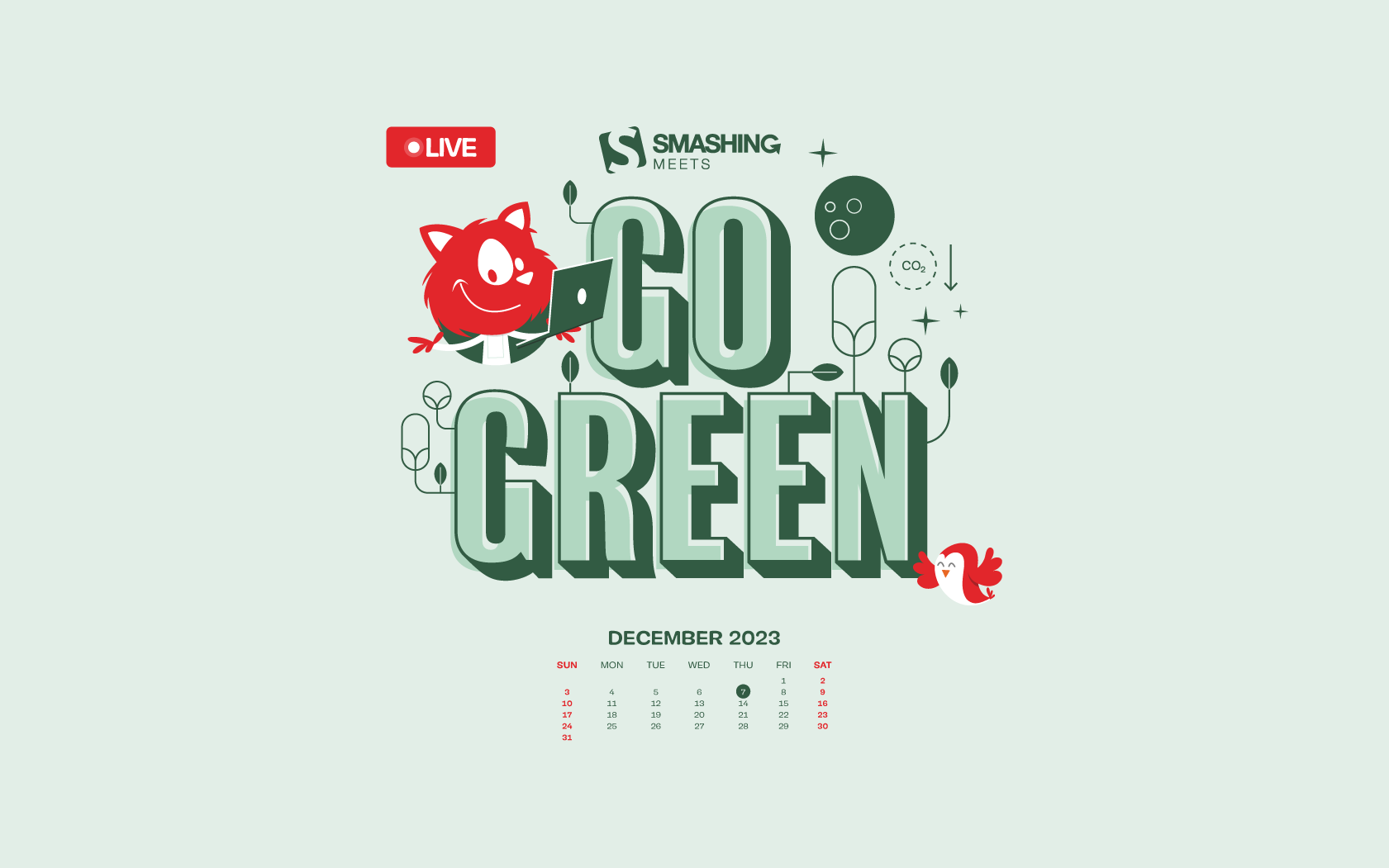
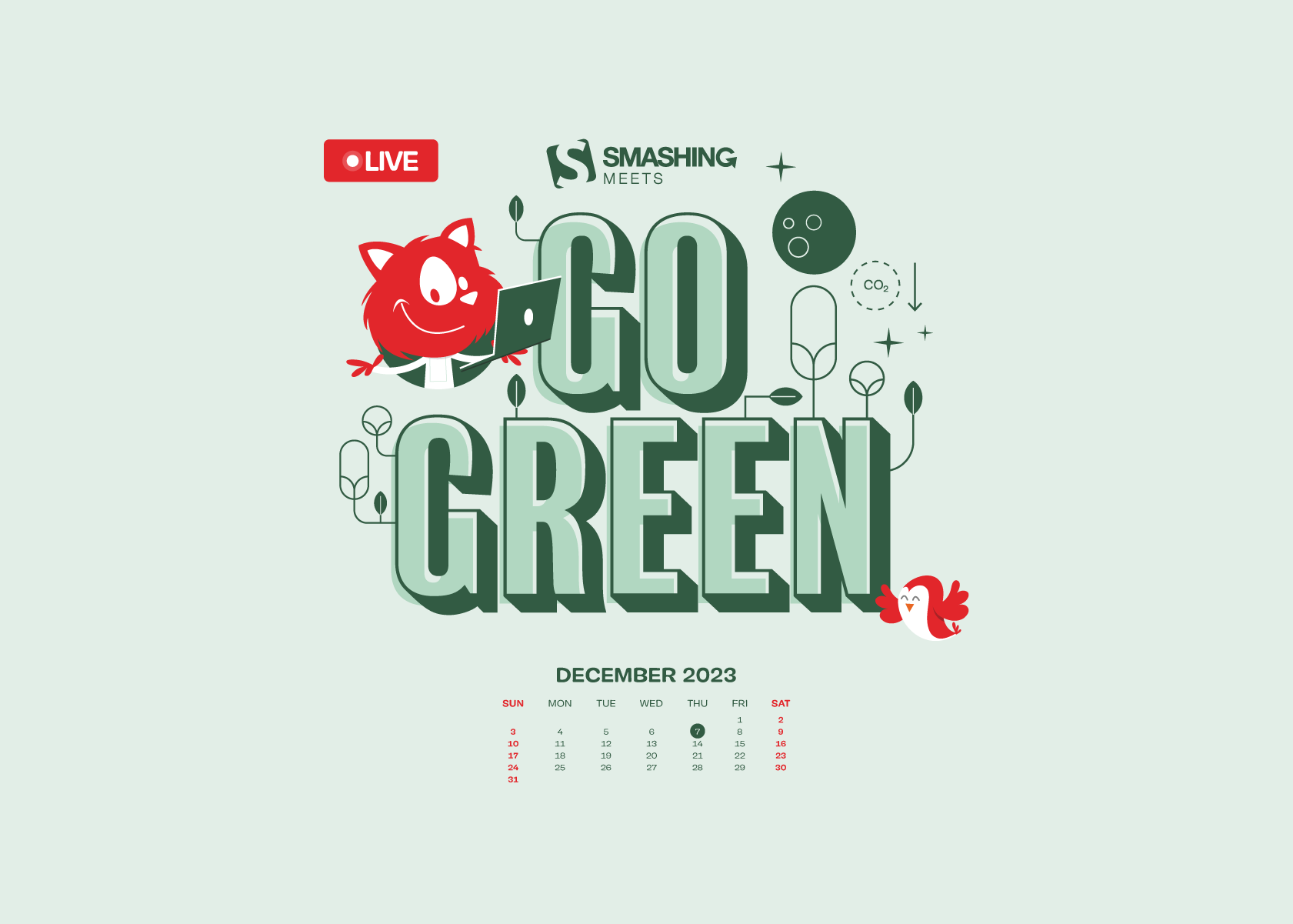
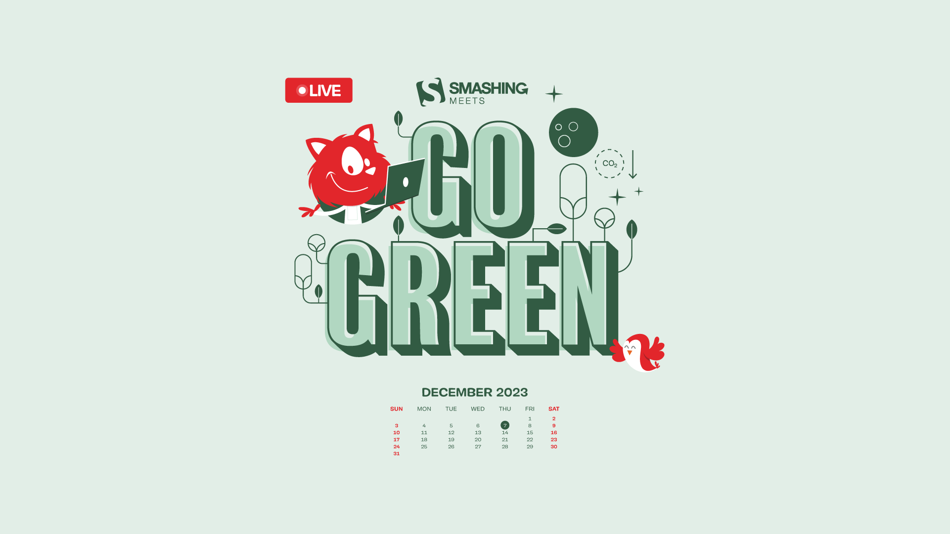
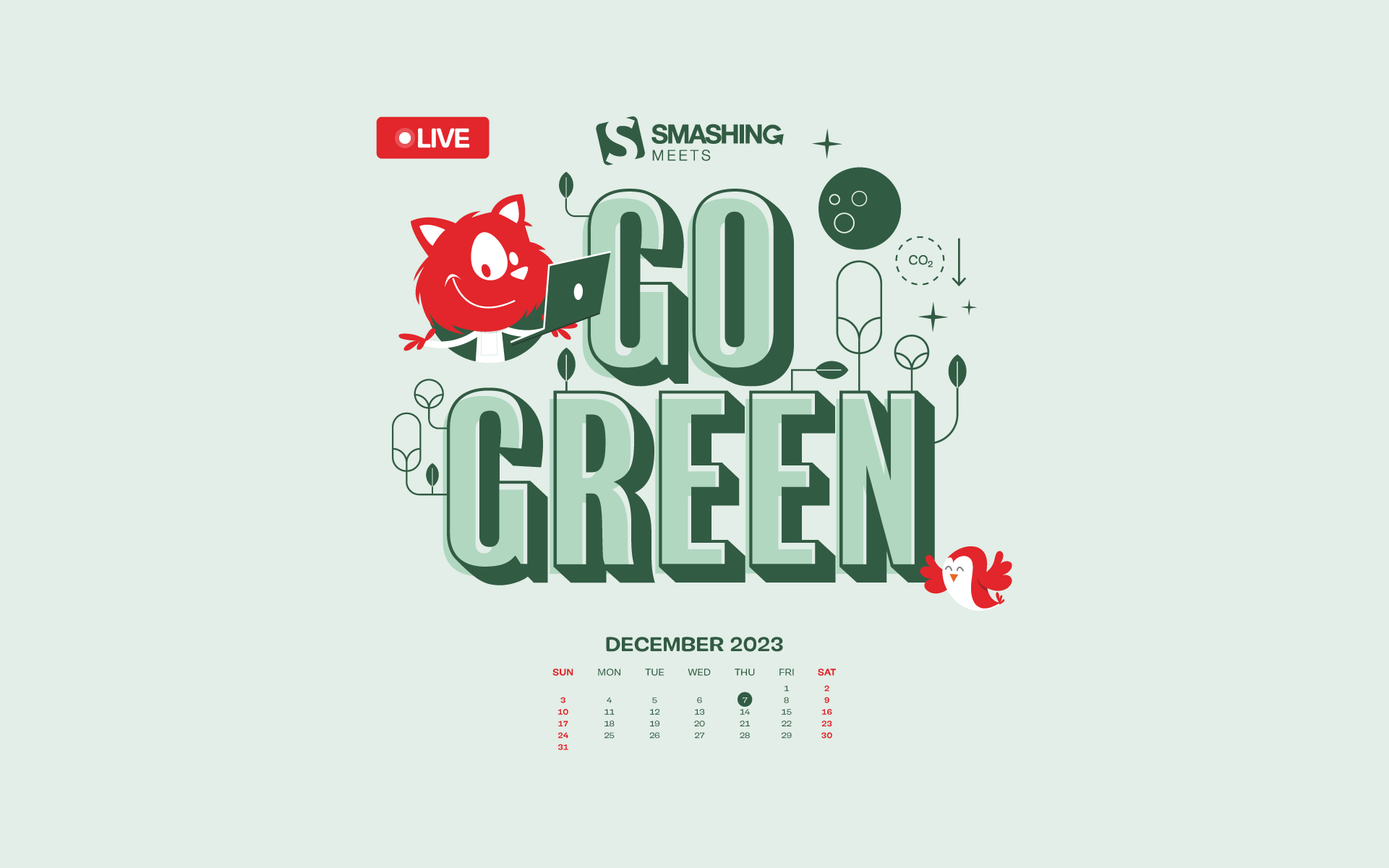
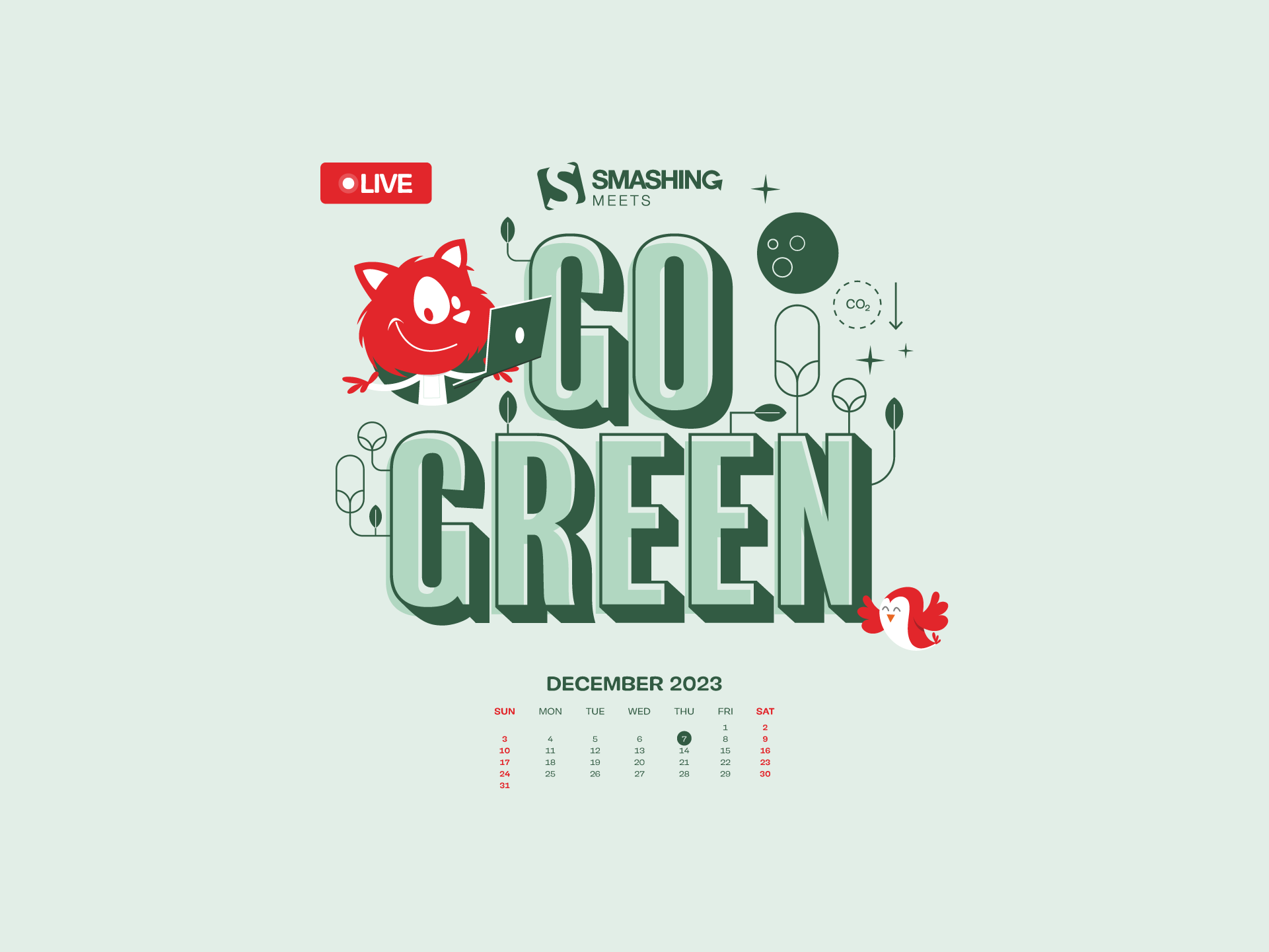
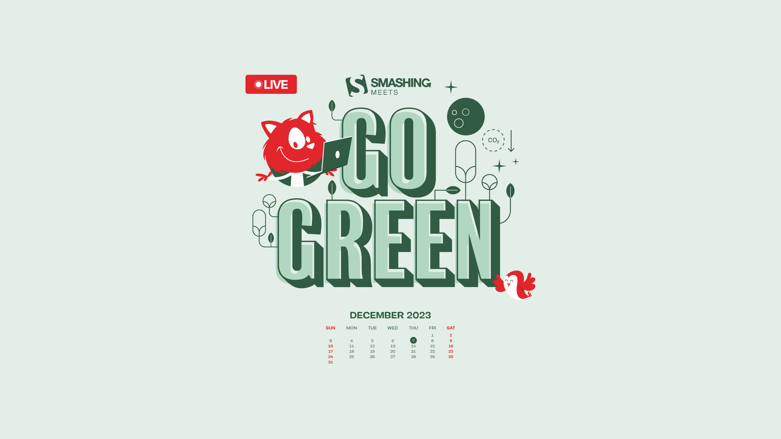
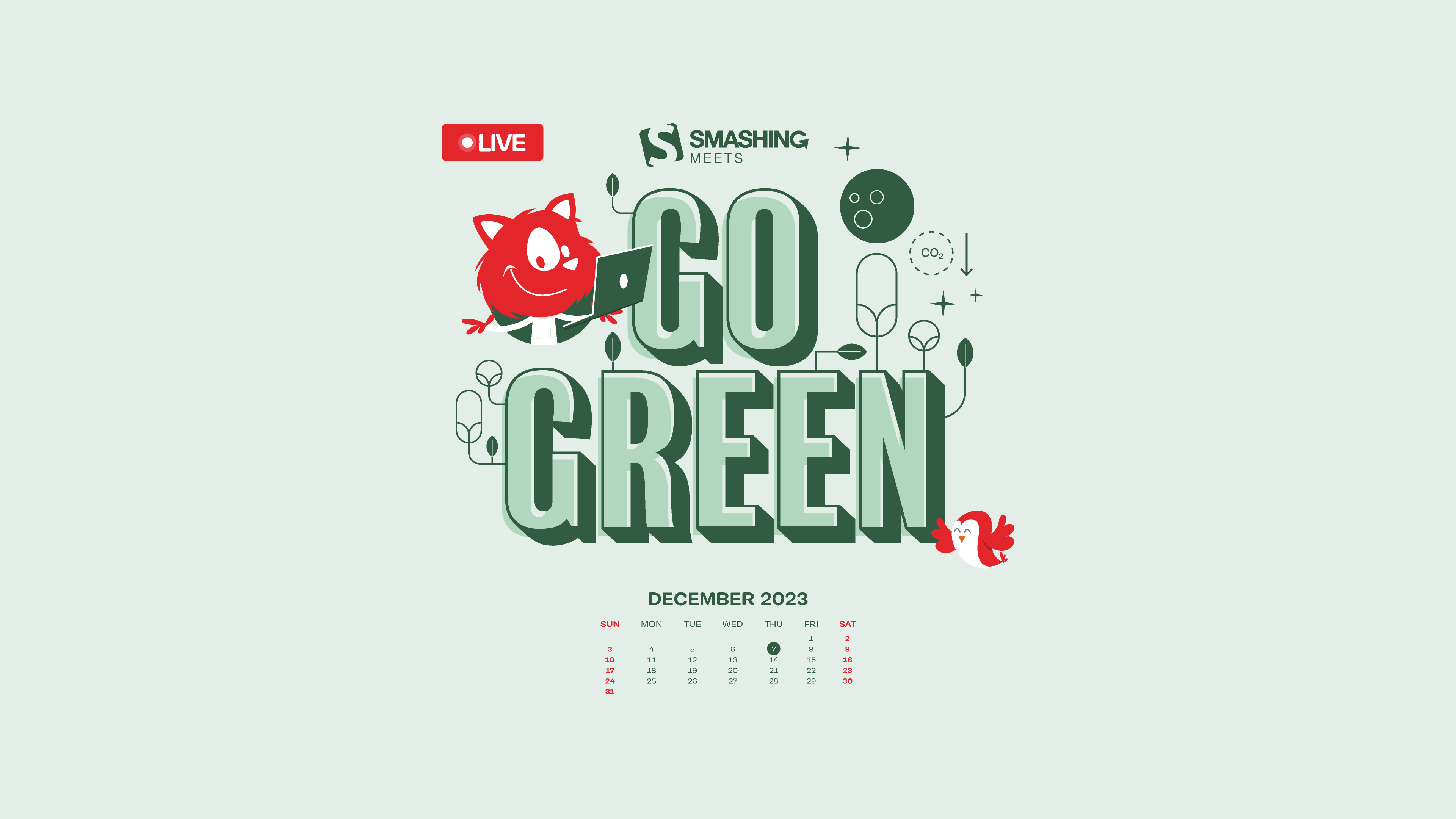
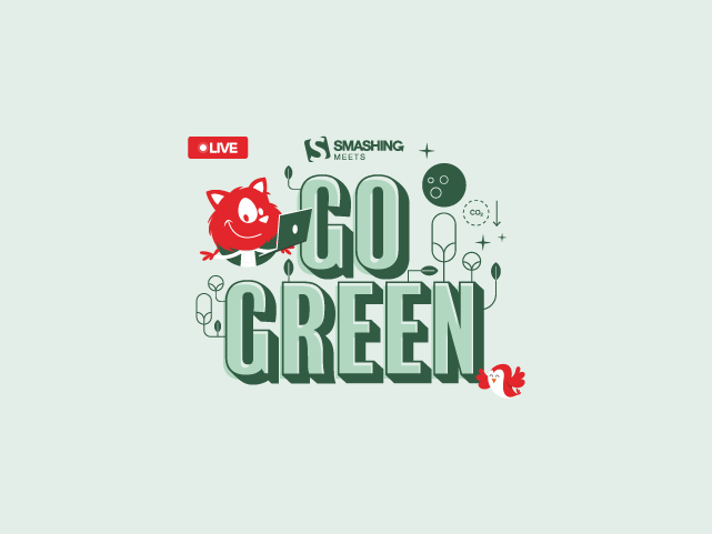
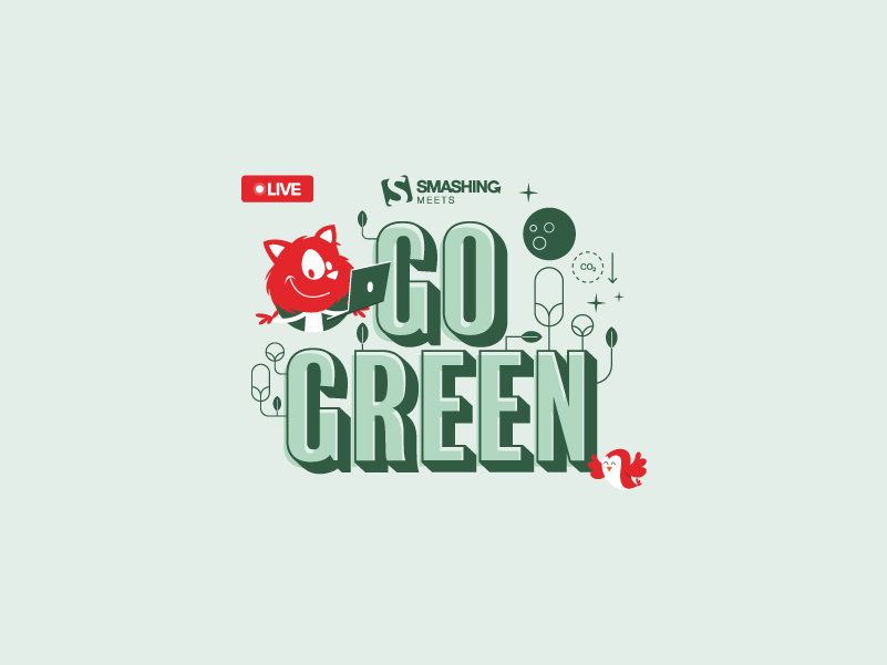
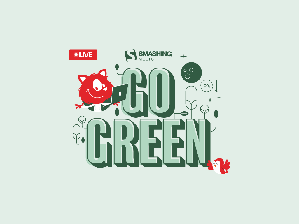
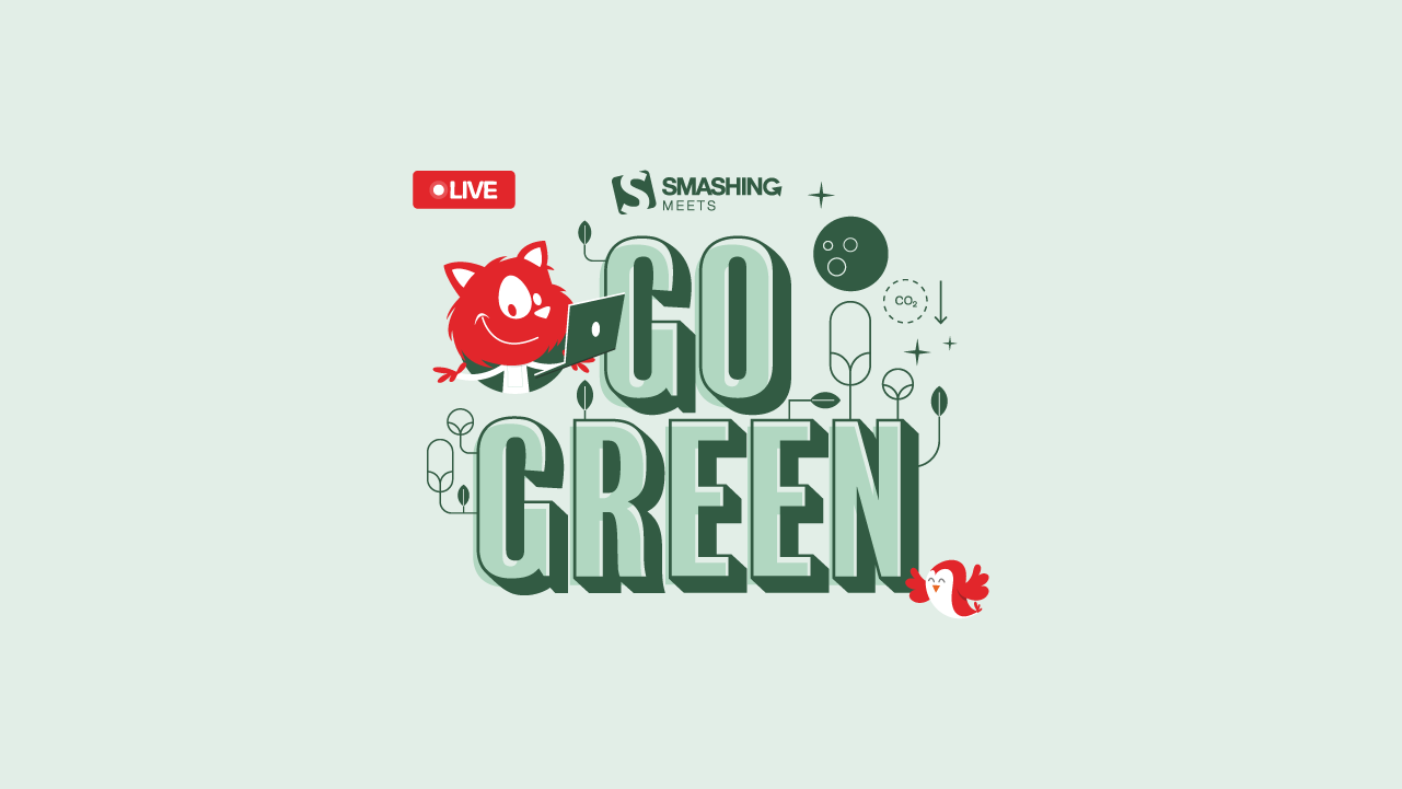
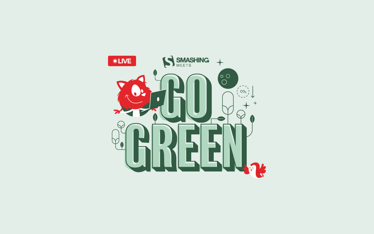
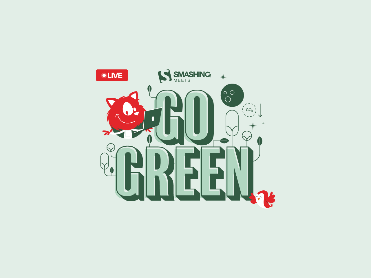
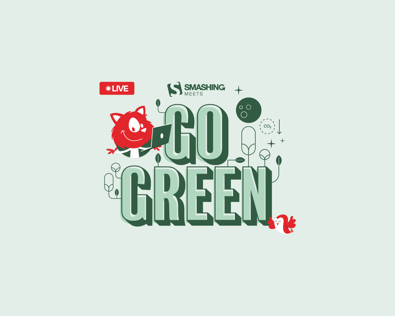
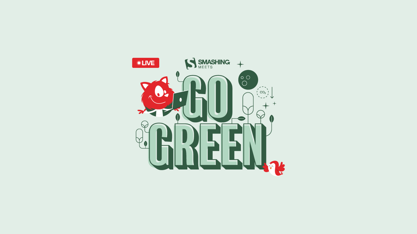
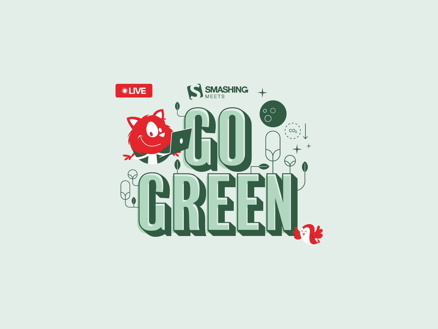
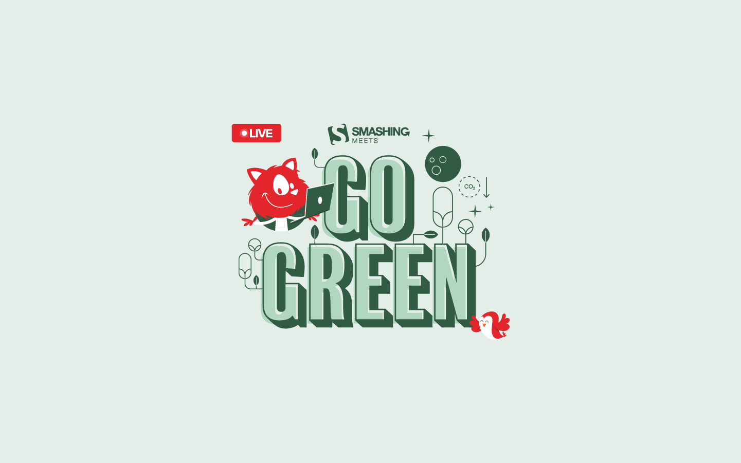
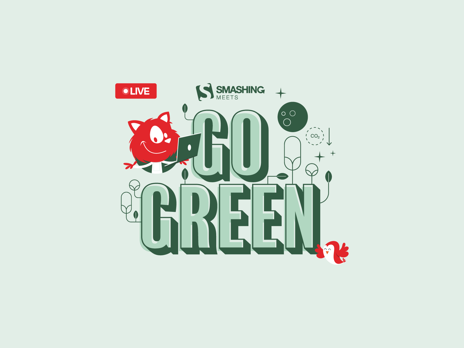
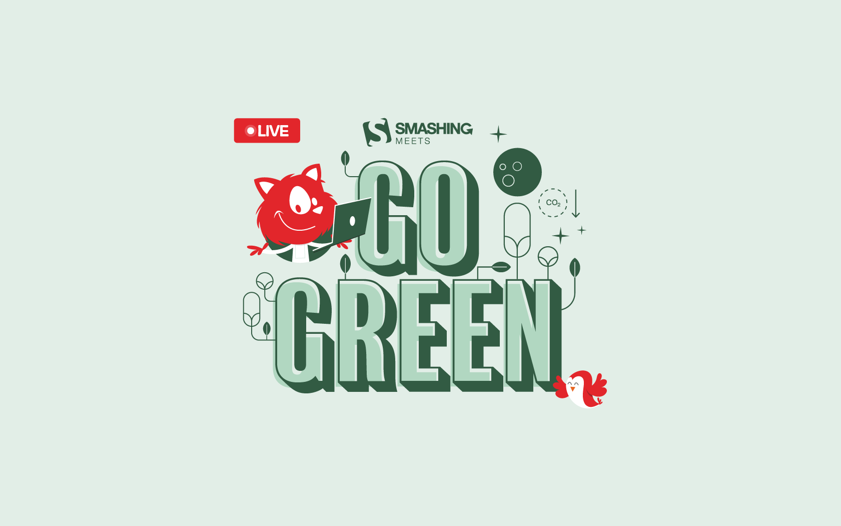
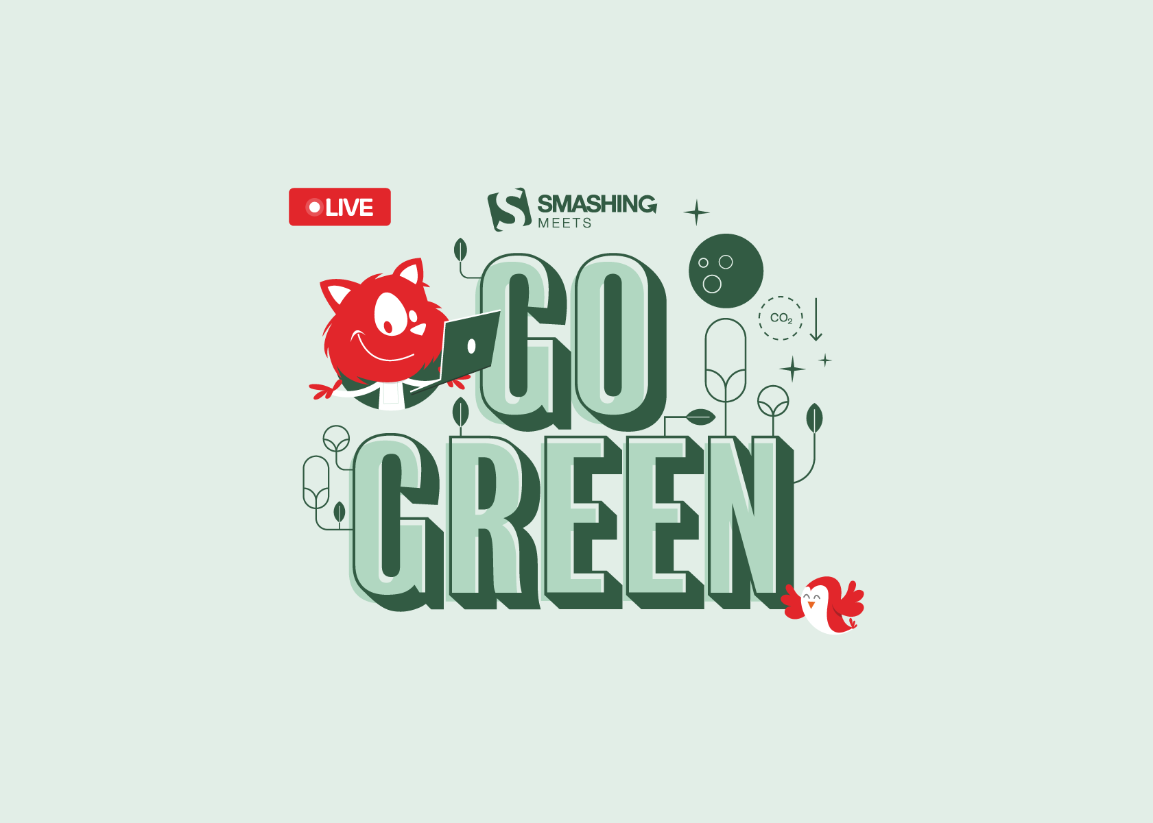
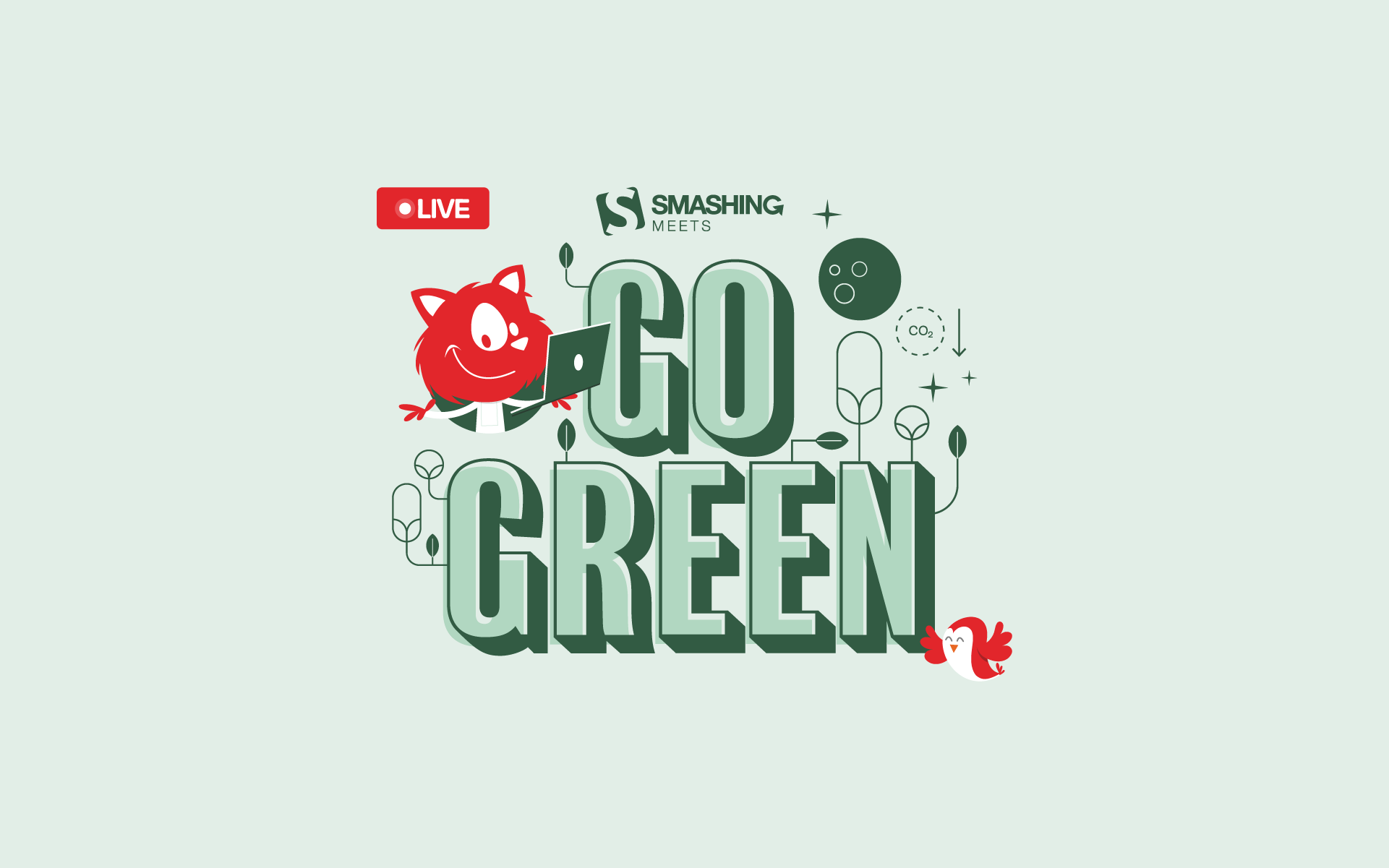
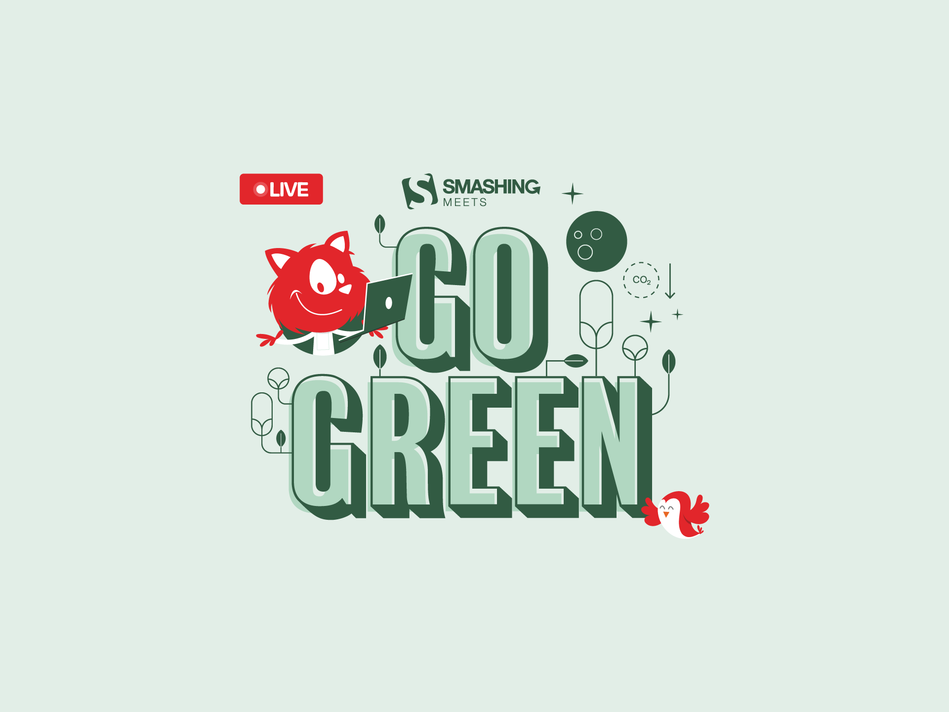
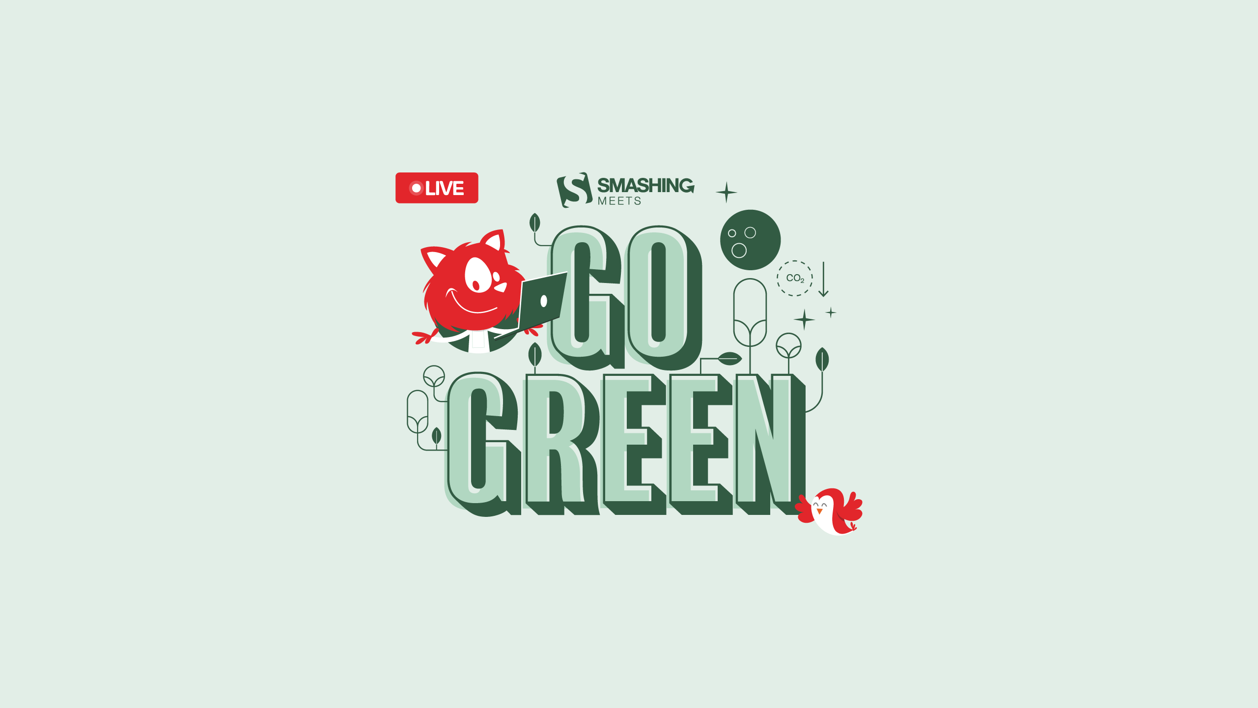
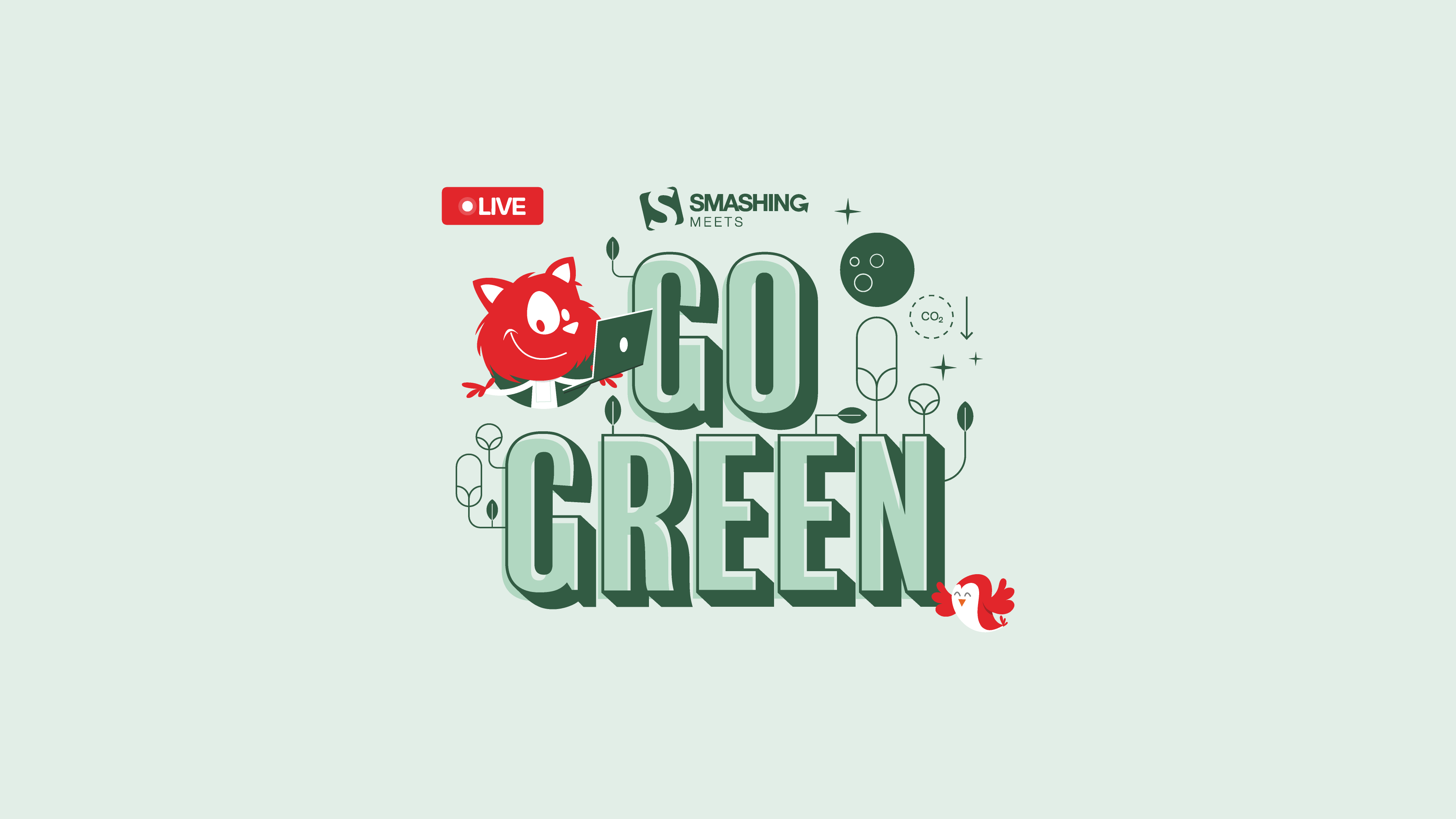
Go Green
We’d love to invite you to our free Smashing Meets Goes Green on Thursday, December 7, to explore how we as designers and developers can make our world just a bit greener. — Designed by Ricardo Gimenes from Sweden.

- preview
- with calendar: 640×480, 800×480, 800×600, 1024×768, 1024×1024, 1152×864, 1280×720, 1280×800, 1280×960, 1280×1024, 1366×768, 1400×1050, 1440×900, 1600×1200, 1680×1050, 1680×1200, 1920×1080, 1920×1200, 1920×1440, 2560×1440, 3840×2160
- without calendar: 640×480, 800×480, 800×600, 1024×768, 1024×1024, 1152×864, 1280×720, 1280×800, 1280×960, 1280×1024, 1366×768, 1400×1050, 1440×900, 1600×1200, 1680×1050, 1680×1200, 1920×1080, 1920×1200, 1920×1440, 2560×1440, 3840×2160
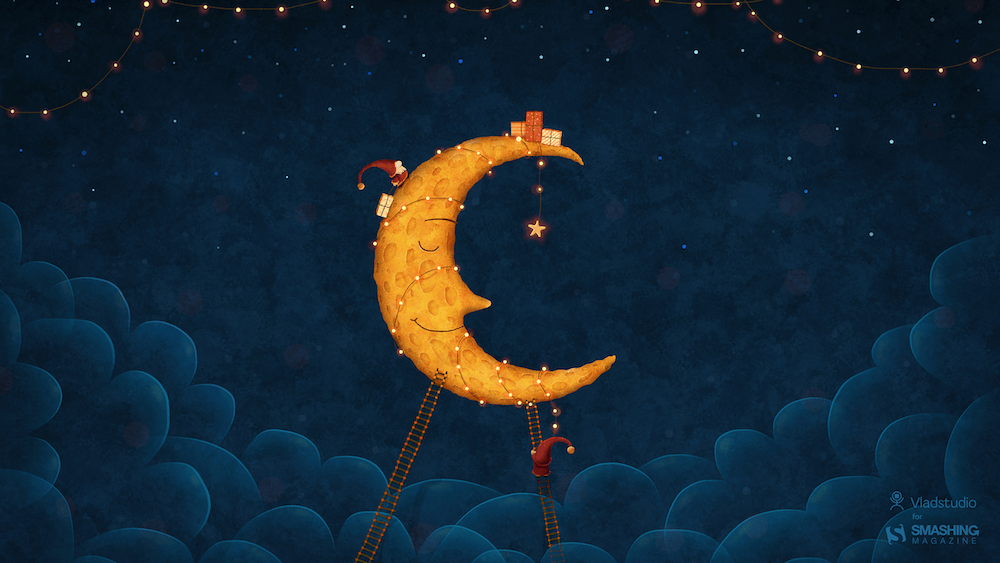
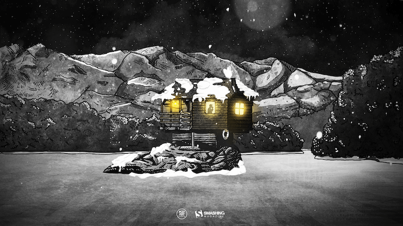
Dear Moon, Merry Christmas
Designed by Vlad Gerasimov from Georgia.
- preview
- without calendar: 800×480, 800×600, 1024×600, 1024×768, 1152×864, 1280×720, 1280×800, 1280×960, 1280×1024, 1366×768, 1400×1050, 1440×900, 1440×960, 1600×900, 1600×1200, 1680×1050, 1680×1200, 1920×1080, 1920×1200, 1920×1440, 2560×1440, 2560×1600, 2880×1800, 3072×1920, 3840×2160, 5120×2880
The House On The River Drina
“Since we often yearn for a peaceful and quiet place to work, we have found inspiration in the famous house on the River Drina in Bajina Bašta, Serbia. Wouldn’t it be great being in nature, away from the civilization, swaying in the wind and listening to the waves of the river smashing your house, having no neighbors to bother you? Not sure about the Internet, though…” — Designed by PopArt Studio from Serbia.

- preview
- without calendar: 640×480, 800×600, 1024×1024, 1152×864, 1280×720, 1280×960, 1280×1024, 1366×768, 1400×1050, 1440×900, 1600×1200, 1680×1200, 1920×1080, 1920×1200, 1920×1440, 2560×1440
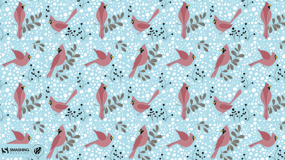
Cardinals In Snowfall
During Christmas season, in the cold, colorless days of winter, Cardinal birds are seen as symbols of faith and warmth. In the part of America I live in, there is snowfall every December. While the snow is falling, I can see gorgeous Cardinals flying in and out of my patio. The intriguing color palette of the bright red of the Cardinals, the white of the flurries and the brown/black of dry twigs and fallen leaves on the snow-laden ground fascinates me a lot, and inspired me to create this quaint and sweet, hand-illustrated surface pattern design as I wait for the snowfall in my town! — Designed by Gyaneshwari Dave from the United States.
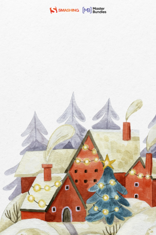
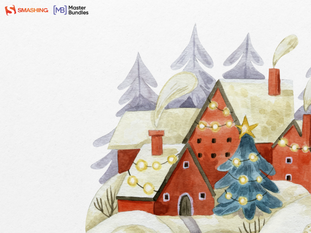
Winter Coziness At Home
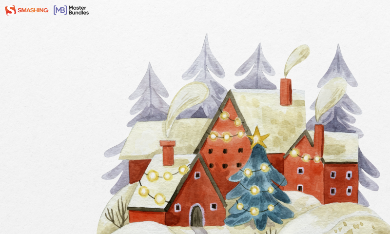
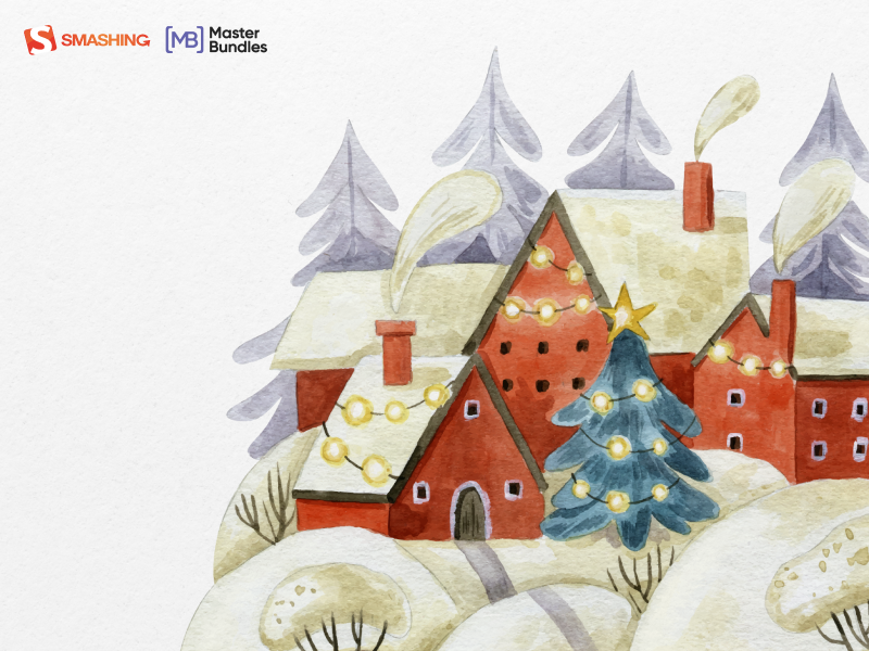
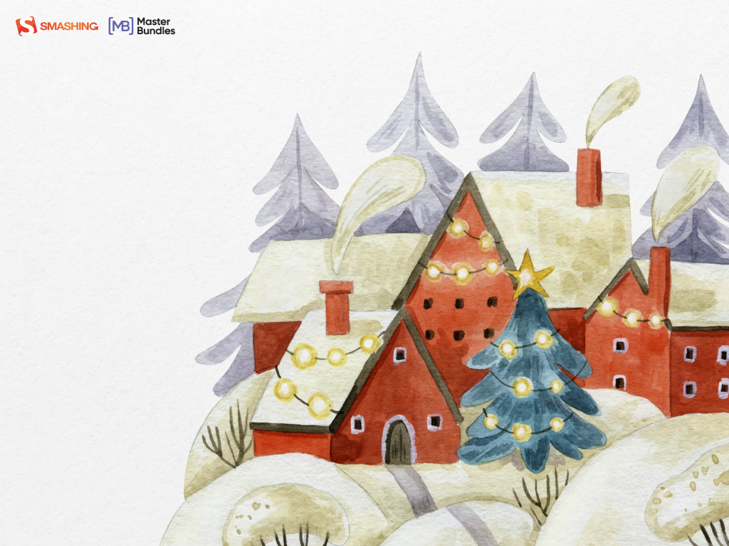
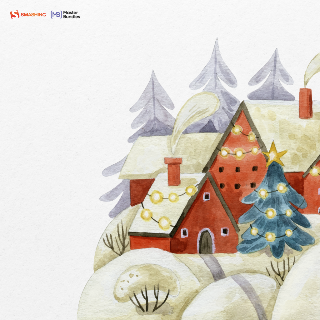
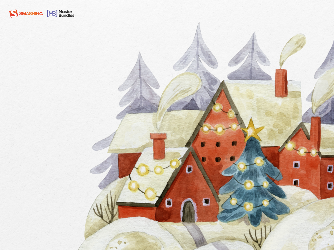
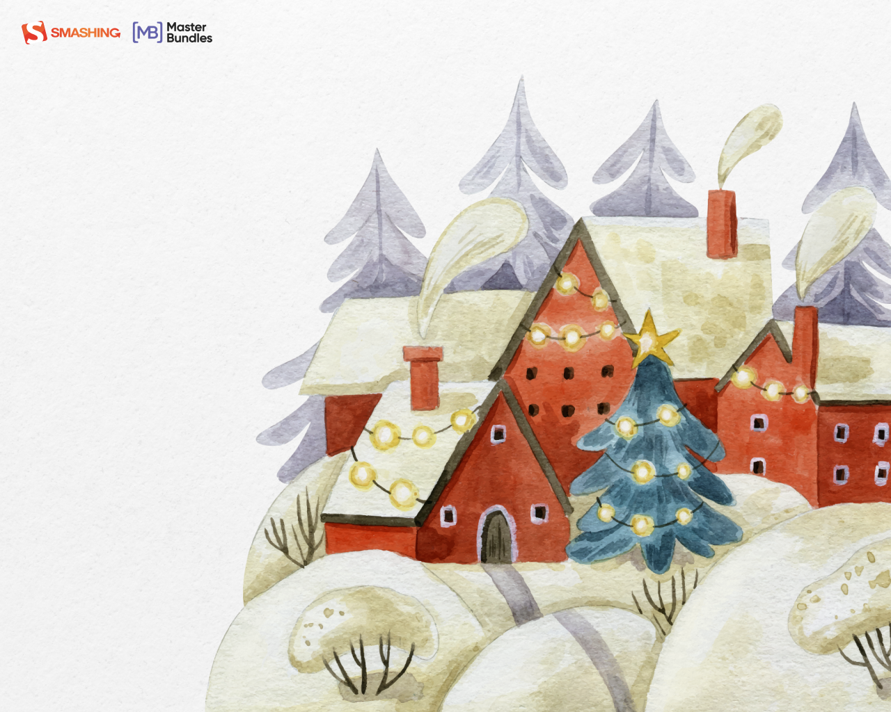
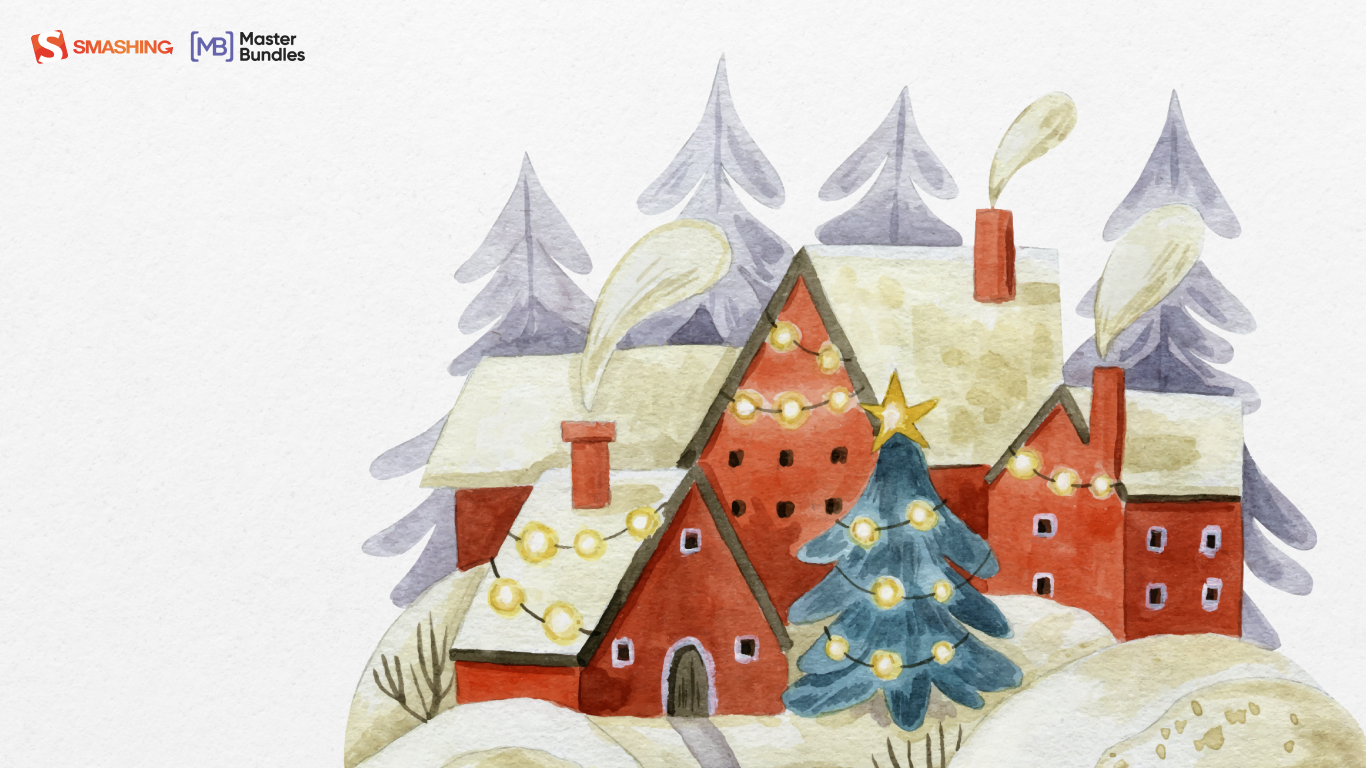
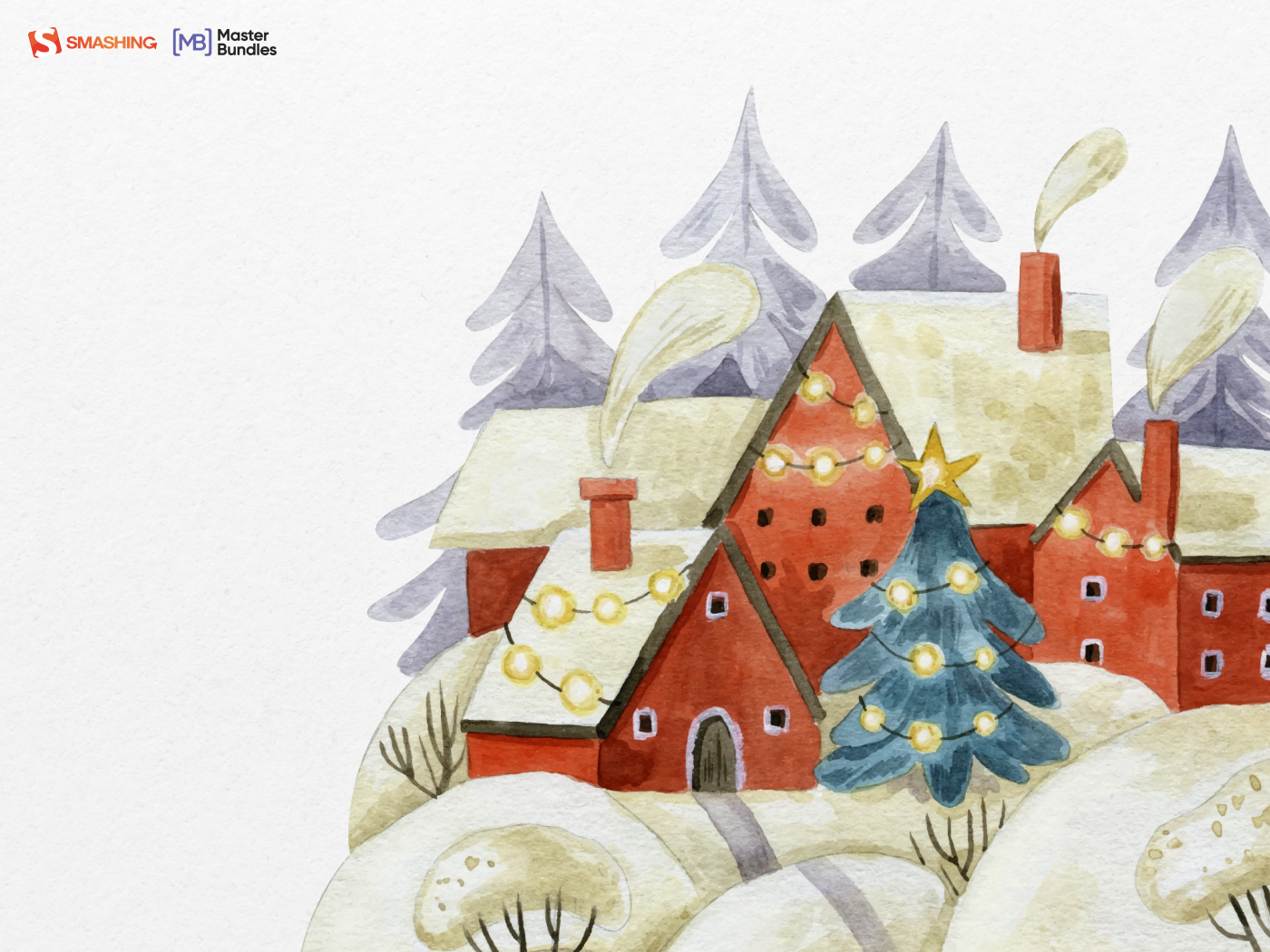
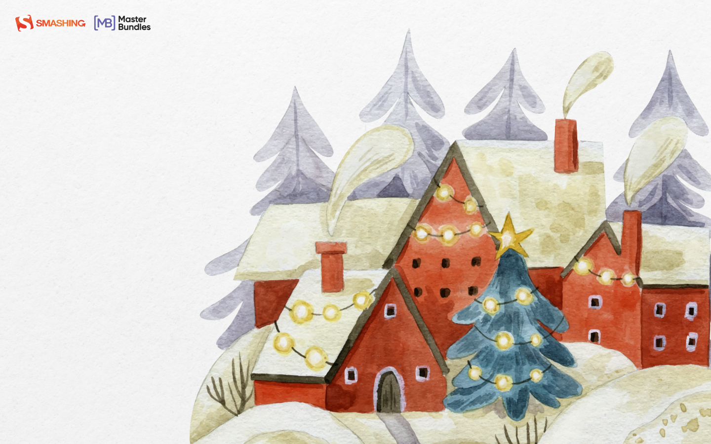
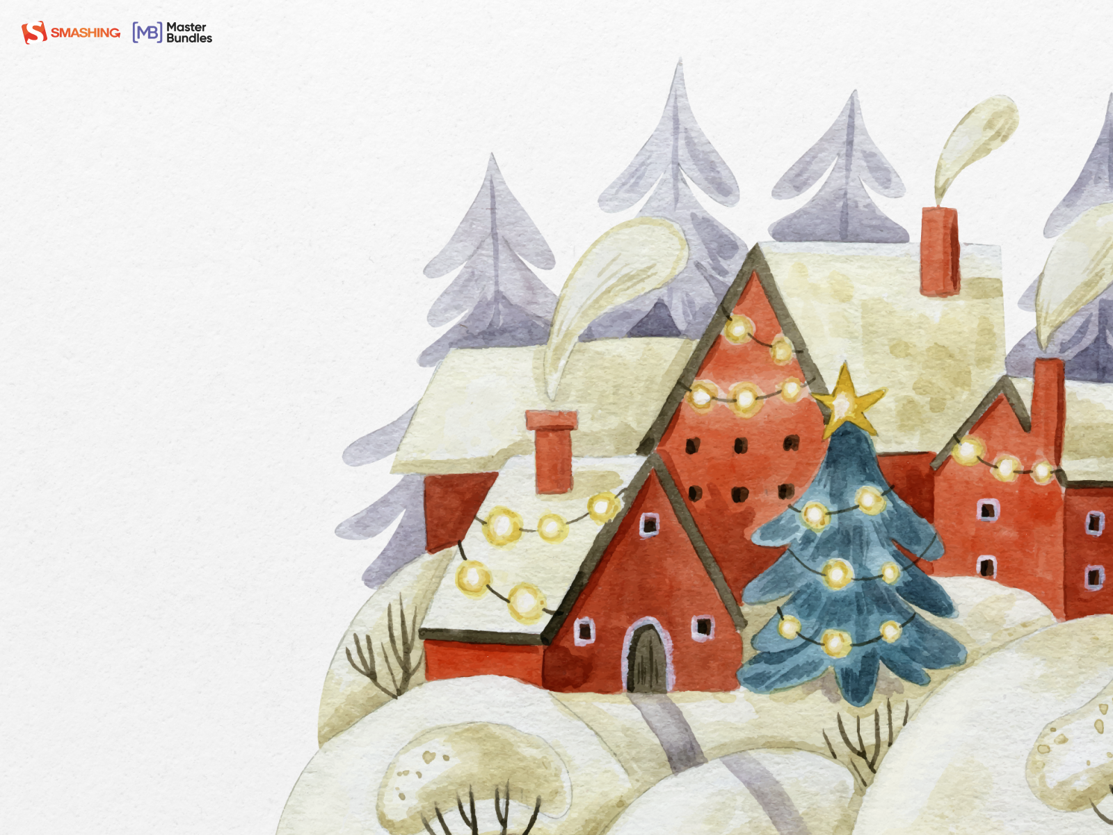
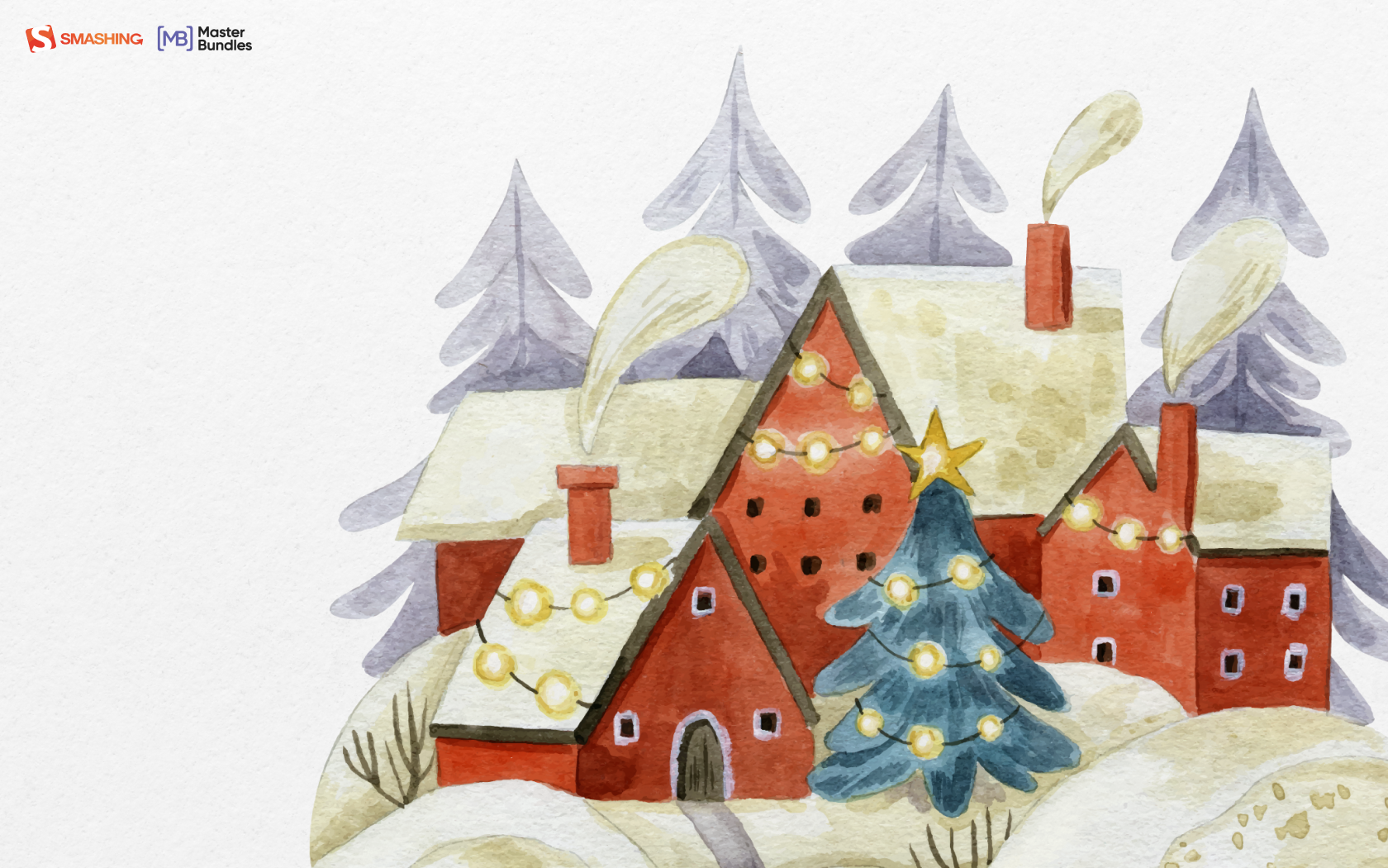
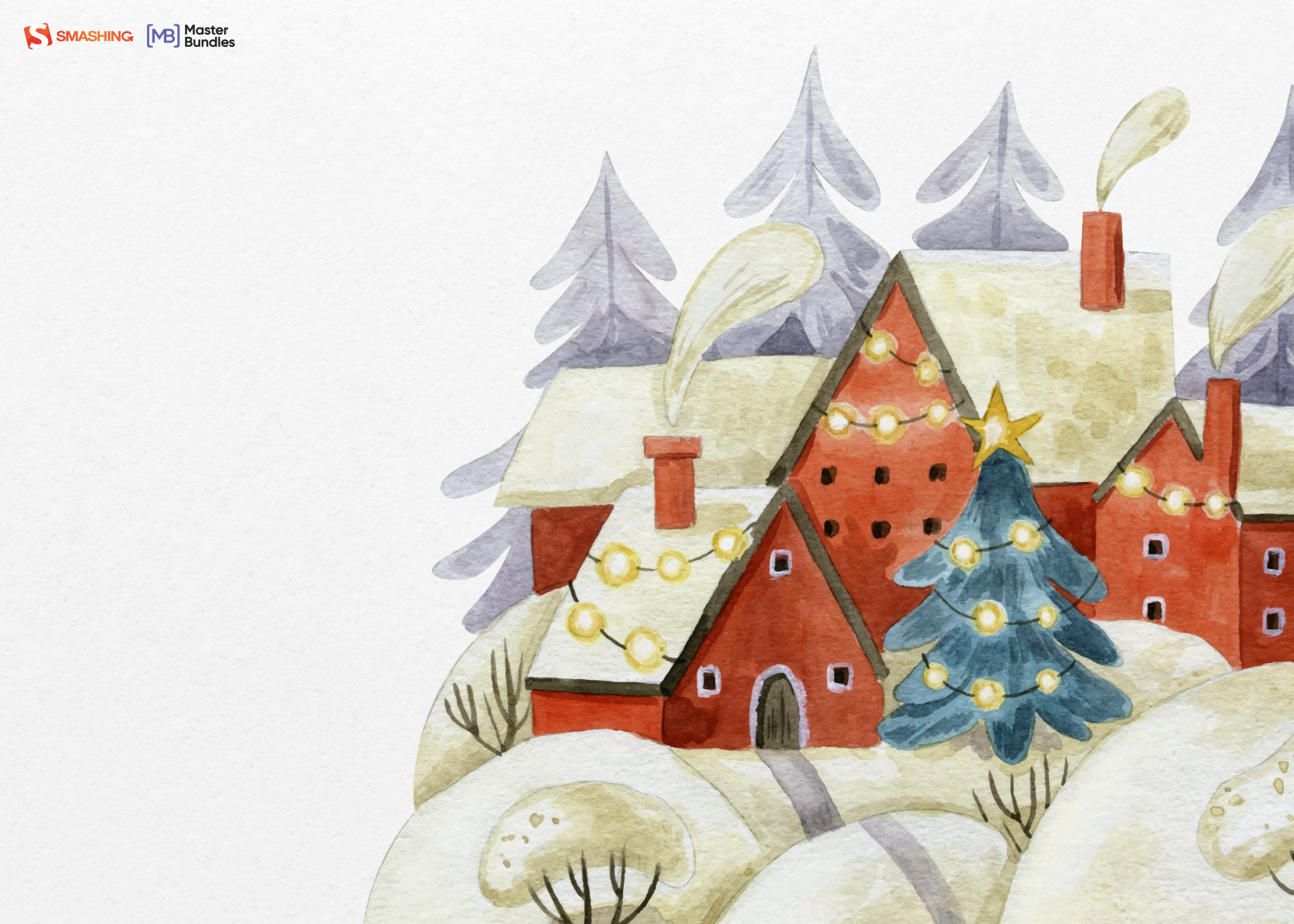
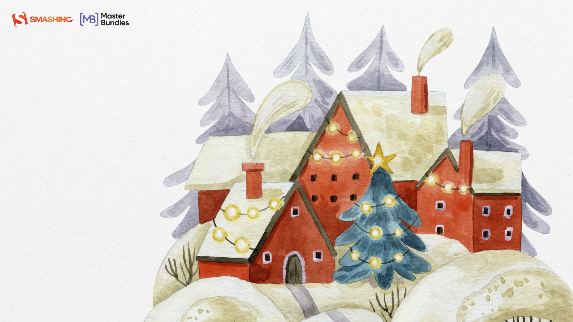
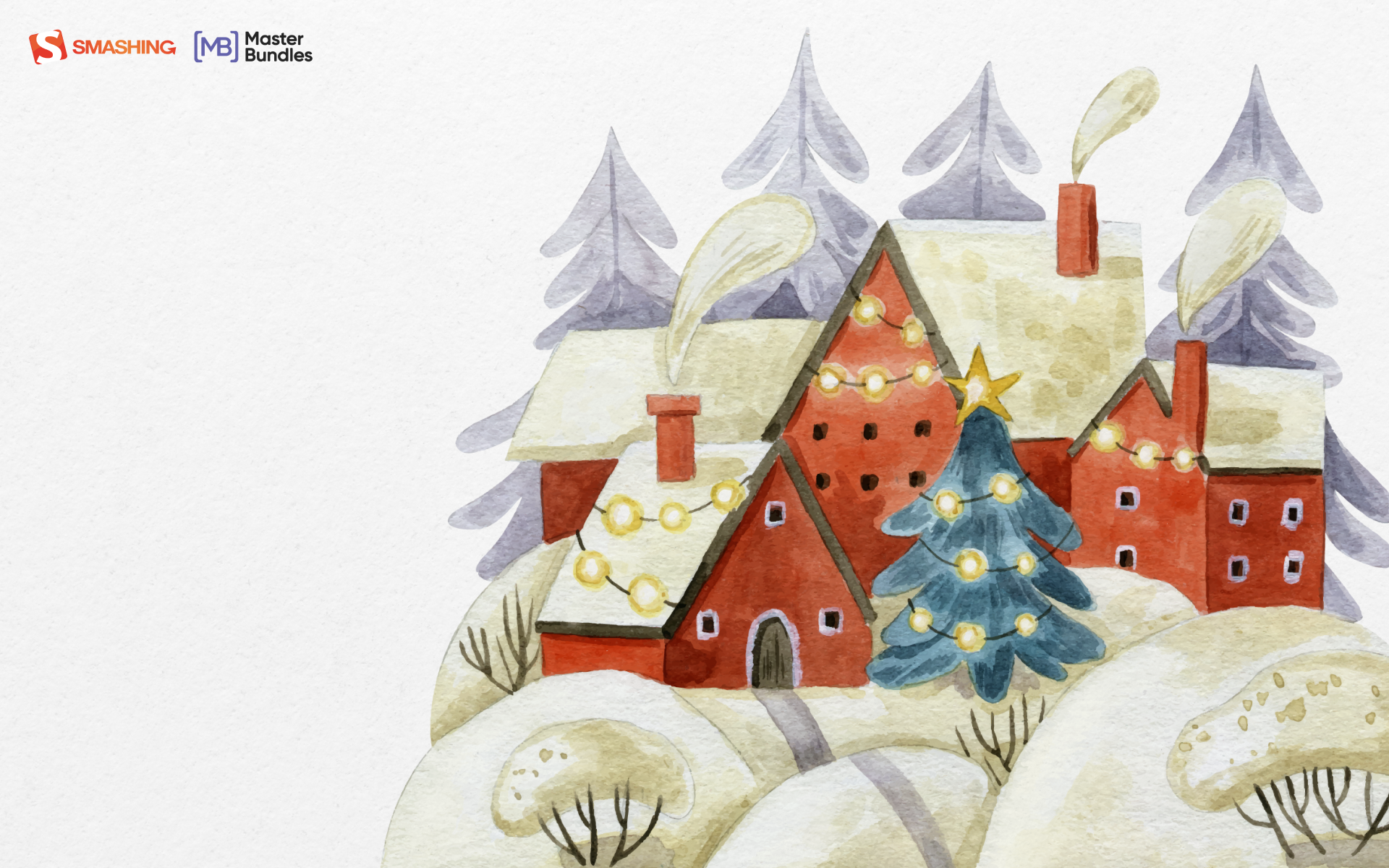
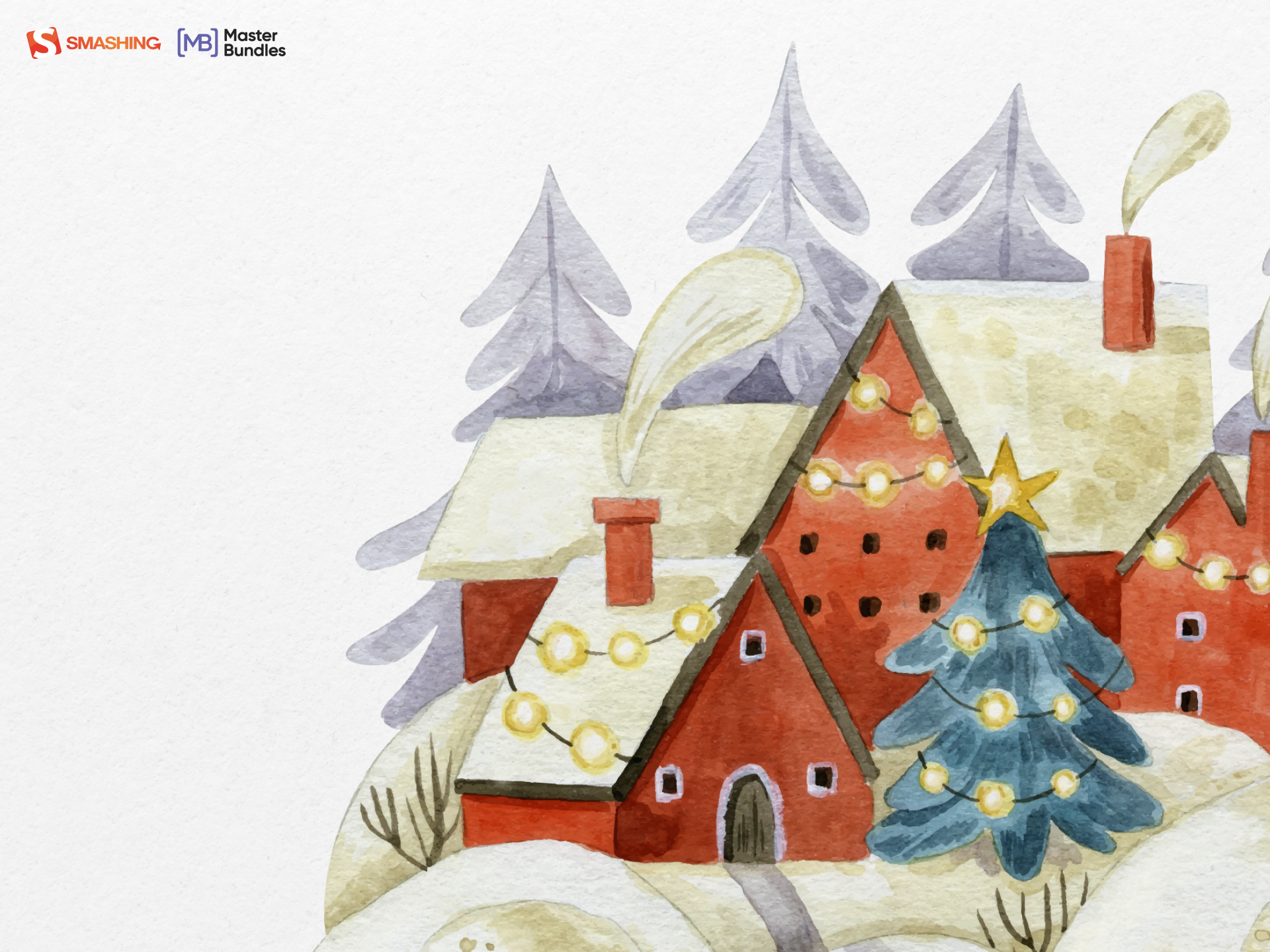
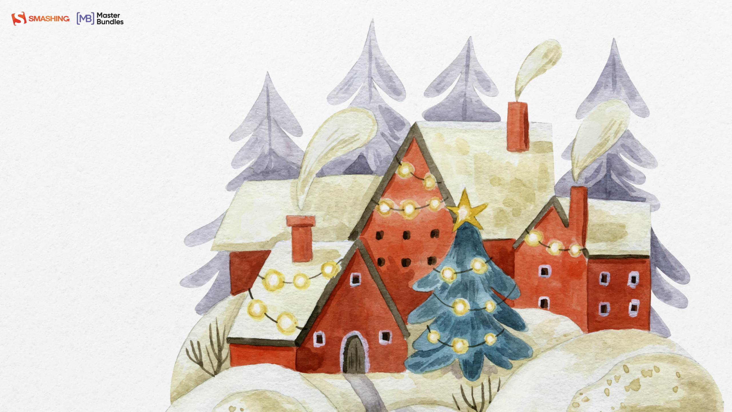
Winter coziness that we all feel when we come home after spending some time outside or when we come to our parental home to celebrate Christmas inspired our designers. Home is the place where we can feel safe and sound, so we couldn’t help ourselves but create this calendar. — Designed by MasterBundles from Ukraine.

- preview
- without calendar: 320×480, 640×480, 800×480, 800×600, 1024×768, 1024×1024, 1152×864, 1280×720, 1280×800, 1280×960, 1280×1024, 1366×768, 1400×1050, 1440×900, 1600×1200, 1680×1050, 1680×1200, 1920×1080, 1920×1200, 1920×1440, 2560×1440
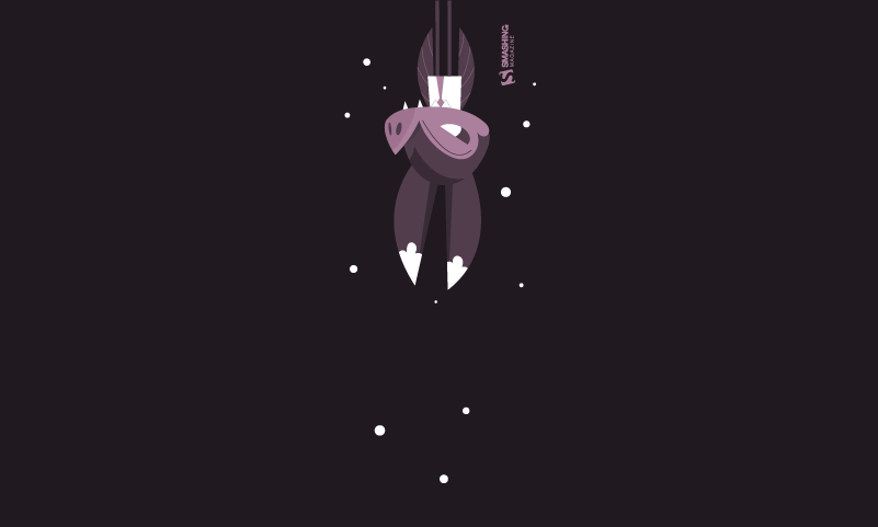
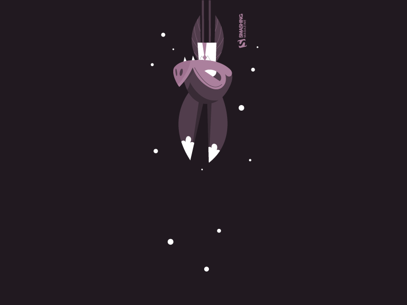
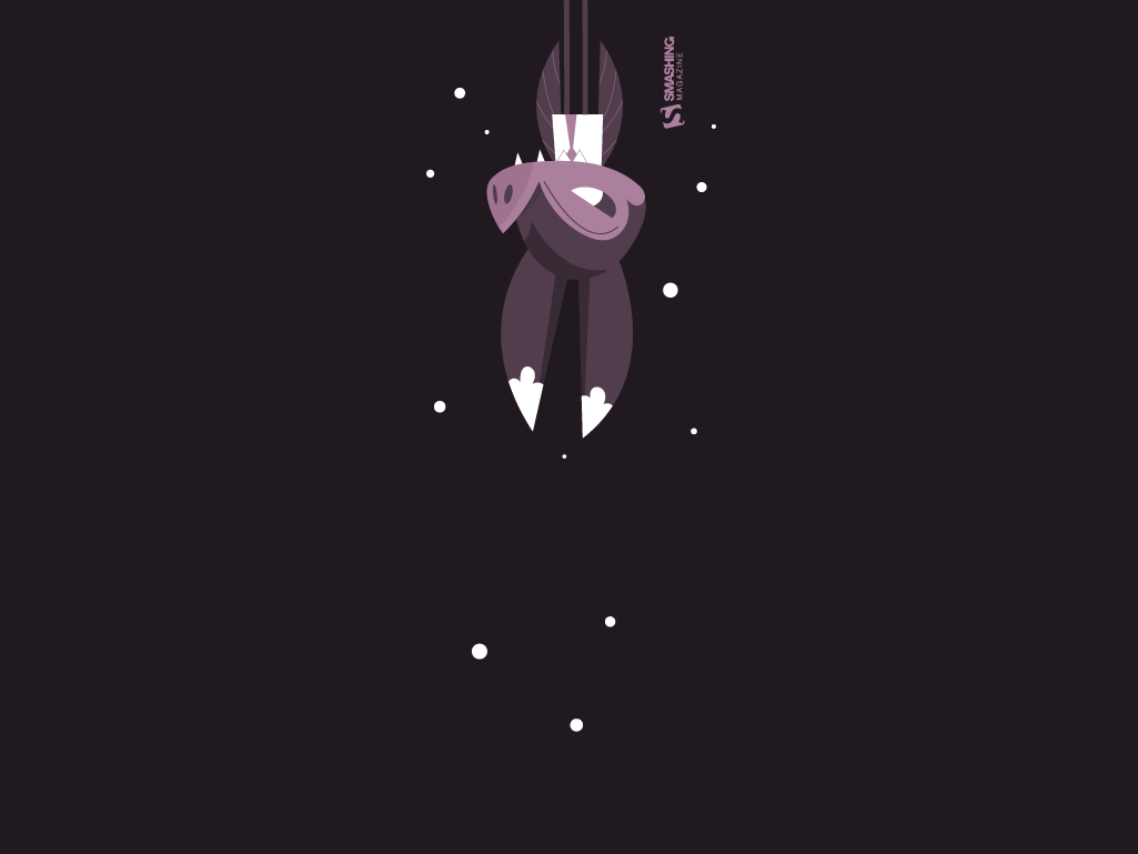
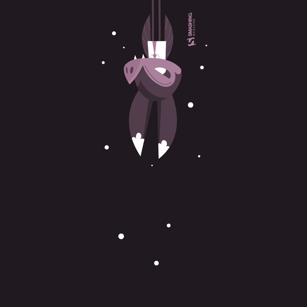
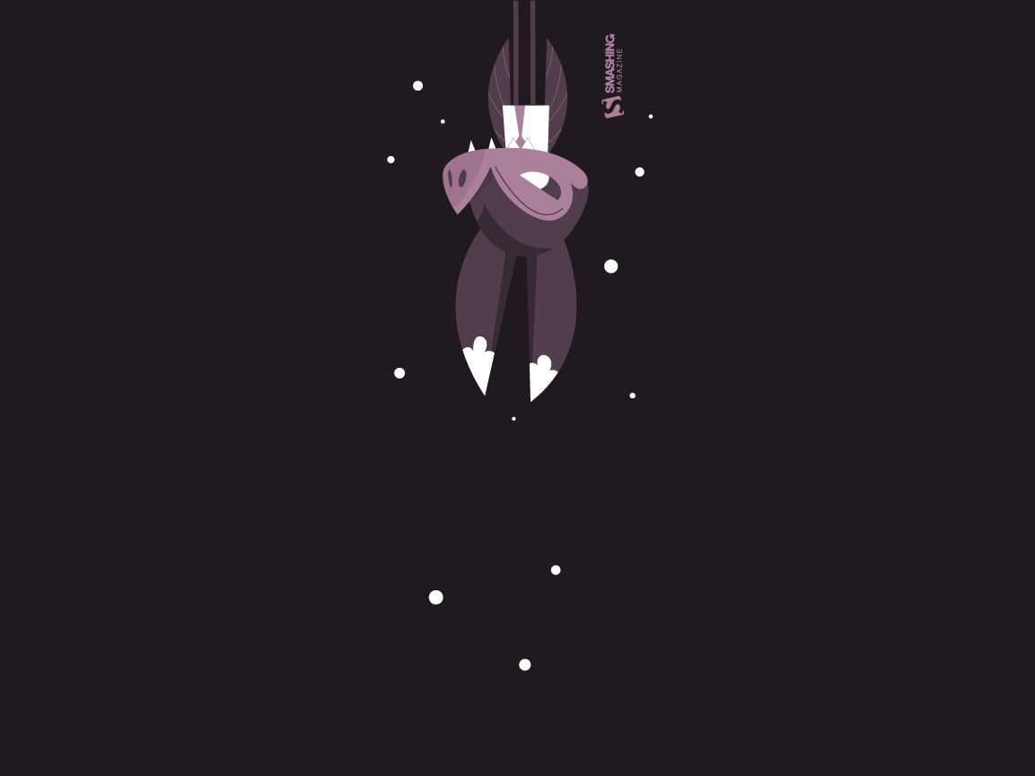
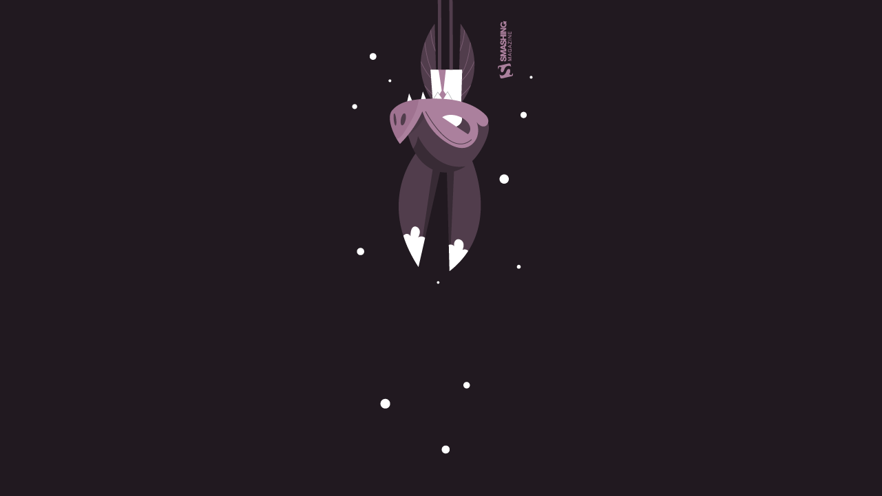
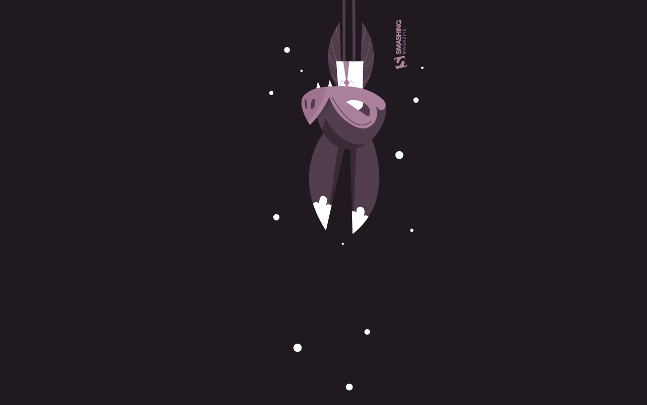
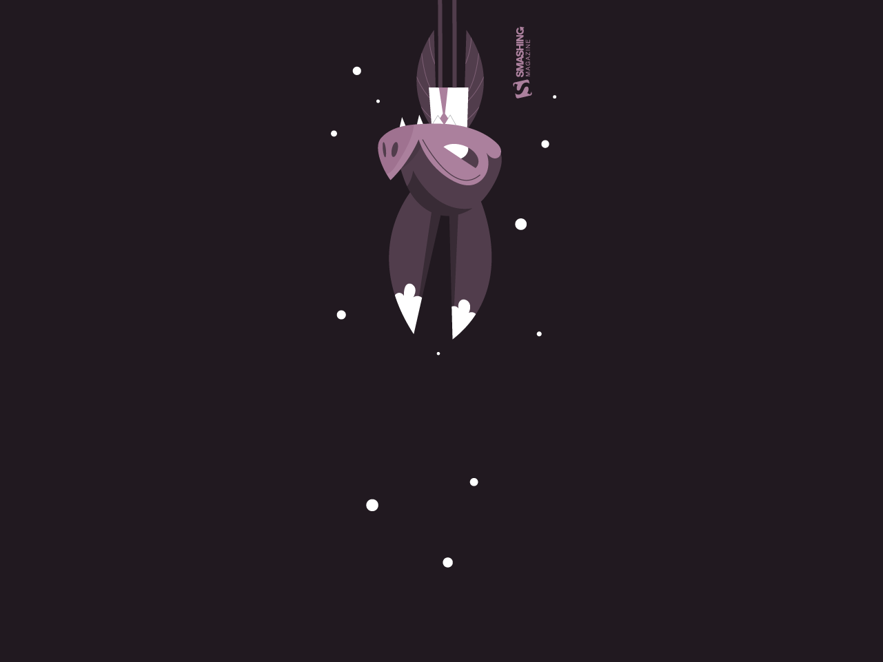
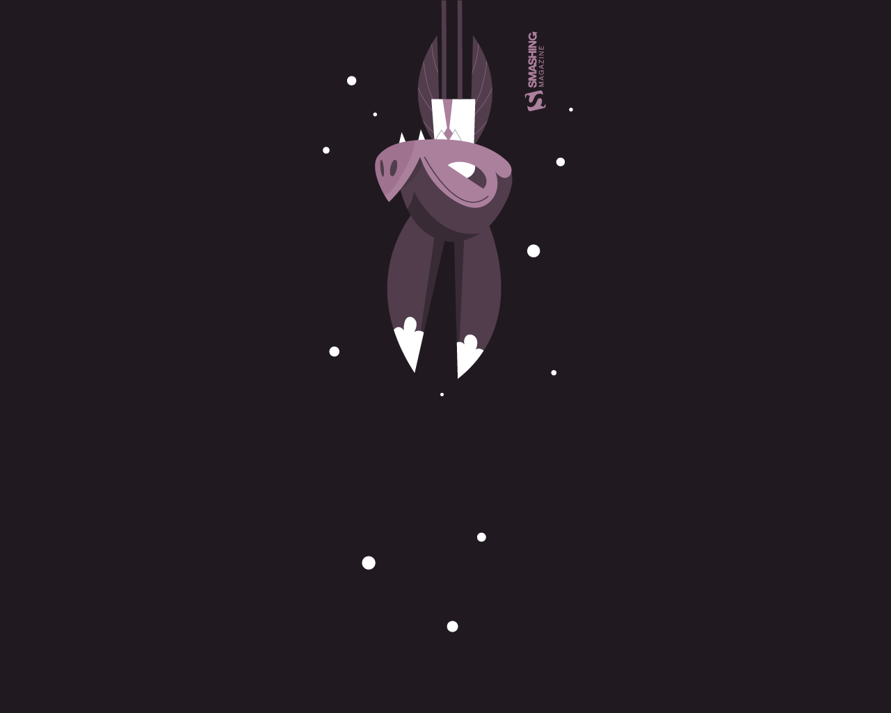
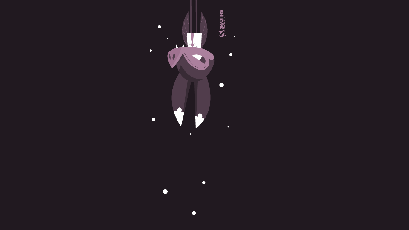
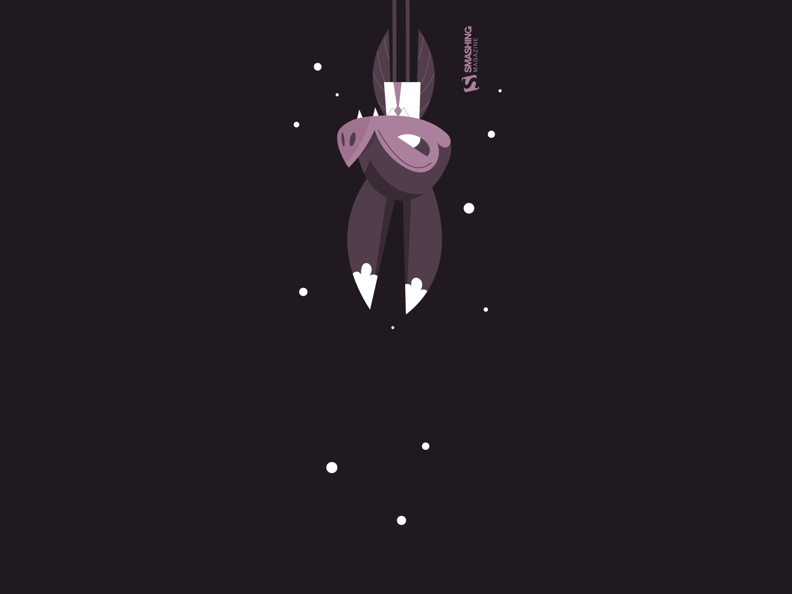
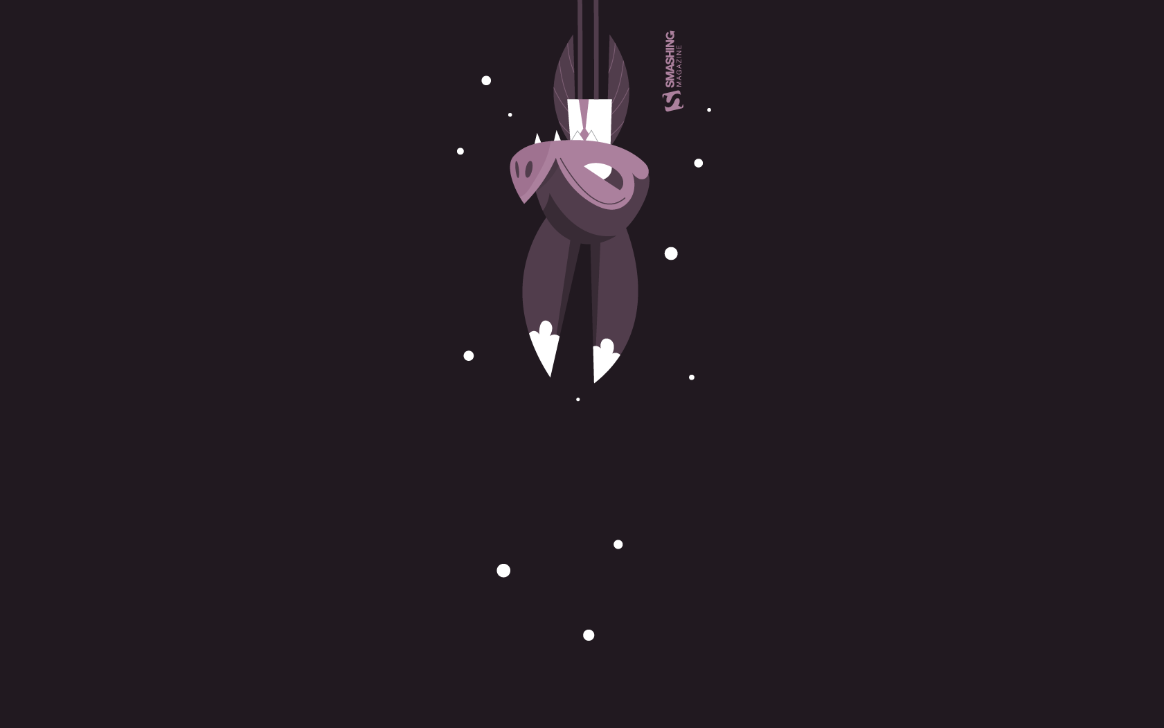
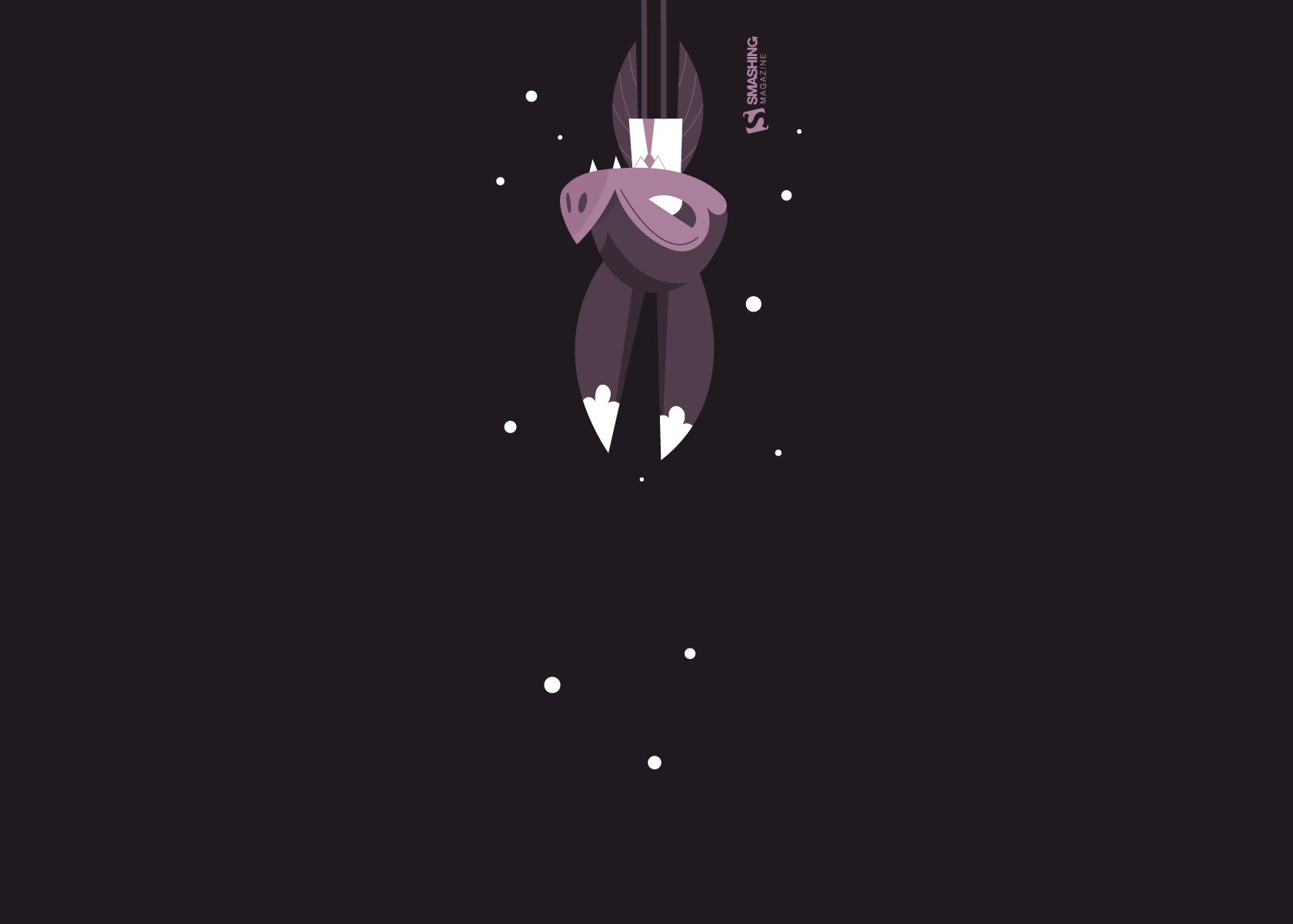
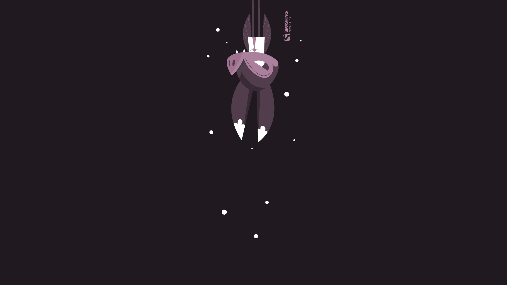
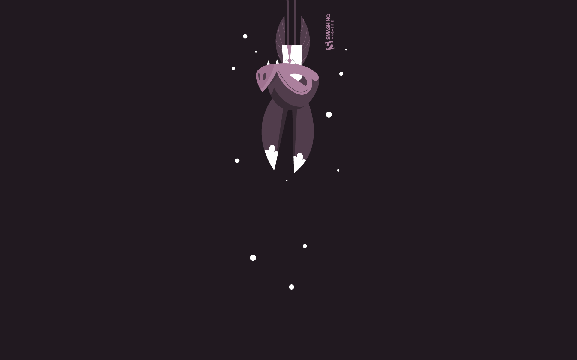
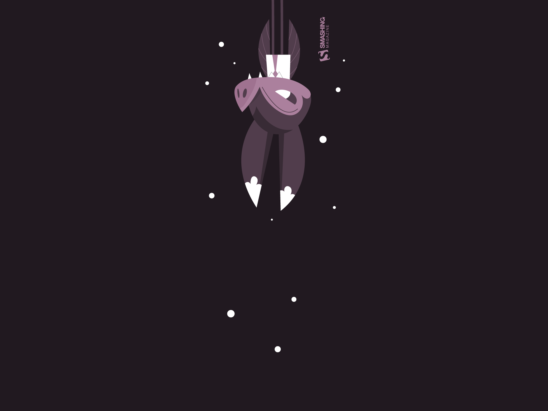
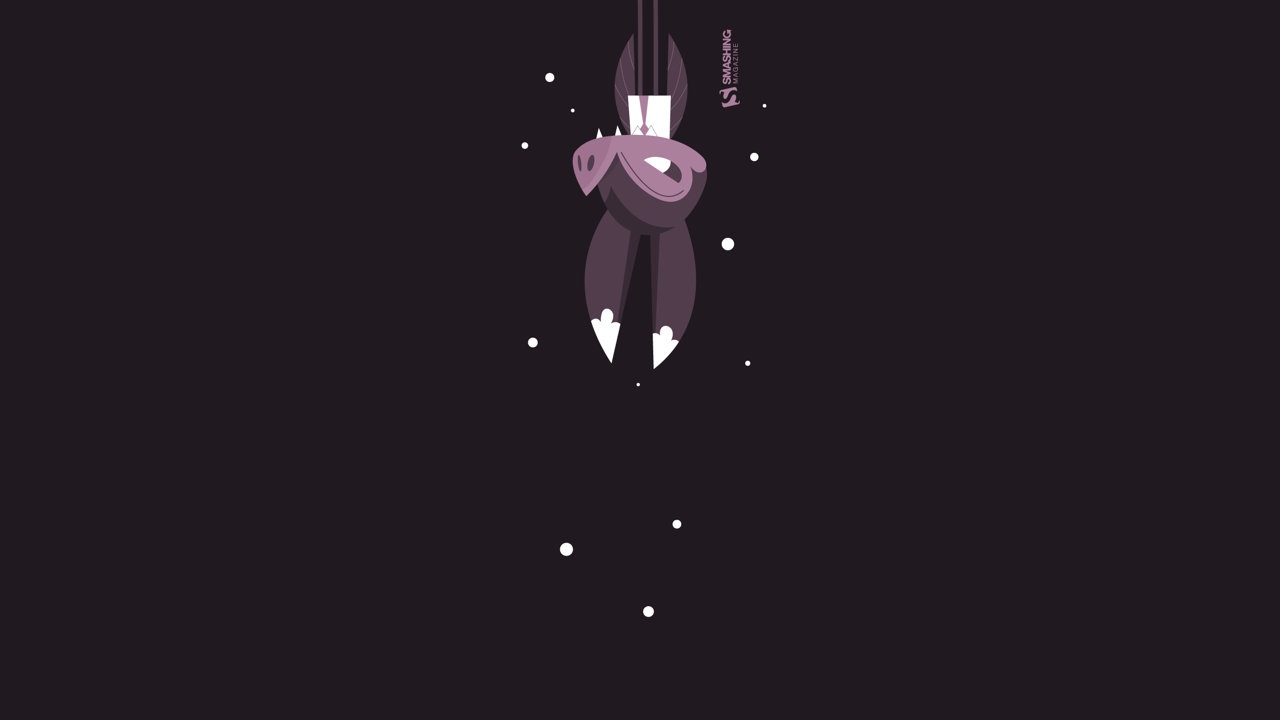
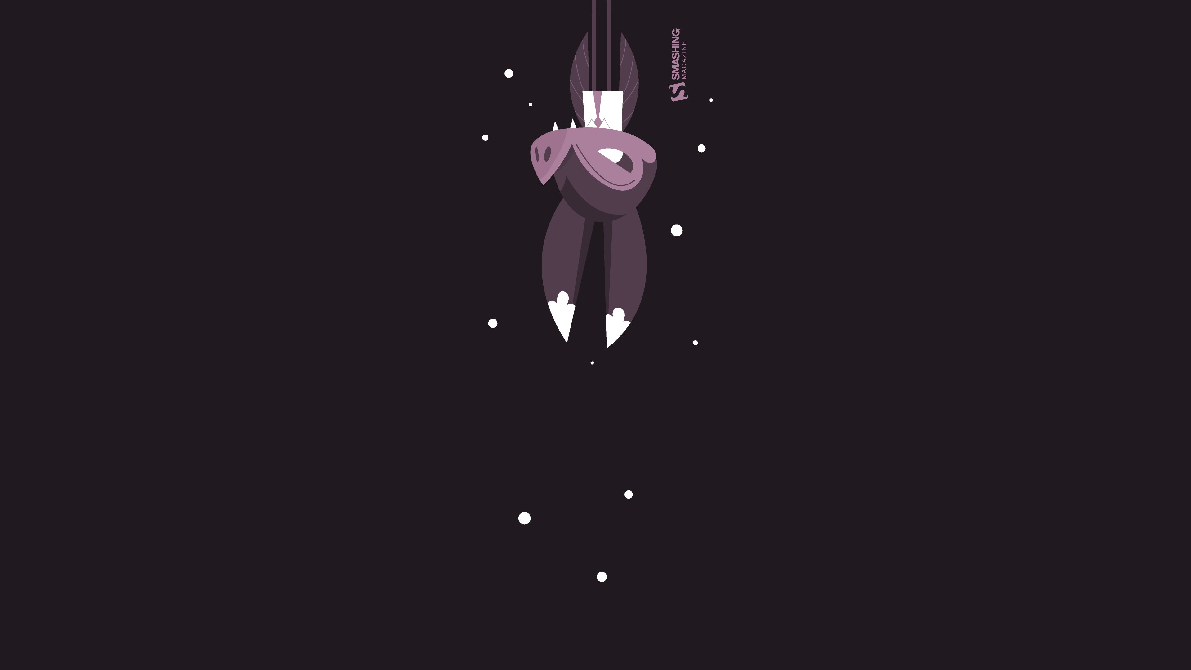
Bat Christmas
Designed by Ricardo Gimenes from Sweden.

- preview
- without calendar: 640×480, 800×480, 800×600, 1024×768, 1024×1024, 1152×864, 1280×720, 1280×800, 1280×960, 1280×1024, 1366×768, 1400×1050, 1440×900, 1600×1200, 1680×1050, 1680×1200, 1920×1080, 1920×1200, 1920×1440, 2560×1440, 3840×2160
Enchanted Blizzard
A seemingly forgotten world under the shade of winter glaze hides a moment where architecture meets fashion and change encounters steadiness. — Designed by Ana Masnikosa from Belgrade, Serbia.

- preview
- without calendar: 320×480, 640×480, 800×480, 800×600, 1024×768, 1024×1024, 1152×864, 1280×720, 1280×800, 1280×960, 1280×1024, 1400×1050, 1440×900, 1600×1200, 1680×1050, 1680×1200, 1920×1080, 1920×1200, 1920×1440, 2560×1440
King Of Pop
Designed by Ricardo Gimenes from Sweden.

- preview
- without calendar: 640×480, 800×480, 800×600, 1024×768, 1024×1024, 1152×864, 1280×720, 1280×800, 1280×960, 1280×1024, 1366×768, 1400×1050, 1440×900, 1600×1200, 1680×1050, 1680×1200, 1920×1080, 1920×1200, 1920×1440, 2560×1440, 3840×2160
Winter Garphee
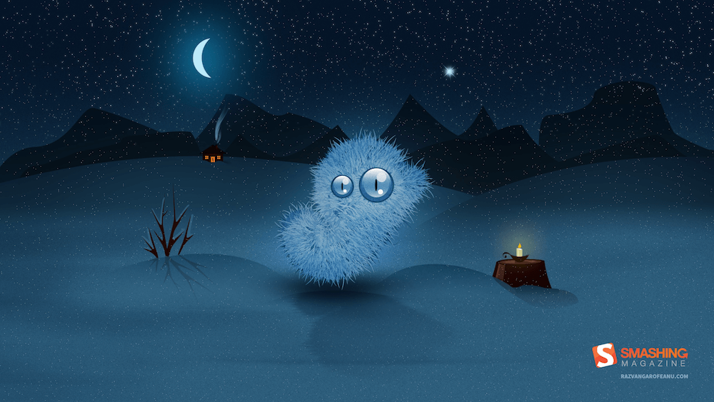
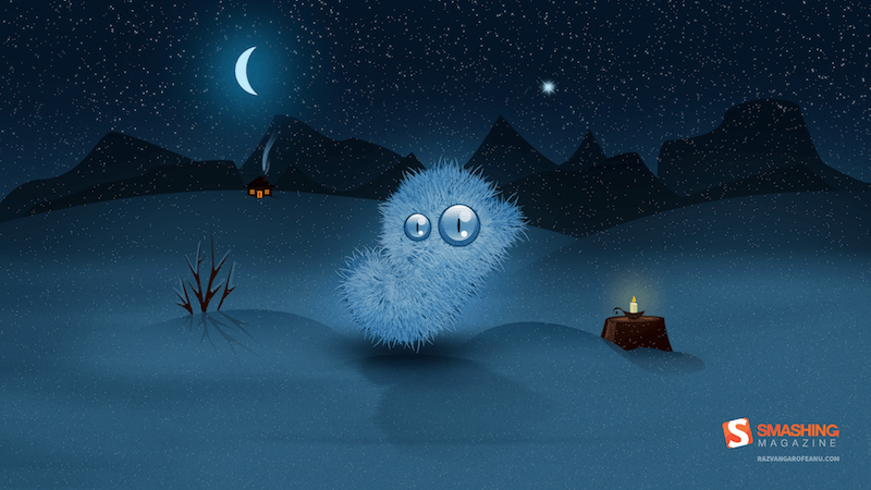
“Garphee’s flufiness glowing in the snow.” Designed by Razvan Garofeanu from Romania.
- preview
- without calendar: 320×480, 1024×768, 1024×1024, 1280×800, 1280×1024, 1366×768, 1440×900, 1680×1050, 1920×1080, 1920×1200, 2560×1440
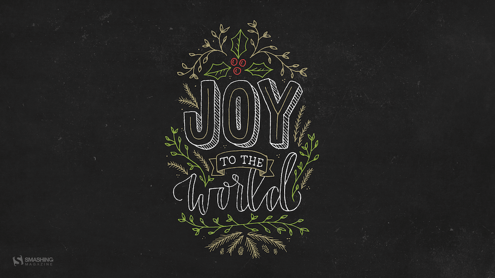
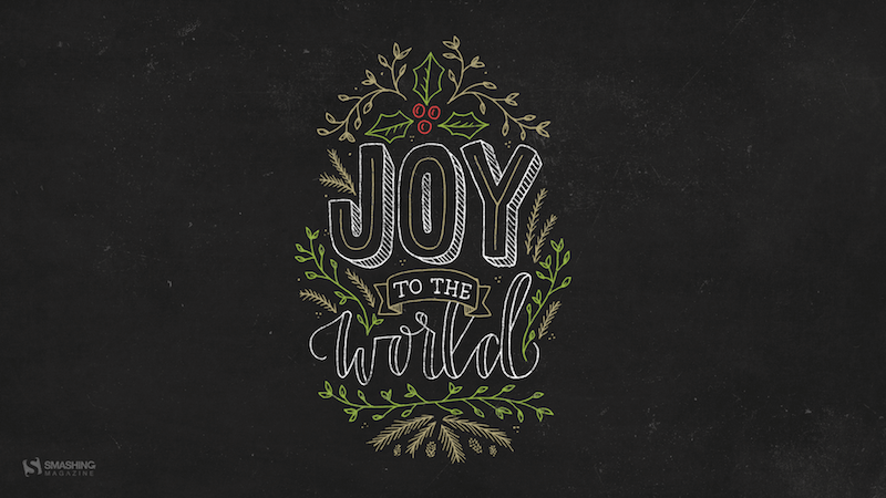
Joy To The World
Joy to the world, all the boys and girls now, joy to the fishes in the deep blue sea, joy to you and me. — Designed by Morgan Newnham from Boulder, Colorado.
- preview
- without calendar: 320×480, 640×480, 800×480, 800×600, 1024×768, 1024×1024, 1152×864, 1280×720, 1280×800, 1280×960, 1280×1024, 1400×1050, 1440×900, 1600×1200, 1680×1050, 1680×1200, 1920×1080, 1920×1200, 1920×1440, 2560×1440
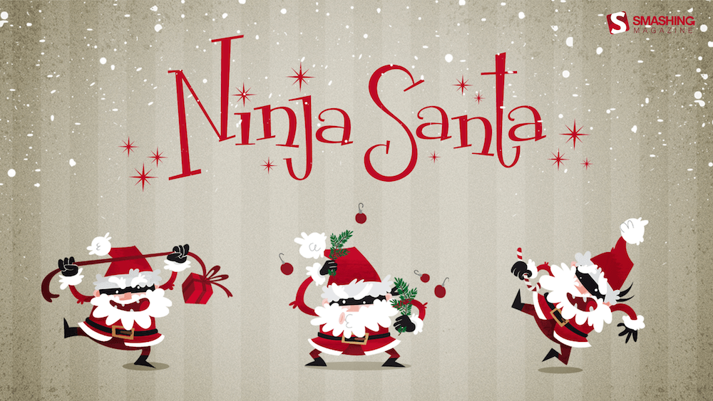
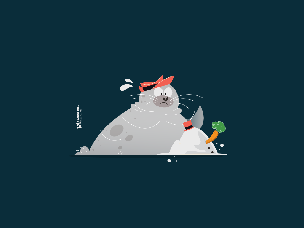
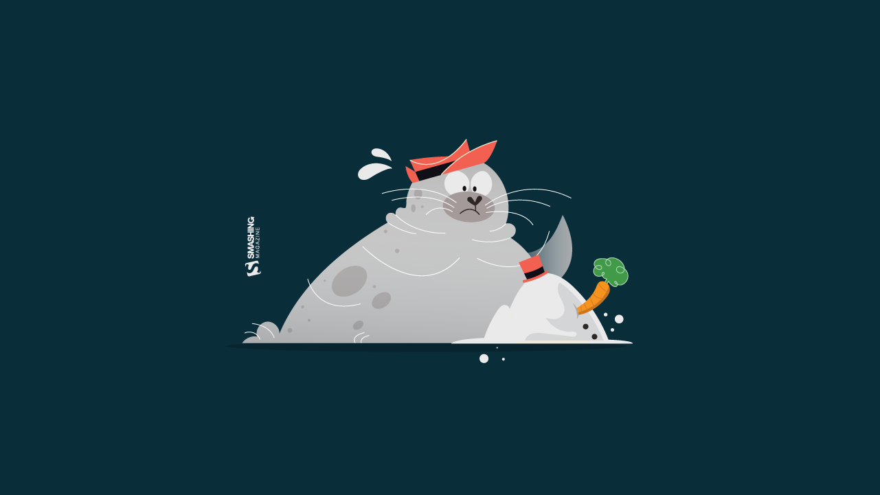
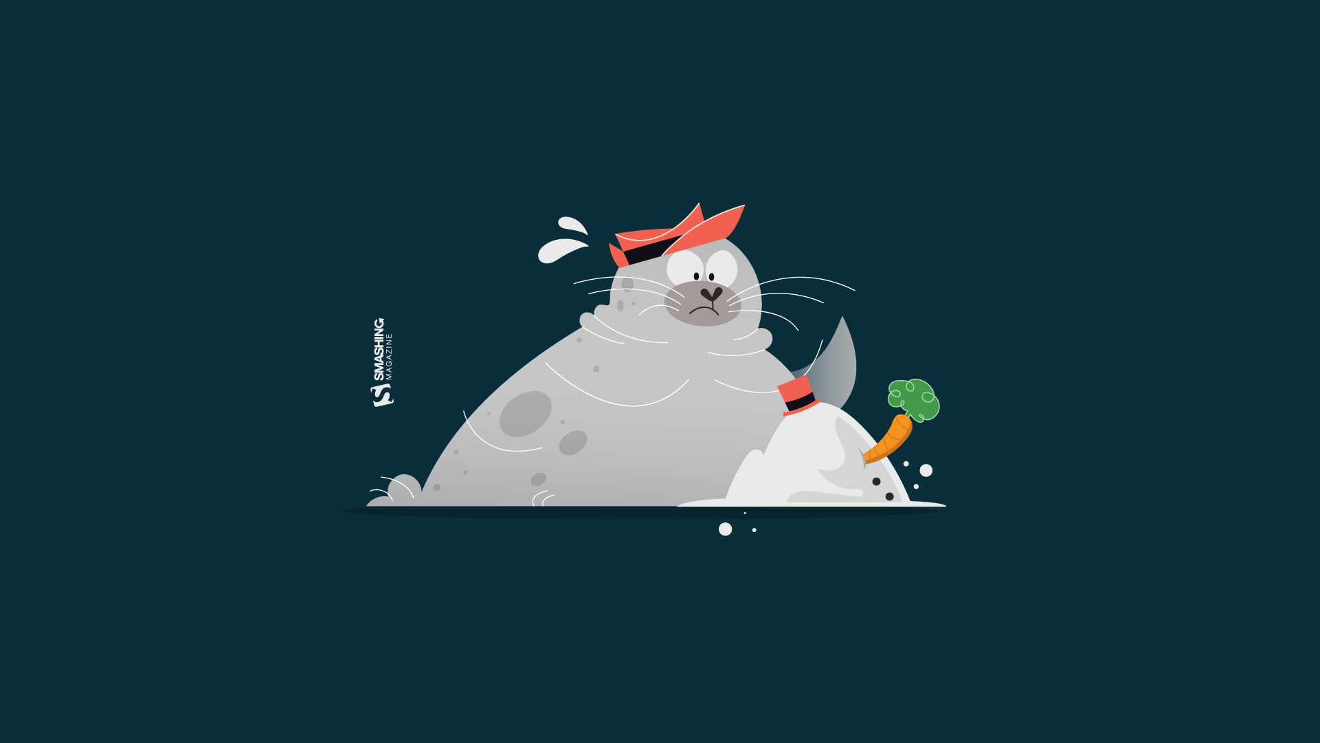
Ninja Santa
Designed by Elise Vanoorbeek from Belgium.
Hot Hot Hot!
Designed by Ricardo Gimenes from Sweden.

- preview
- without calendar: 640×480, 800×480, 800×600, 1024×768, 1024×1024, 1152×864, 1280×720, 1280×800, 1280×960, 1280×1024, 1366×768, 1400×1050, 1440×900, 1600×1200, 1680×1050, 1680×1200, 1920×1080, 1920×1200, 1920×1440, 2560×1440, 3840×2160
Christmas Cookies
Christmas is coming and a great way to share our love is by baking cookies. — Designed by Maria Keller from Mexico.

- preview
- without calendar: 320×480, 640×480, 640×1136, 750×1334, 800×480, 800×600, 1024×768, 1024×1024, 1152×864, 1242×2208, 1280×720, 1280×800, 1280×960, 1280×1024, 1366×768, 1400×1050, 1440×900, 1600×1200, 1680×1050, 1680×1200, 1920×1080, 1920×1200, 1920×1440, 2560×1440, 2880×1800
Sweet Snowy Tenderness
You know that warm feeling when you get to spend cold winter days in a snug, homey, relaxed atmosphere? Oh, yes, we love it, too! It is the sentiment we set our hearts on for the holiday season, and this sweet snowy tenderness is for all of us who adore watching the snowfall from our windows. Isn’t it romantic? — Designed by PopArt Studio from Serbia.

- preview
- without calendar: 320×480, 640×480, 800×480, 800×600, 1024×768, 1024×1024, 1152×864, 1280×720, 1280×800, 1280×960, 1280×1024, 1366×768, 1400×1050, 1440×900, 1600×1200, 1680×1050, 1680×1200, 1920×1080, 1920×1200, 1920×1440, 2560×1440
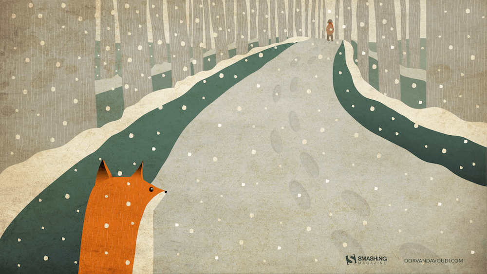
All That Belongs To The Past
“Sometimes new beginnings make us revisit our favorite places or people from the past. We don’t visit them often because they remind us of the past but enjoy the brief reunion. Cheers to new beginnings in the new year!” Designed by Dorvan Davoudi from Canada.
- preview
- without calendar: 800×480, 800×600, 1024×1024, 1152×864, 1280×720, 1280×800, 1280×960, 1280×1024, 1366×768, 1400×1050, 1440×900, 1600×1200, 1680×1050, 1680×1200, 1920×1080, 1920×1200, 1920×1440, 2560×1440
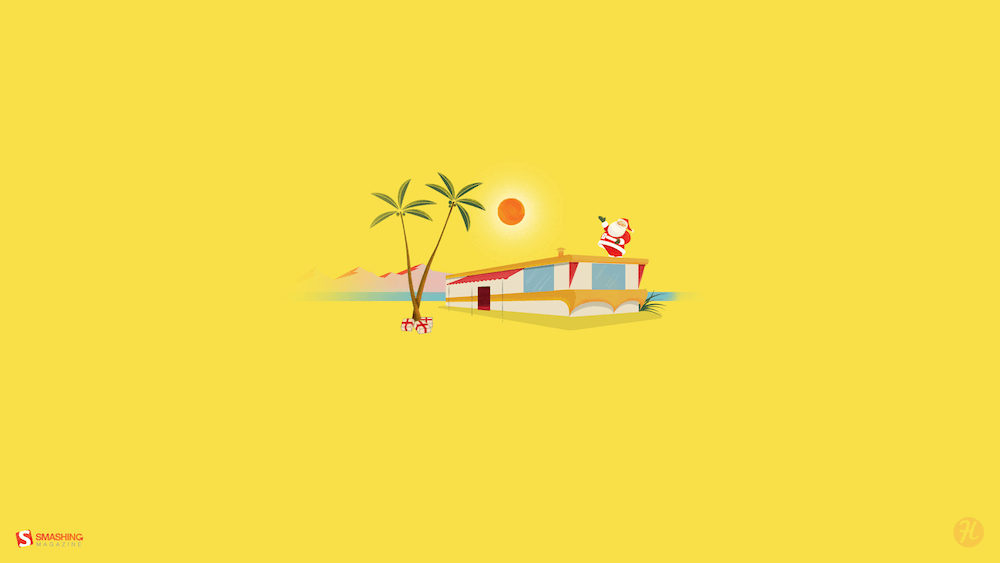
Trailer Santa
“A mid-century modern Christmas scene outside the norm of snowflakes and winter landscapes.” Designed by Houndstooth from the United States.
Getting Hygge
There’s no more special time for a fire than in the winter. Cozy blankets, warm beverages, and good company can make all the difference when the sun goes down. We’re all looking forward to generating some hygge this winter, so snuggle up and make some memories. — Designed by The Hannon Group from Washington D.C.

- preview
- without calendar: 320×480, 640×480, 800×600, 1024×768, 1280×960, 1440×900, 1600×1200, 1680×1050, 1680×1200, 1920×1080, 1920×1440, 2560×1440
December Through Different Eyes
“As a Belgian, December reminds me of snow, cosiness, winter, lights, and so on. However, in the Southern Hemisphere, it is summer at this time. With my illustration I wanted to show the different perspectives on December. I wish you all a Merry Christmas and Happy New Year!” — Designed by Jo Smets from Belgium.
Ice Flowers
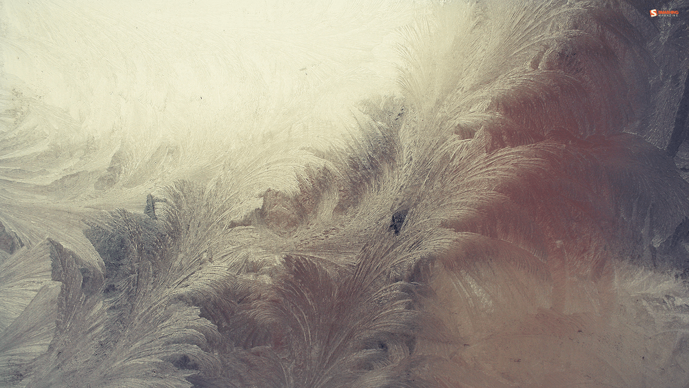
“I took some photos during a very frosty and cold week before Christmas.” Designed by Anca Varsandan from Romania.
Bathtub Party Day
December 5th is also known as Bathtub Party Day, which is why I wanted to visualize what celebrating this day could look like. — Designed by Jonas Vanhamme from Belgium.

- preview
- without calendar: 320×480, 640×480, 800×480, 800×600, 1024×768, 1280×720, 1280×800, 1280×960, 1400×1050, 1600×1200, 1680×1200, 1920×1080, 1920×1200, 1920×1440, 2560×1440, 2560×1600
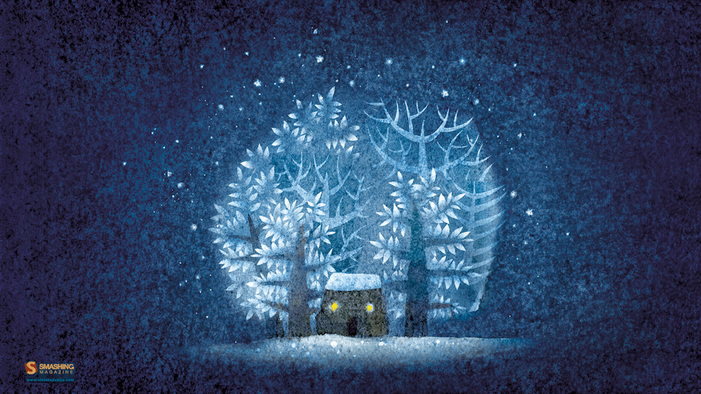
Silver Winter
Designed by Violeta Dabija from Moldova.
Christmas Fail
Designed by Elise Vanoorbeek from Belgium.

- preview
- without calendar: 1024×768, 1024×1024, 1152×864, 1280×720, 1280×800, 1280×960, 1280×1024, 1366×768, 1400×1050, 1440×900, 1600×1200, 1680×1050, 1680×1200, 1920×1080, 1920×1200, 1920×1440, 2560×1440
Catch Your Perfect Snowflake
“This time of year, people tend to dream big and expect miracles. Let your dreams come true!” Designed by Igor Izhik from Canada.

- preview
- without calendar: 800×480, 800×600, 1024×768, 1024×1024, 1152×864, 1280×720, 1280×800, 1280×960, 1280×1024, 1400×1050, 1440×900, 1600×1200, 1680×1050, 1680×1200, 1920×1080, 1920×1200, 1920×1440, 2560×1440, 2560×1600
Dream What You Want To Do
The year will end, hope the last month, you can do what you want to do, seize the time, cherish yourself, expect next year we will be better! — Designed by Hong Zi-Qing from Taiwan.
- preview
- without calendar: 1024×768, 1152×864, 1280×720, 1280×960, 1366×768, 1400×1050, 1530×900, 1600×1200, 1920×1080, 1920×1440, 2560×1440
Time For Reindeer, Snowflakes And Jingle Bells
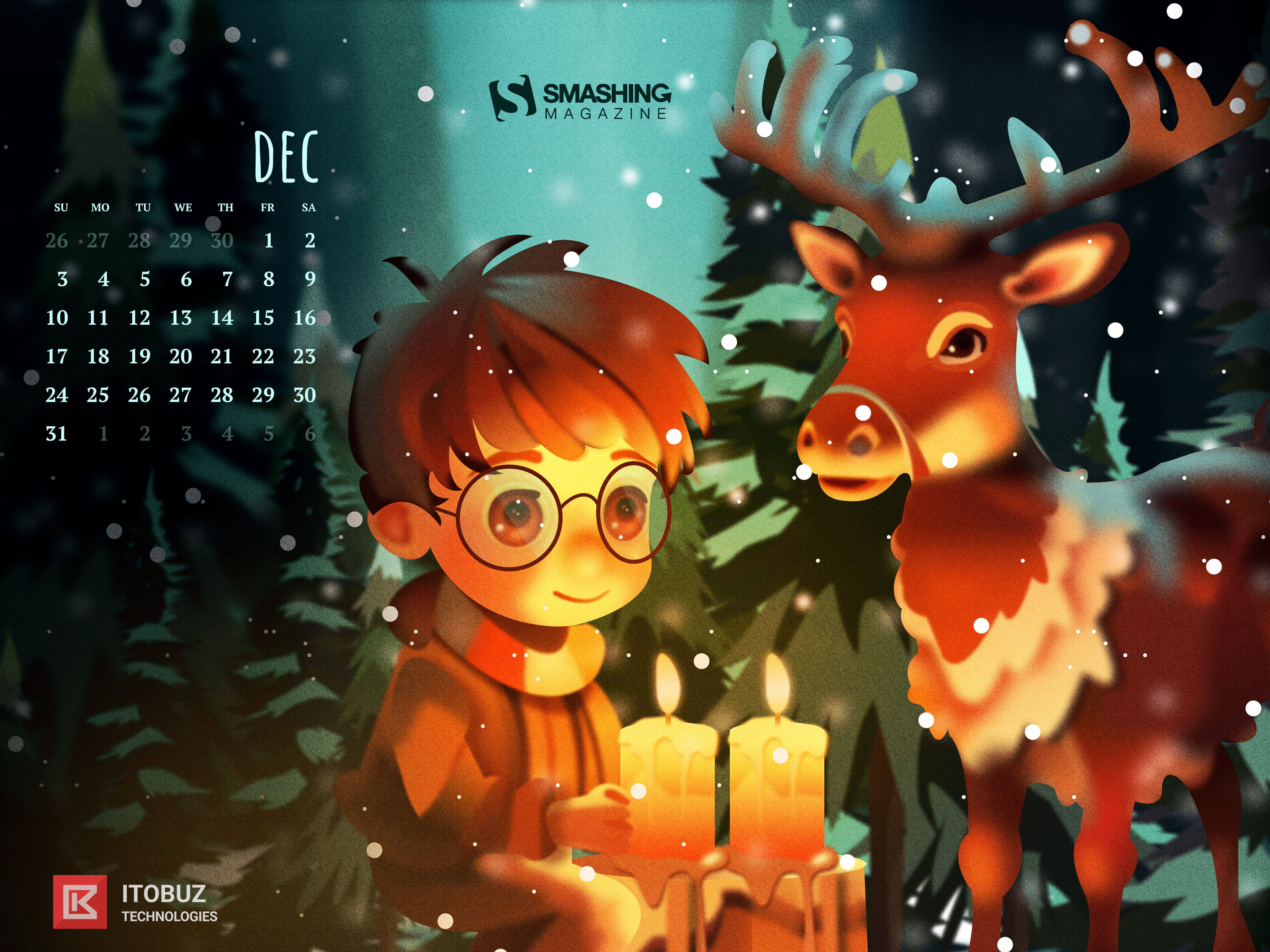
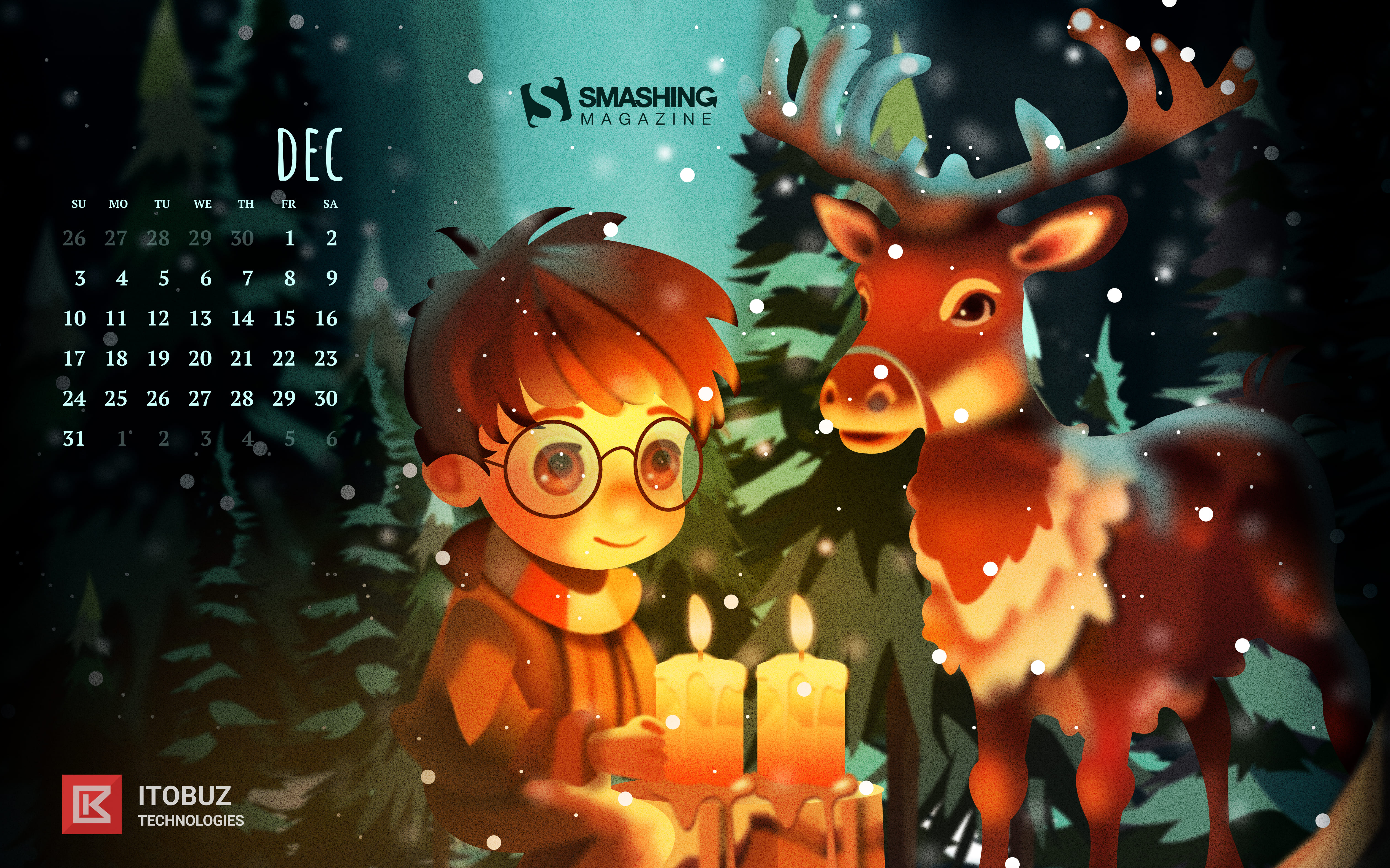
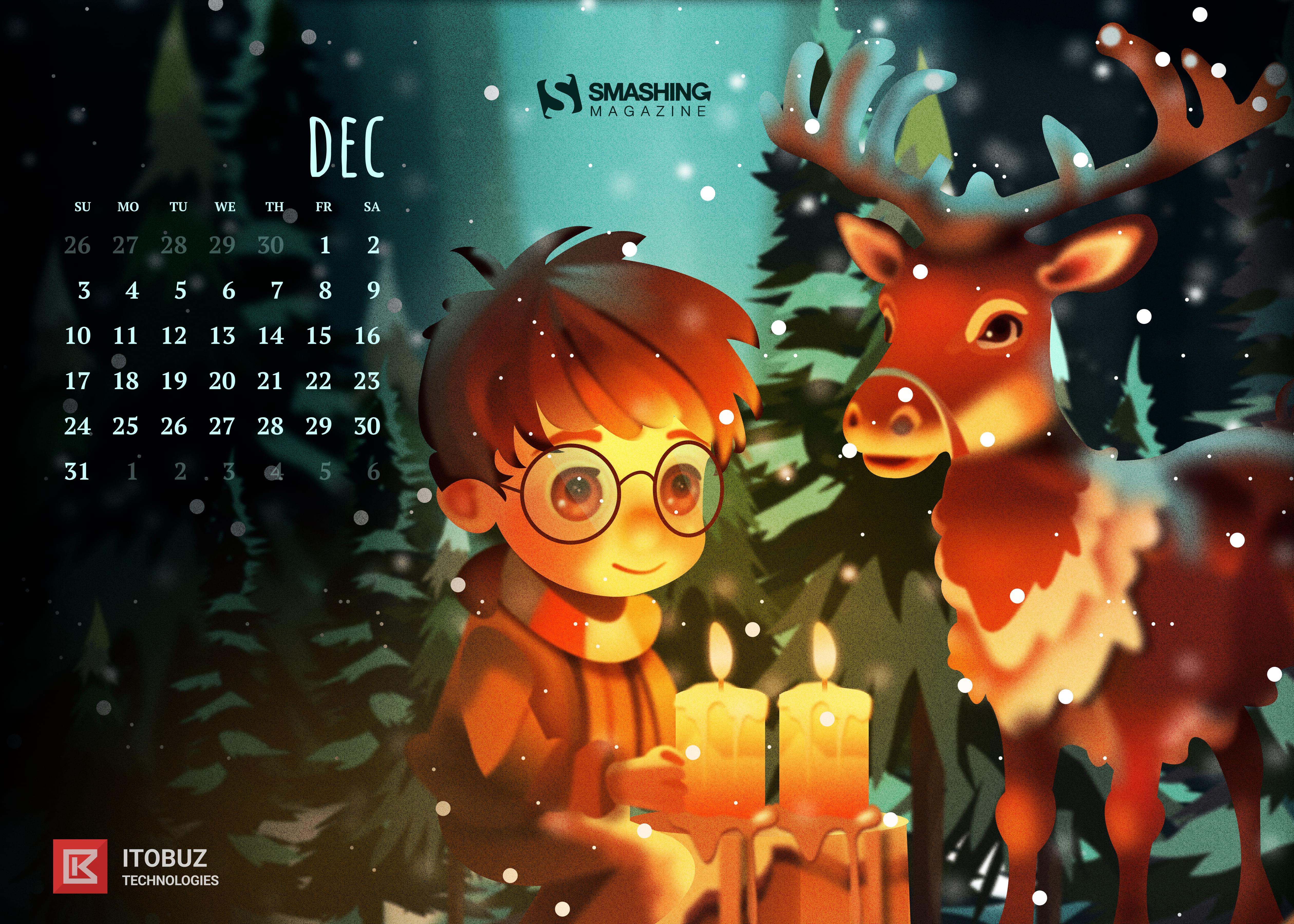
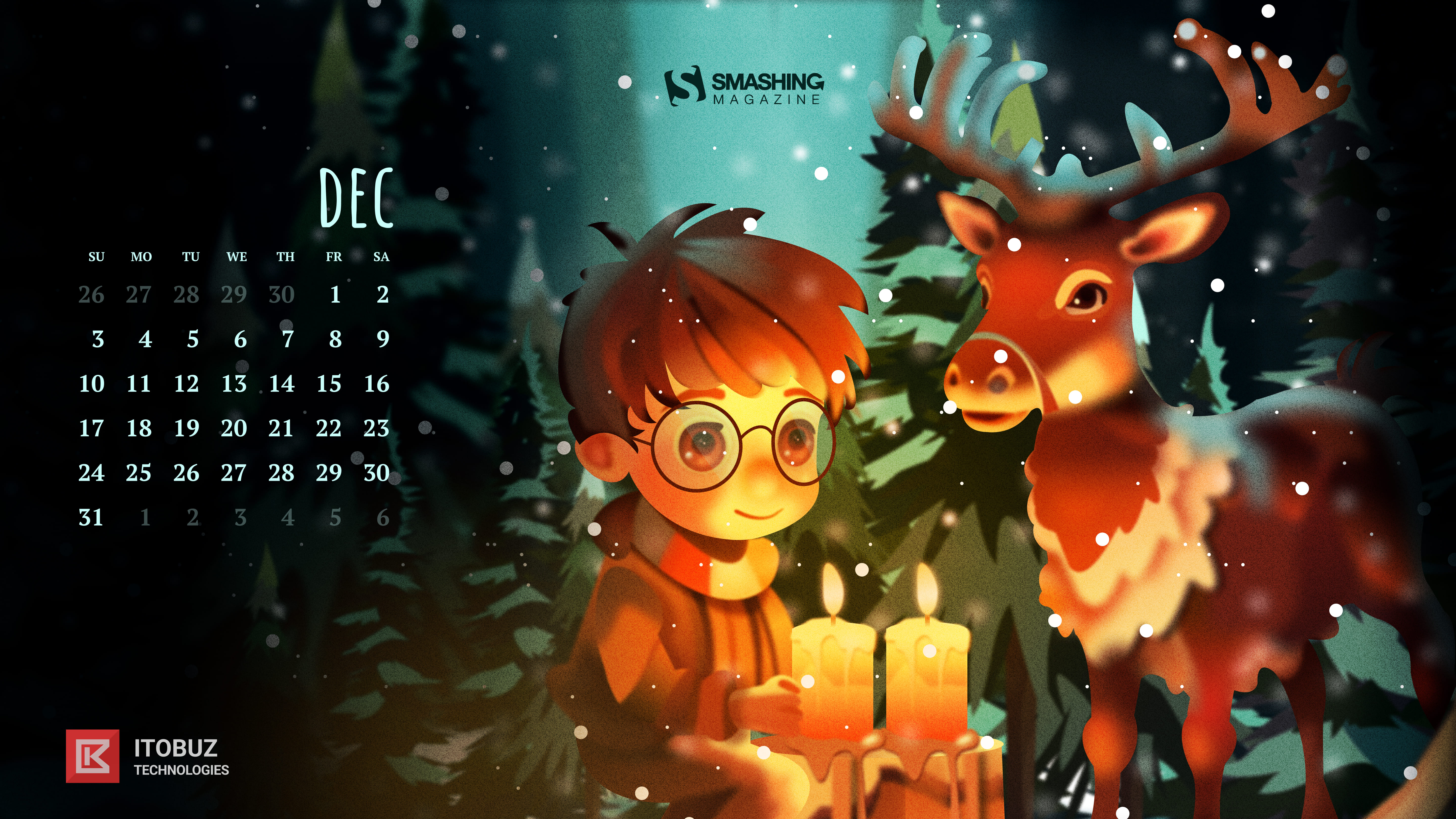
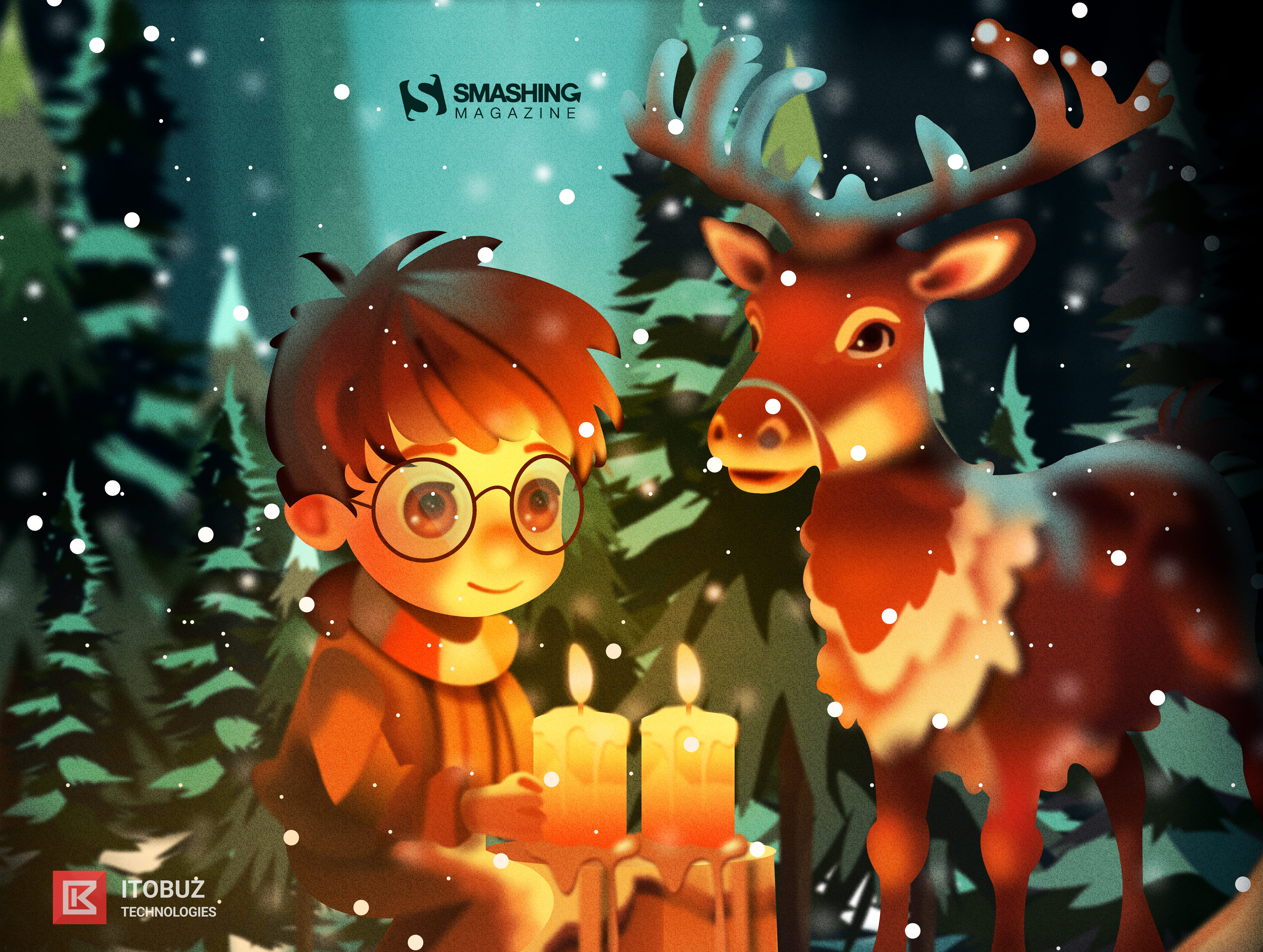
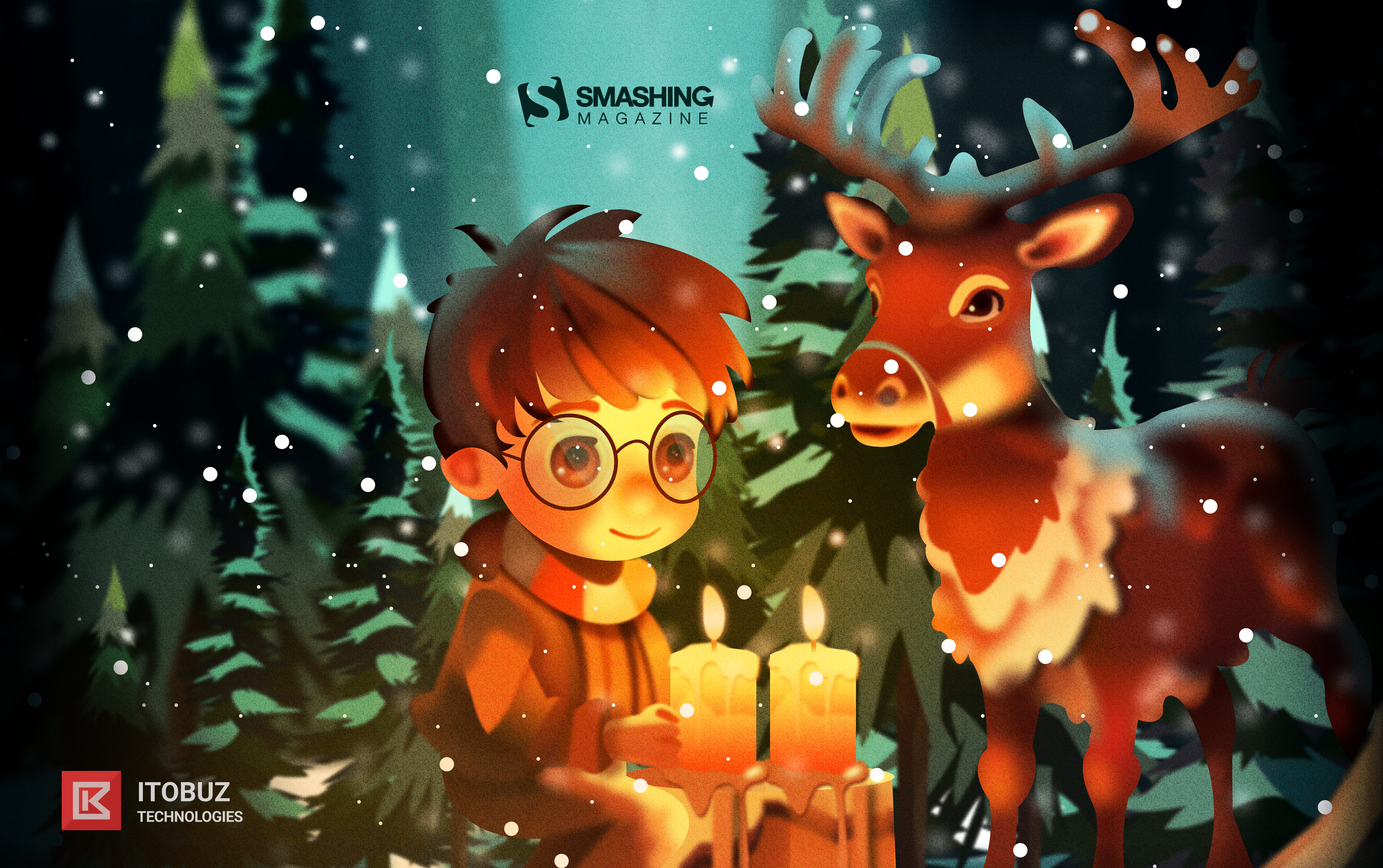
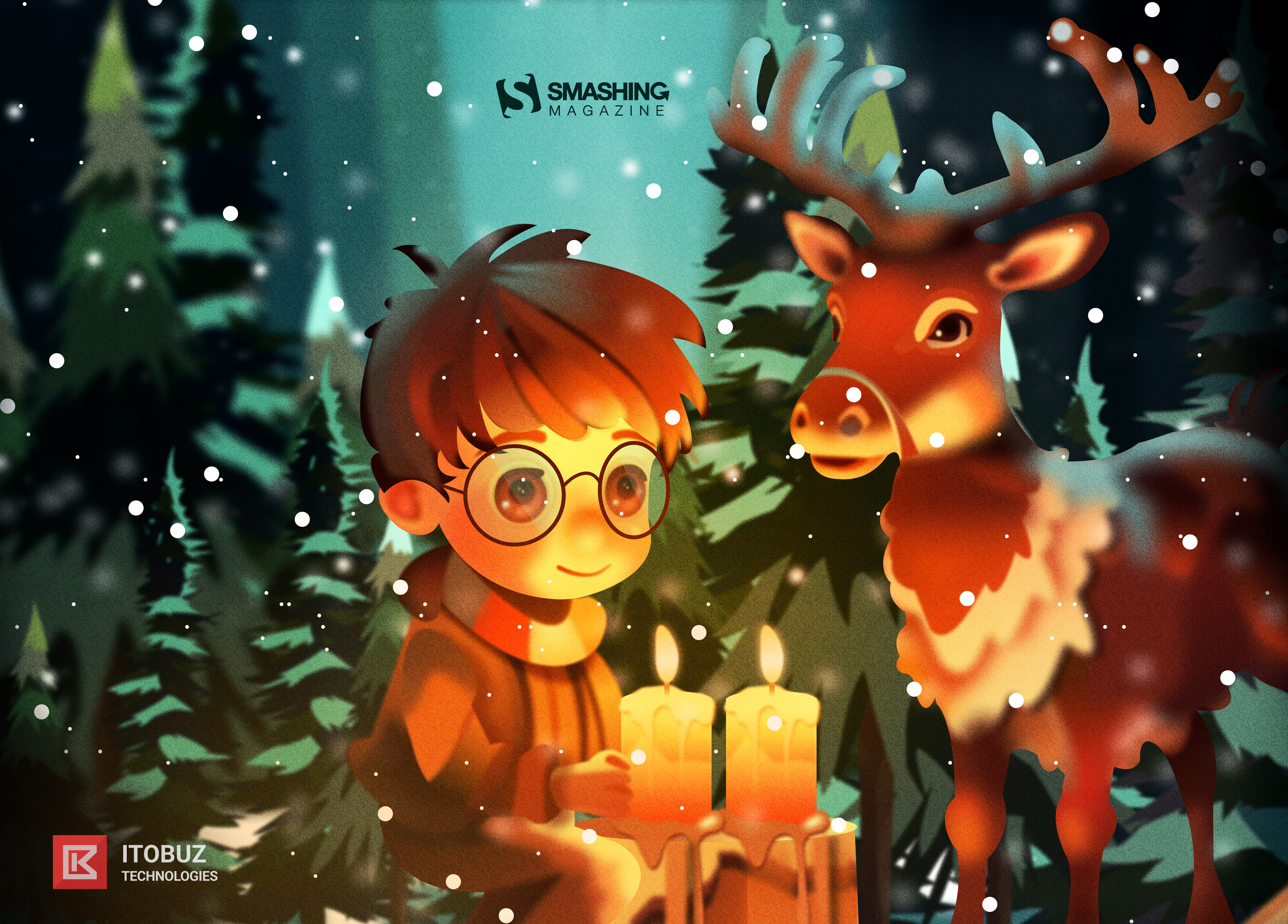
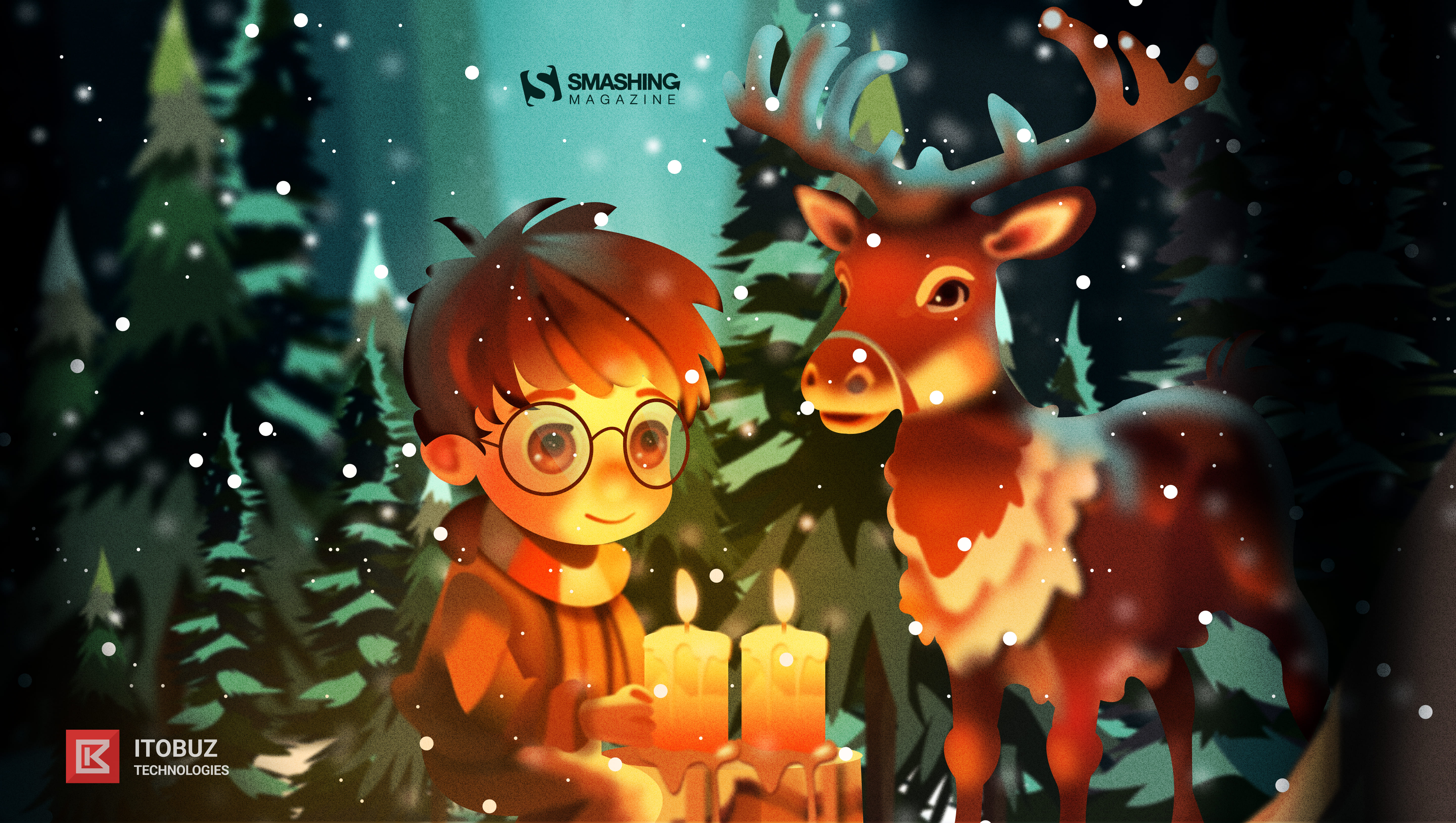
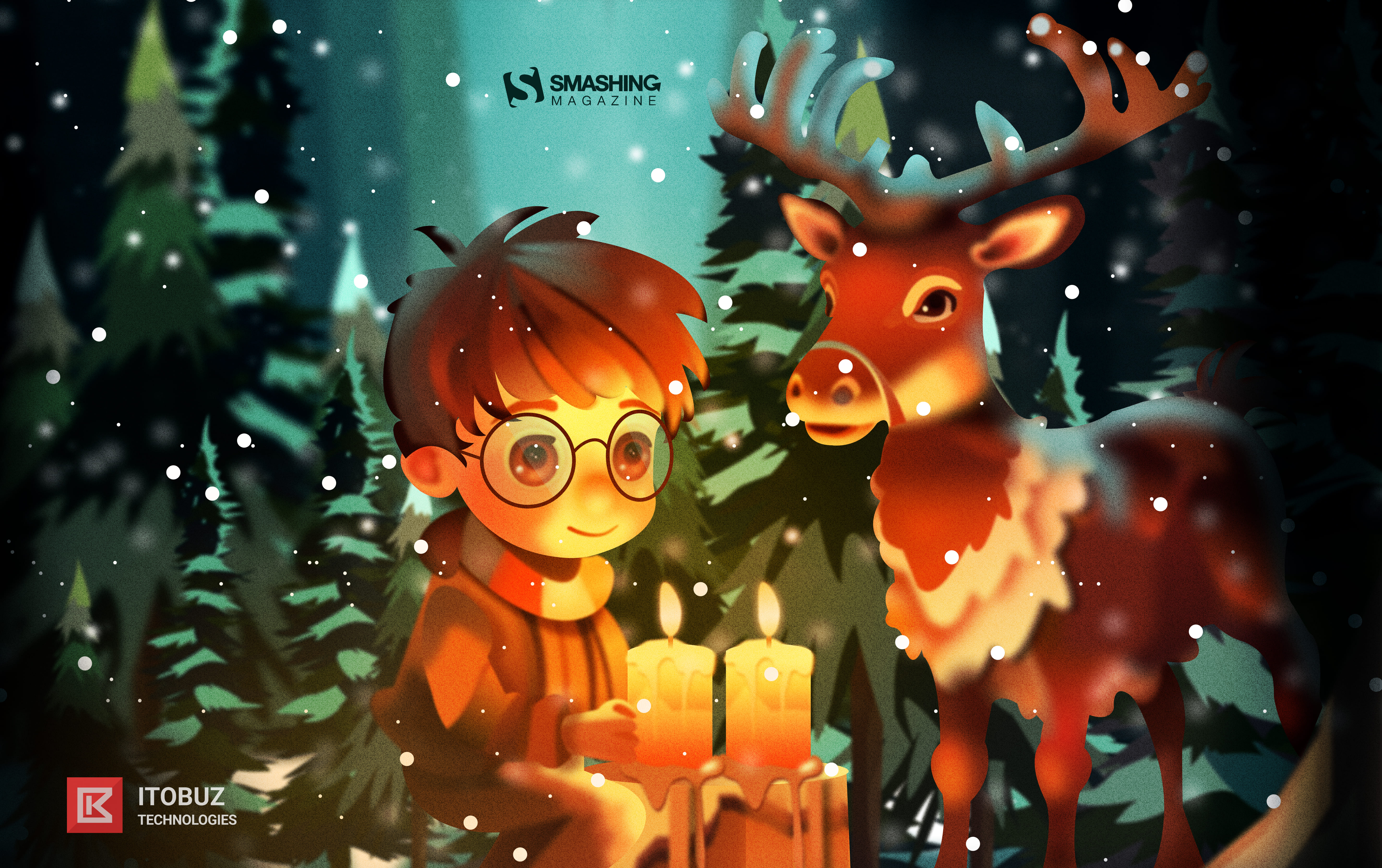
“Christmas is a time you get homesick, even when you’re home! Christmas reminds me of Harry Potter and his holidays when he would be longing to visit the Weasleys and have a Christmas feast with them at their table! The snowflakes, the Christmas tree, bundles of presents, and the lip smacking feast all gives you a reason to celebrate and stay happy amidst all odds! Life is all about celebration! Christmas is a reason to share the joy of happiness, peace and love with all, your near and dear ones.” — Designed by Acodez IT Solutions from India.

- preview
- without calendar: 320×480, 640×480, 800×480, 800×600, 1024×768, 1024×1024, 1152×864, 1280×720, 1280×960, 1280×1024, 1366×768, 1400×1050, 1440×900, 1600×1200, 1680×1050, 1680×1200, 1920×1080, 1920×1200, 1920×1440, 2560×1440
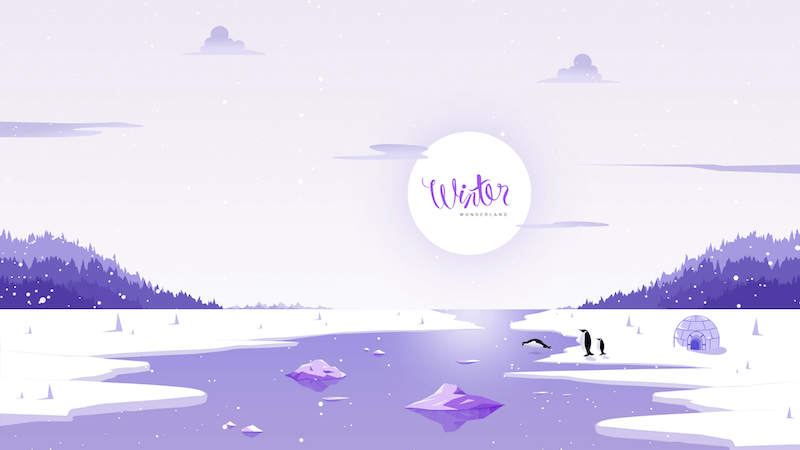
Winter Wonderland
“‘Winter is the time for comfort, for good food and warmth, for the touch of a friendly hand and for a talk beside the fire: it is the time for home.’ (Edith Sitwell) — Designed by Dipanjan Karmakar from India.

- preview
- without calendar: 1280×720, 1280×800, 1280×960, 1280×1024, 1366×768, 1400×1050, 1440×900, 1600×1200, 1680×1050, 1680×1200, 1920×1080, 1920×1440, 2560×1440
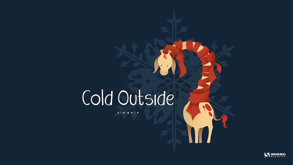
Cold Outside
“In December it is cold outside, so cute giraffe with scarf.” — Designed by Kim Lemin from Belgium.
Christmas Lights Under The Sea
“Jellyfish always reminded me of Christmas because of the shiny magic they create. Lights of hope in the deep blue sea.” — Designed by Marko Stupić from Zagreb, Croatia.

- preview
- without calendar: 640×480, 800×600, 1024×768, 1152×864, 1280×720, 1280×960, 1400×1050, 1600×1200, 1920×1080, 1920×1440, 2560×1440
Christmas Time
Designed by Sofie Keirsmaekers from Belgium.

Happy Holidays
Designed by Ricardo Gimenes from Sweden.

- preview
- without calendar: 640×480, 800×480, 800×600, 1024×768, 1024×1024, 1152×864, 1280×720, 1280×800, 1280×960, 1280×1024, 1366×768, 1400×1050, 1440×900, 1600×1200, 1680×1050, 1680×1200, 1920×1080, 1920×1200, 1920×1440, 2560×1440, 3840×2160
.nl-boxform .nl-boxform–button,.nl-boxform .nl-boxform–email{flex-grow:1;flex-shrink:0;box-sizing:border-box;width:auto;margin:0;padding:.75em 1em;border:0;border-radius:11px;background:#fff;font-size:1em}
input.nl-boxform–email:active,input.nl-boxform–email:focus,.nl-boxform–button:active,.nl-boxform–button:focus{box-shadow:0 1px 1px rgba(0,0,0,.3)}
.nl-boxform–button:-ms-input-placeholder,.nl-boxform–email:-ms-input-placeholder{color:#777;font-style:italic}
.nl-boxform–email::placeholder,.nl-boxform–button::placeholder{color:#777;font-style:italic}
.nl-boxform .nl-boxform–button{transition:all .2s ease-in-out;color:#fff;background-color:#0168b8;font-family:Mija,-apple-system,Arial,BlinkMacSystemFont,“roboto Slab”, “droid Serif”, “segoe UI”, Ubuntu, Cantarell, Georgia, serif;font-weight:700;box-shadow:0 1px 1px rgba(0,0,0,.3);width:100%;border:0;border-left:1px solid #ddd;flex:2;border-top-left-radius:0;border-bottom-left-radius:0}
.nl-boxform .nl-boxform–email{border-top-right-radius:0;border-bottom-right-radius:0;width:100%;flex:4}
.nl-box__img{height:auto;width:100%}
@media all and (max-width: 650px){.nl-boxform .nl-boxgroup { flex-wrap: wrap; box-shadow: none; } .nl-boxform .nl-boxform–email, .nl-boxform .nl-boxform–button { border-radius: 11px; border-left: none; }
.cardsgrid { grid-template-columns: repeat(auto-fit, minmax(220px, 1fr)); } .nl-boxform .nl-boxform–email { box-shadow: 0 13px 27px -5px rgba(50, 50, 93, 0.25), 0 8px 16px -8px rgba(0, 0, 0, 0.3), 0 -6px 16px -6px rgba(0, 0, 0, 0.025); min-width: 100%; } .nl-boxform .nl-box__form–button { margin-top: 1em; box-shadow: 0 1px 1px rgba(0, 0, 0, 0.5); }}
.nl-boxform .nl-boxform–button:active,.nl-boxform .nl-boxform–button:focus,.nl-boxform .nl-boxform–button:hover{cursor:pointer;color:#fff;background-color:#0168b8;border-color:#dadada;box-shadow:0 1px 1px rgba(0,0,0,.3)}
.nl-boxform .nl-boxform–button:focus,.nl-boxform .nl-boxform–button:active{outline:none!important;text-shadow:1px 1px 1px rgba(0,0,0,.3);box-shadow:inset 0 3px 3px rgba(0,0,0,.3)}
.nl-box__group{display:flex;box-shadow:0 13px 27px -5px rgba(50,50,93,.25),0 8px 16px -8px rgba(0,0,0,.3),0 -6px 16px -6px rgba(0,0,0,.025);border-radius:11px}
.nl-box__wrapper{display:flex;flex-direction:column;justify-content:center}
.nl-box__form form{width:100%}
.nl-boxform .nl-boxgroup{margin:0}
.nl-box__caption{font-size:.9em;line-height:1.5em;color:#fff;border-radius:11px;padding:.5em 1em;display:inline-block;background-color:#0067b859;text-shadow:1px 1px 1px rgba(0,0,0,.3)}
.nl-box{margin:1.5em 0;padding:1em 0;box-shadow:none;max-width:750px;justify-self:center}
.nl-box__blue{background-color:#1b71bb;background-image:linear-gradient(#1b71bb 60%,#01a6c1 100%)}
.nl-box__desc{padding:.5rem 2rem 1rem}
.nl-box__image{width:100%;height:auto}
@media screen and (min-width: 48em){.nl-box__desc { padding: 0.5rem calc(2rem + 0.5vw) 1rem calc(2rem + 0.5vw); }}
.nl-box__desc–heading-link{color:#fff;text-shadow:1px 1px 1px rgba(0,0,0,.9)}
.nl-box__summary{border-bottom:0;color:#fff;font-style:normal;text-shadow:1px 1px 1px rgba(0,0,0,.4)}
.promo-box–blue{–promo-background:#e7f8ff;–promo-text:#000;–promo-highlight-text:#e7f8ff;–promo-highlight:#006fc6;–promo-highlight–hover:#006fc6}
.promo-box{background:var(–promo-background);color:var(–promo-text);position:relative;padding:125px 1.5em 2em;margin-top:125px;text-align:center;display:flex;flex-direction:column;align-items:center;justify-content:center;border-radius:11px;width:100%}
.promo-box__image-link{position:absolute;display:block;top:0;padding:0;left:50%;transform:translate(-50%,-50%);width:250px;height:250px;text-decoration:none;background:0 0}
.promo-box__image{width:100%;height:100%}
.promo-box__cta{background:#fff;color:#d33a2c;text-decoration:none;padding:.5em .8em;border-radius:11px;box-shadow:0 0 1px 1px rgba(0,0,0,.15);background-image:none;font-weight:700;font-size:1.2em;margin:0;position:relative;box-shadow:0 2px 6px rgba(0,0,0,.12);transition:background .4s ease-in-out,color .4s ease-in-out}
.promo-boxcta:active,.promo-boxcta:focus{outline:0!important;background:#fff;text-shadow:none;box-shadow:inset 0 3px 3px rgba(0,0,0,.3)}
.promo-box__heading{line-height:1.2;font-size:1.5em;font-weight:700;margin:1.25em 0 0}
.promo-box__button{background:var(–promo-highlight);border-radius:11px;padding:.8em 1em;font-size:1.15em;text-shadow:1px 1px 1px rgba(0,0,0,.3);text-decoration:none;color:#fff;font-weight:700;display:flex;width:100%;justify-content:center;transition:all .2s ease-in-out}
.promo-boxbutton:active,.promo-boxbutton:focus,.promo-box__button:hover{border-bottom:none;cursor:pointer;border-color:#dadada}
.promo-boxbutton:active,.promo-boxbutton:focus{outline:0!important;box-shadow:inset 0 3px 3px rgba(0,0,0,.3)}
via Pixel Lyft https://ift.tt/MG09UV1
